Protective Life’s Insurance Plan for Dentists
Digital Director & Lead Account Strategist
Digital Strategy for a Specialized HCP Audience That Increased Leads by 71%
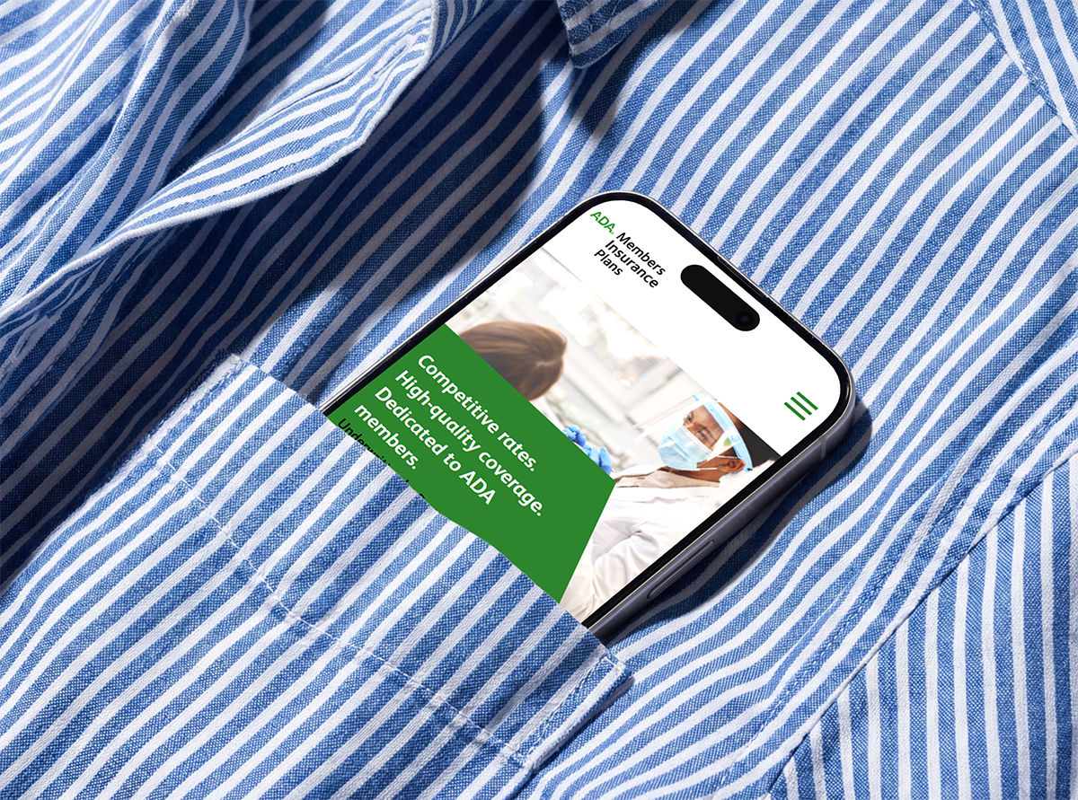
ADA Members Insurance Plans (AMIP), offered through Protective Life, provides specialized insurance products to ADA-member dentists across the United States. As Digital Director and dedicated account lead at Pathfinders Advertising Agency, my team and I were tasked with driving qualified leads through digital channels for a highly specialized audience: licensed dental professionals.
The full scope of this initiative included a comprehensive audit and redesign of all digital channels (web, email, and search), UX and competitor research, and landing page, SEO, and AI/AEO strategy. I led the effort with an incredibly talented team of UI/UX designers, copywriters, and developers.
The Strategic Approach
Our process began with a comprehensive website audit and competitor analysis of five key insurance brands, combining that research with performance and user data.
I then translated these findings into key insights and a detailed journey map that ensured every core audience’s needs were met, making sure engagement and remarketing opportunities were included throughout (conversion rate optimization). Example findings:
Product pages were too long and copy-heavy, driving high bounce rates and low engagement
The Get a Quote experience had too many form fields and pages, with no indication of overall form length. This created friction and reduced submissions (conversions)
Applicant information like email address and phone number was not captured early on in the Quote form flow, inhibiting remarketing
SEO errors were suppressing organic visibility
Email sender reputation had deteriorated following a platform migration, impacting deliverability and suppressing open rates
The existing digital program lacked dedicated lead generation landing pages entirely, sending mid-funnel audiences from Paid ad campaigns back to a top-of-funnel experience
From our insights, we built and executed a project plan of optimizations across every digital channel:
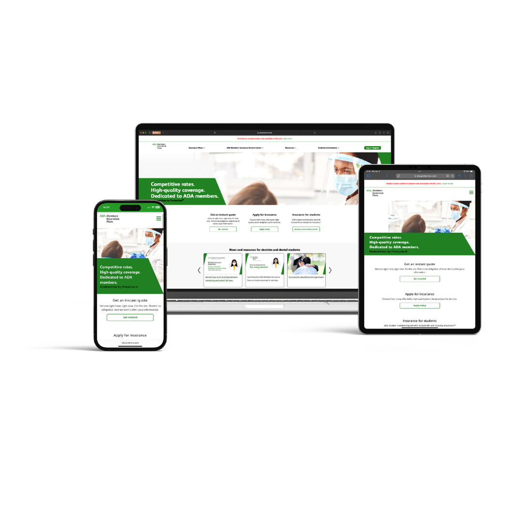
Redesigned and launched new lead generation landing pages for key products (Term Life, Income Protection, Free Consultation), improving UX for mid-funnel and Paid audiences
Introduced lead gen pop-ups across all product pages and Get a Quote pages, answering common questions before visitors bounced
Corrected critical SEO errors site-wide and implemented an ongoing SEO optimization cadence
Partnered with the client on next-gen AEO/AIO tactics: added customer reviews, relevant blog articles and FAQs, winning top placement in AI-driven search
Launched retargeting ads targeting users who had engaged with the site
Rebuilt the email program from the ground up: cleaned lists, repaired sender reputation, redesigned templates, and developed persona-based messaging strategies for dental students and established dentists
Created and launched re-engagement email strategies, connecting with dentists who had abandoned the Quote form before completion
Overhauled product page copy and layout (UI/UX design, mobile optimization, SEO-informed messaging) to reduce friction and improve engagement
As part of this project, we also:
Created Figma design systems to ensure cohesion and consistency across marketing channels and devices, while also increasing efficiency, ensuring the project stayed on track and on budget
Evaluated site and email performance each month and quarter to identify and plan continuous improvement opportunities
Key considerations
The AMIP audience of HCPs (ADA-licensed dentists) sits at the intersection of healthcare professional and business owner.
They evaluate financial products the way they evaluate clinical information, quickly and with a high level of scrutiny. Every piece of copy, every UX decision, and every creative choice was filtered through that lens: does this earn trust and credibility immediately? Does this reduce friction? Does this give a busy professional a reason to stay?
A note on confidentiality: select assets are shown with client approval. Some details have been omitted in accordance with agency confidentiality standards.
a UX-focused Email Strategy
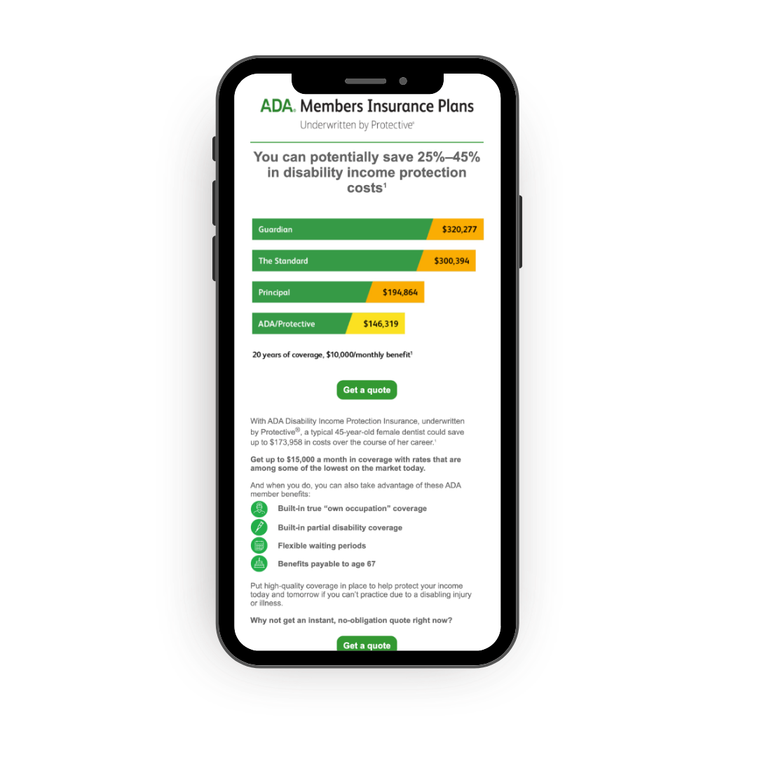
Data-based emails like this one performed best for our ‘established’ audiences of practicing dentists by providing the key information they needed to know without searching or scrolling. Established dentists have existing knowledge of insurance and may already be covered by a competitor.
In this case, cost is highlighted as the brand’s key differentiator, while also showcasing that they’re in the same league as other high-quality insurance providers, like Guardian. This acts as a trust and authority signal.
Email send time was also a critical element: we theorized and confirmed via A/B testing that the best time for our emails to reach the inboxes of established dentists was early in the morning, at lunch, or just after normal working hours, when the dentist would likely be catching up on email.
A mobile-first design also ensured the email rendered perfectly, even if they were reading while on-the-go.
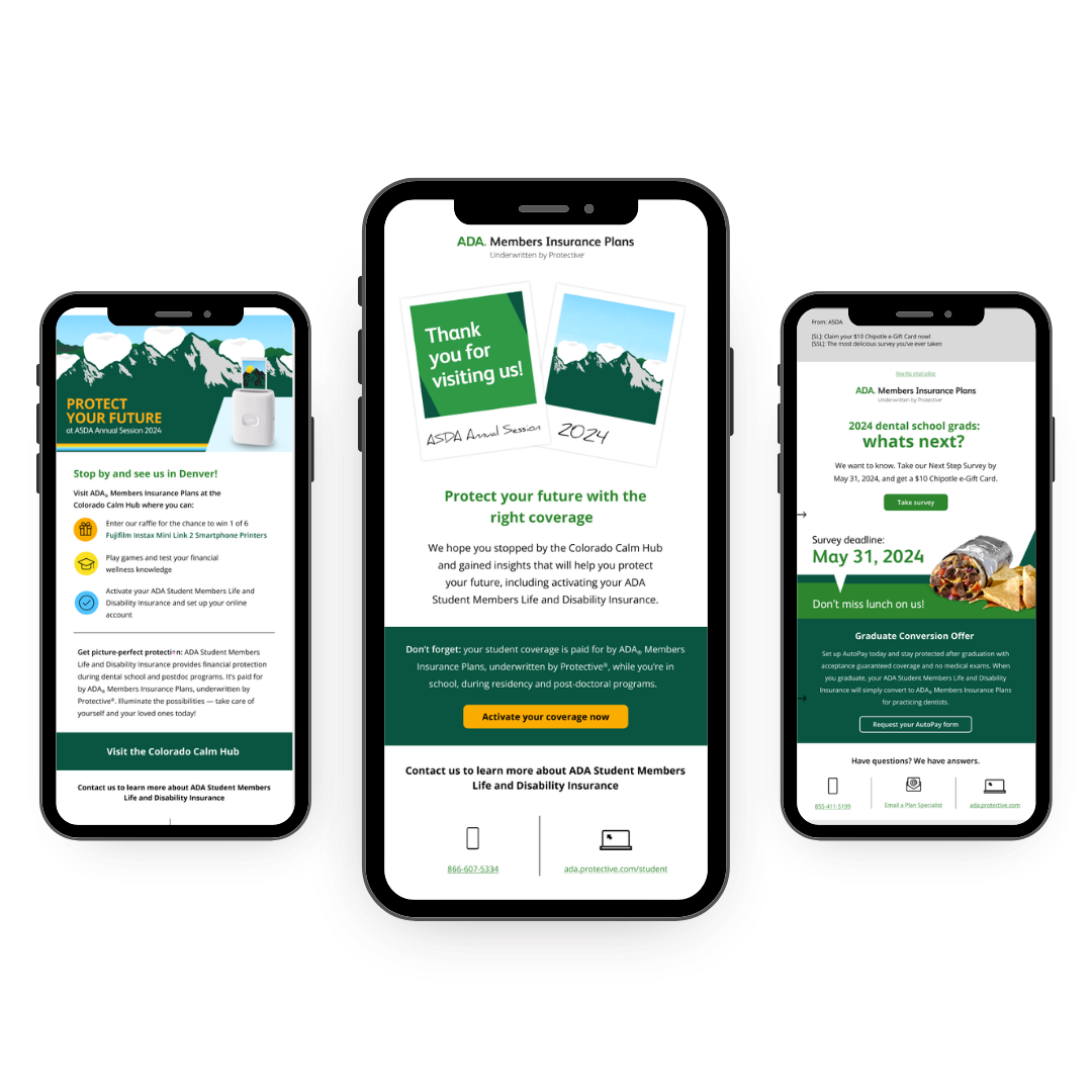
By contrast, these colorful, graphic emails that emphasize brand persona over hard data were the top performers for our client’s audience of dental students.
Unlike practicing dentists, dental students are just entering the field and have a limited understanding of the insurance they’ll need to cover themselves and their practice. These emails emphasize the brand, creating equity and trust as early entry points.
Money is also, of course, top-of-mind for dental students, who are still paying for an expensive education. To meet this audience where they are, we worked with our client on an offer for a free lunch if they took a survey, and a Fujifilm Instax instant camera if they stopped by their “Calming Center” booth at a tradeshow in Denver, incentives that any hardworking college student can appreciate.
the results

40% increase in web search visibility
29.26%
Average email open rate
71%
increase in leads
70%
increase in website engagement
More Case Studies of creative excellence
-
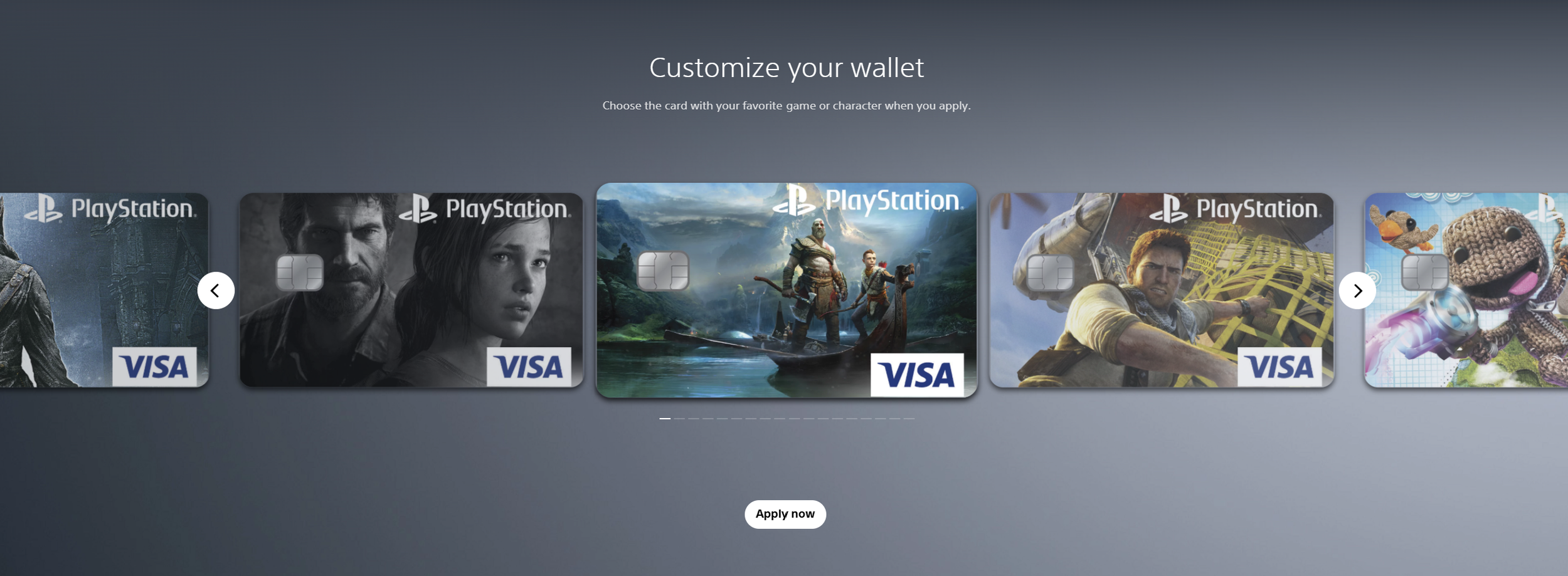
![Screenshots of PlayStation digital wallet customization interface showing several customized Visa game and character-themed credit cards, with navigation arrows and an 'Apply now' button.]()
Sony PlayStation & Visa Acquisition Campaign
-
![A young woman with curly hair and gold earrings looking at herself in a mirror while holding a spoon and a bowl of ice cream in a bathroom with a marble countertop and a green wall.]()
Brilli Wellness Lighting Lifestyle Photography
-
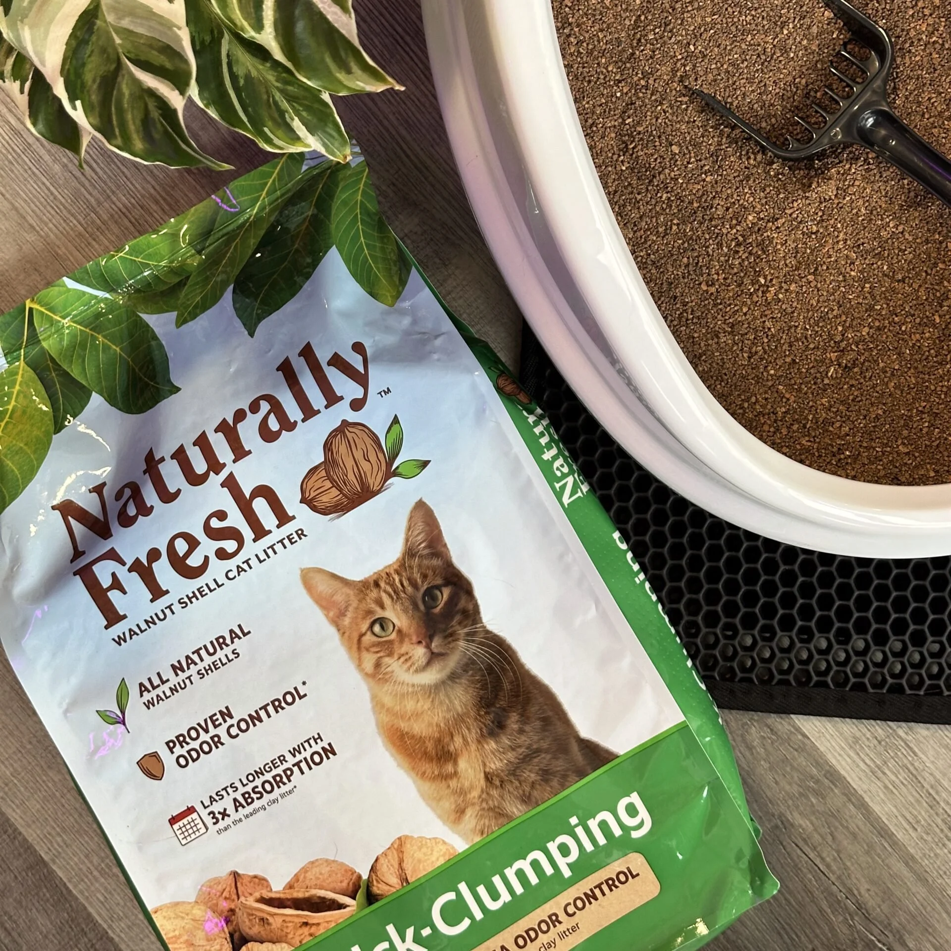
![Packet of natural cat litter with a picture of an orange tabby cat, green plants, and walnut shells on the packaging. Part of a white litter box and a black litter scoop are visible on a brown textured surface.]()
Naturally Fresh Digital Creative Strategy
-
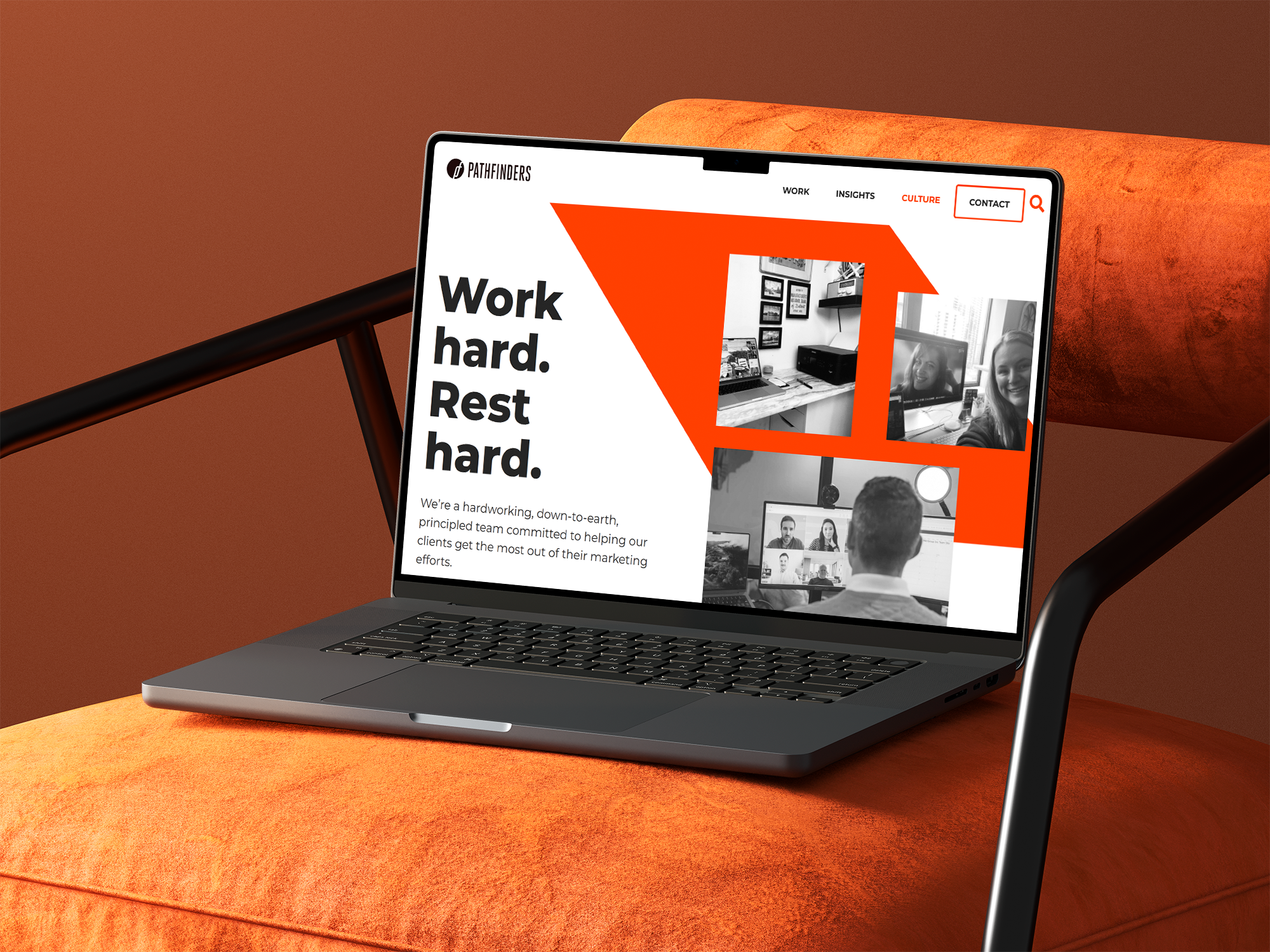
![A laptop on an orange surface displaying a webpage with the title 'Work hard. Rest hard.' and a menu bar with options including Work, Insights, Culture, Contact, and a search icon. The webpage features black and white images of people working on video calls and in office settings.]()
Pathfinders Advertising Digital Growth Strategy
-
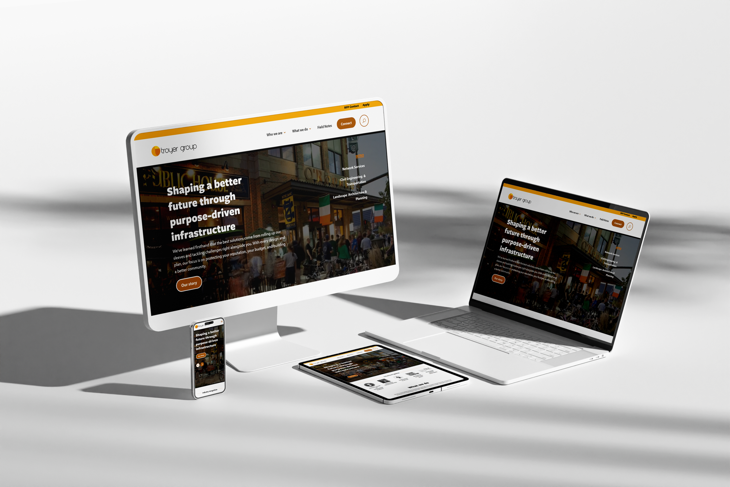
![Multiple electronic devices including a desktop monitor, laptop, smartphone, and tablet displaying the same website for Troyer Group, with a white background.]()
Troyer Group Architectural Firm Digital Strategy
-
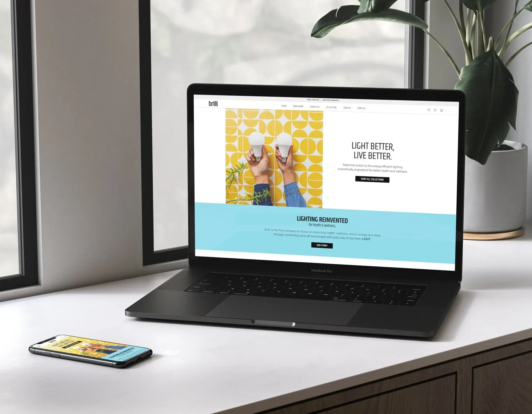
![A workspace with a MacBook Pro laptop displaying a website for Brilli, a smartphone showing the same website, and a potted plant with large green leaves on a windowsill in the background.]()
Brilli Wellness Lighting Brand & Digital Strategy
-
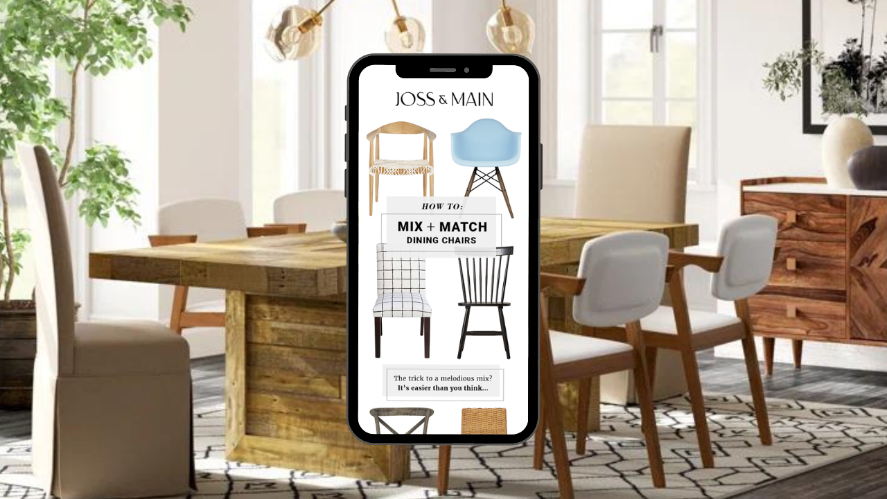
![Interior of a dining room with a wooden table, white and upholstered chairs, large windows, plants, and modern lighting fixtures. A smartphone in the foreground displays a furniture website with images of dining chairs and matching tips.]()
Joss & Main Email Strategy & Design
-
![Close-up of a smartphone showing the time 9:41, with signal, Wi-Fi, and battery icons on a gradient background.]()
Brilli Wellness Mobile App Product Management
-
![Close-up of a person using a mirror to touch up their lipstick with their finger, with the brand name 'brillii' visible on the mirror's base.]()
Brilli Wellness Lighting Video Direction
-
![A box of bright charge up 75W LED light bulb against a blue background.]()
Brilli Wellness Lighting Social Media Strategy & Influencer Management
-
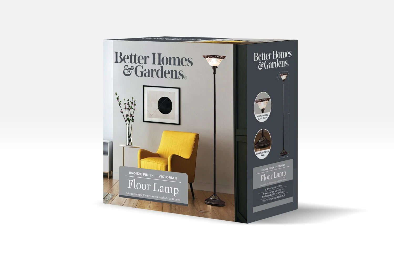
![Product packaging for a Victorian style floor lamp with a bronze finish, showing a living room scene with a yellow armchair, a small side table with a vase of flowers, artwork on the wall, and the lamp turned on.]()
Better Homes & Gardens (Walmart) Packaging Design Direction
-
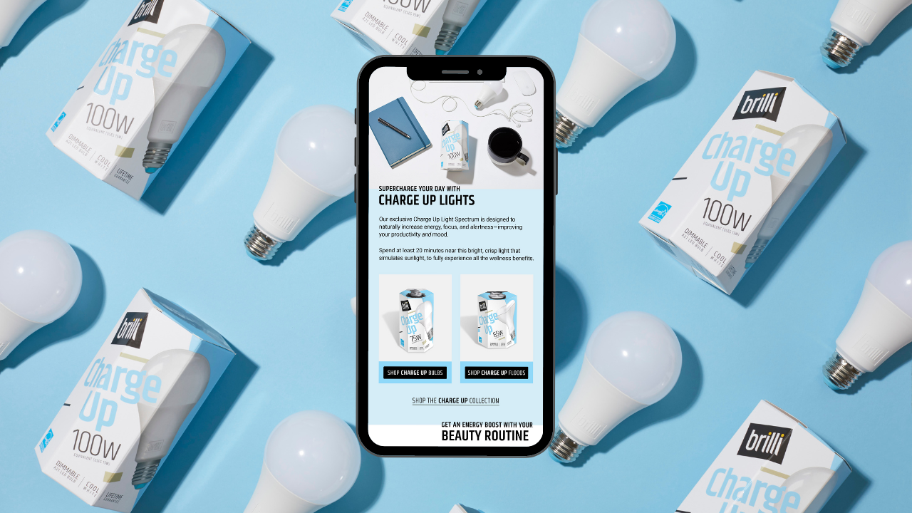
![Smartphone displaying a webpage about Brilli Charge Up LED light bulbs, surrounded by multiple boxed bulbs and unboxed LED bulbs on a blue background.]()
Brilli Wellness Email Strategy & Design
-
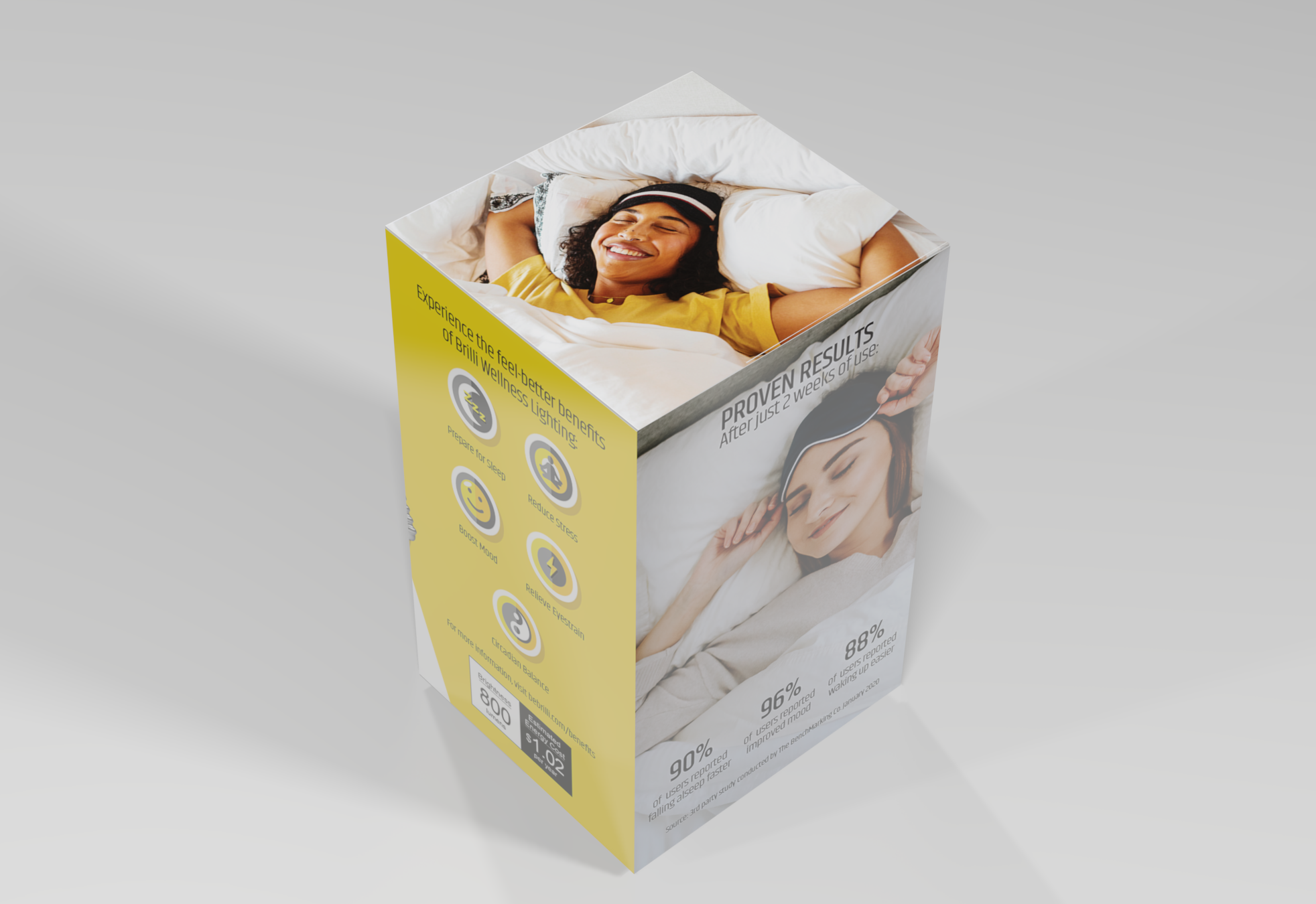
![A product packaging box featuring a smiling woman sleeping on a bed, with text promoting wellness benefits like better sleep, stress reduction, mood boost, and energy. The box also shows some statistics and pricing information.]()
Brilli Wellness Lighting Packaging & POP Design Direction
-
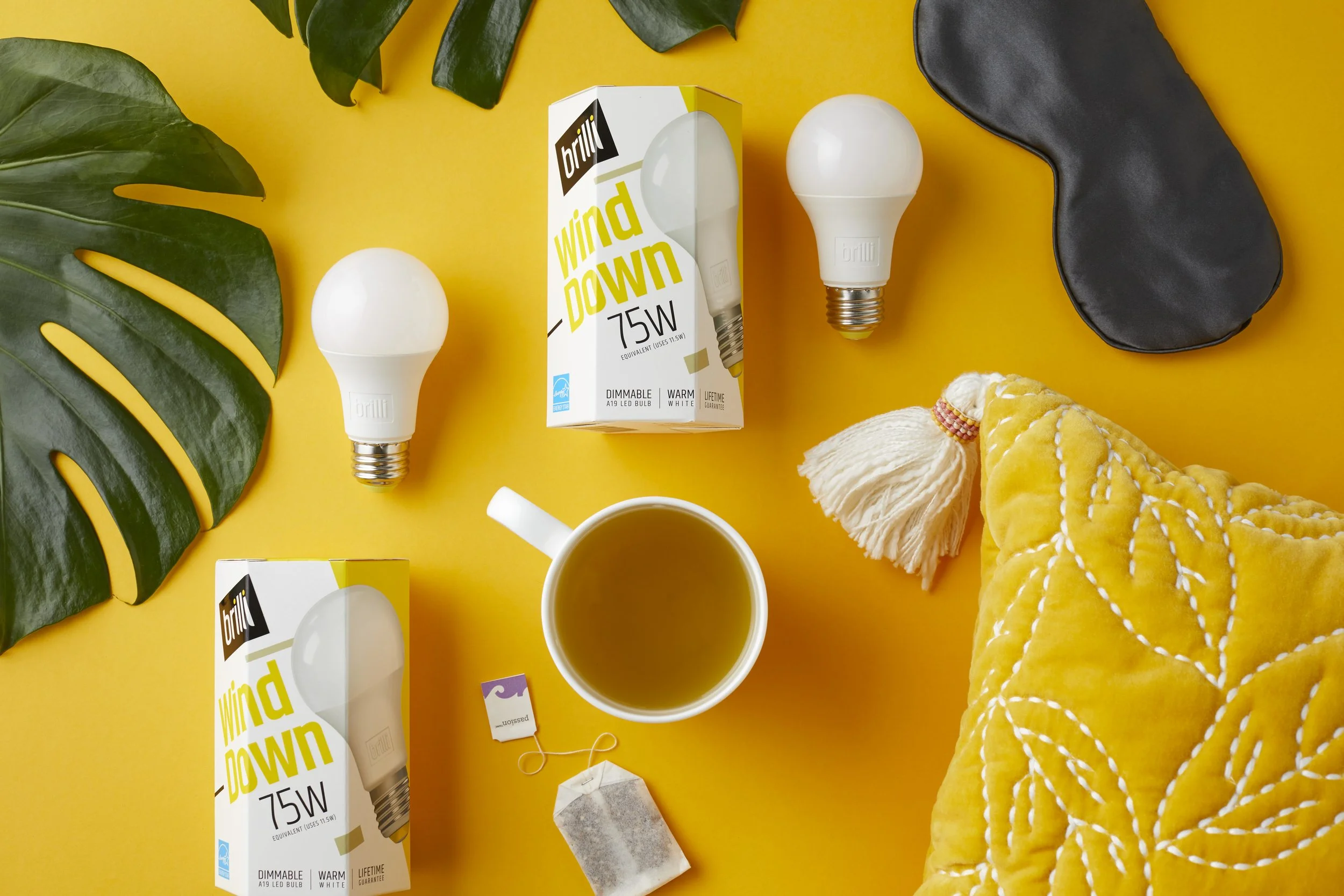
![Yellow background with two white LED bulbs, one in a box labeled 'brilli wind down 75W', a black eye mask, a white mug of tea, a yellow quilted blanket, green leaves, a tea bag, and a string.]()
Brilli Wellness Product Photography
-
![A yellow mid-century modern loveseat with wooden legs set against an orange and white background.]()
AllModern (Wayfair) Art & Animation Direction
-
![]()
Protective's ADA Insurance for Dentists Digital Transformation