Audience-targeted influencer Strategy
Brilli Wellness Lighting
Creative Director, Art Director, Social Media Strategist
Brilli Wellness Lighting launched in 2019 as a pioneer in a new product category: healthy circadian lighting, designed and scientifically proven to improve sleep, energy, mood, and more.
In a market dominated by "bulbs as simple, single-purpose utilities," Brilli sought to position itself as an attainable wellness essential for health-conscious Millennials, new parents, and biohacking enthusiasts. I helped deliver on this goal through strategic partnerships with social media influencers, reflecting our core customer demographic’s lifestyles in an aspirational-yet-attainable way. This campaign showed how wellness could be achieved simply by turning on the light.
As Brilli’s founding Creative Director, I was presented with an exciting challenge: launching a wellness brand in a new product category, circadian lighting, that was largely invisible and misunderstood.
The Strategy
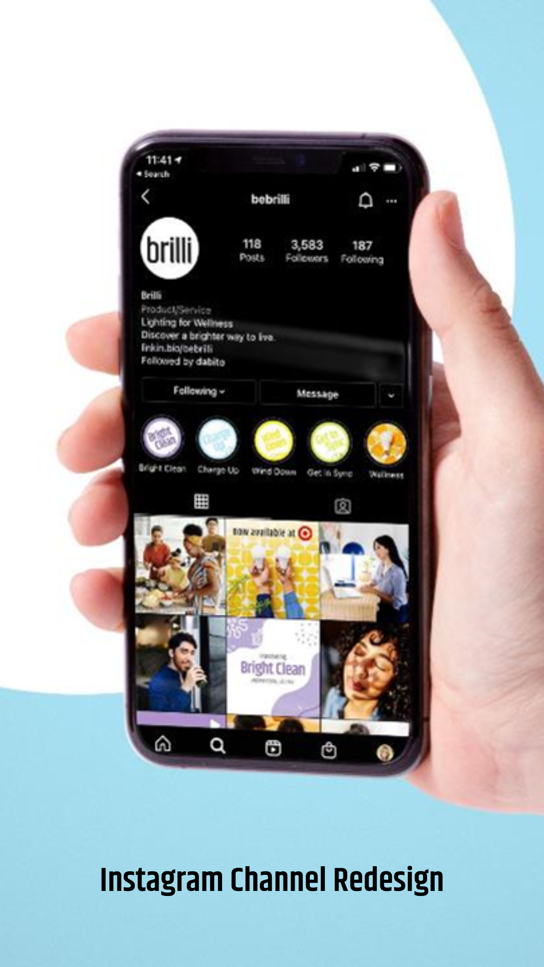
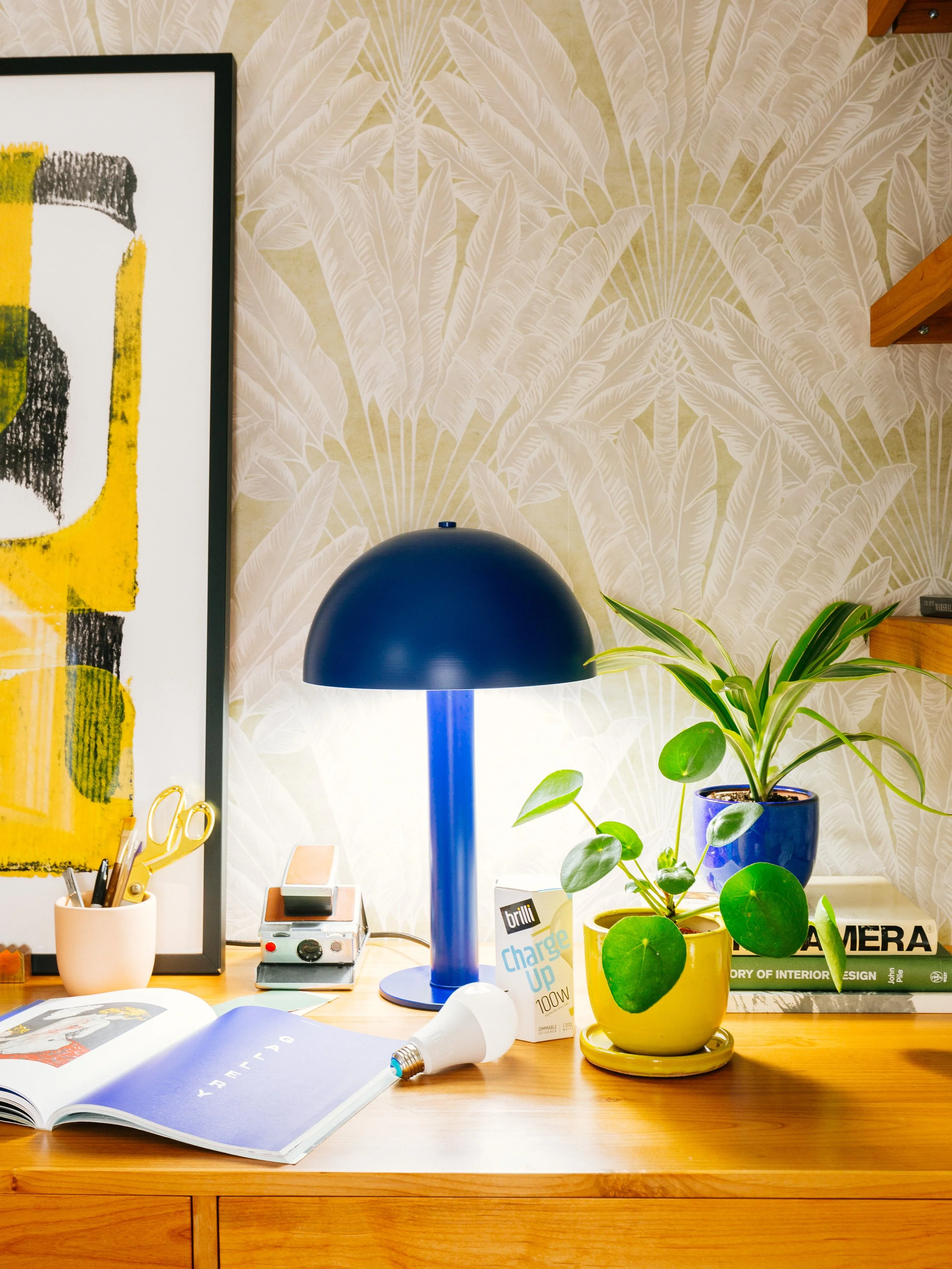
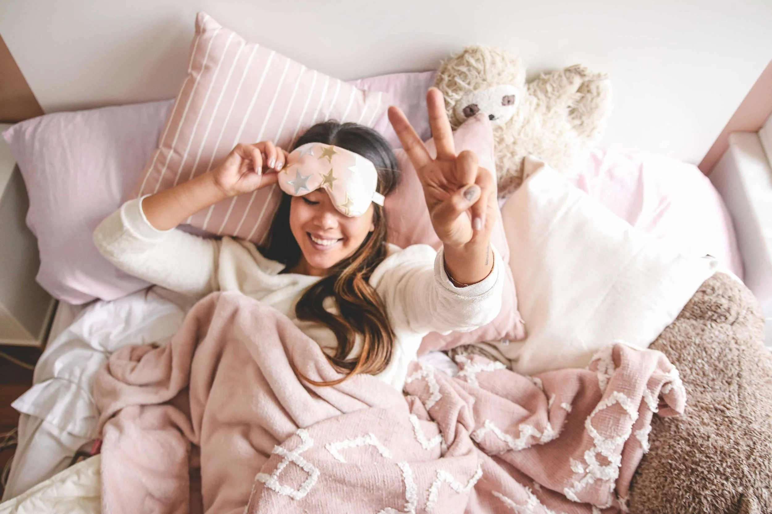
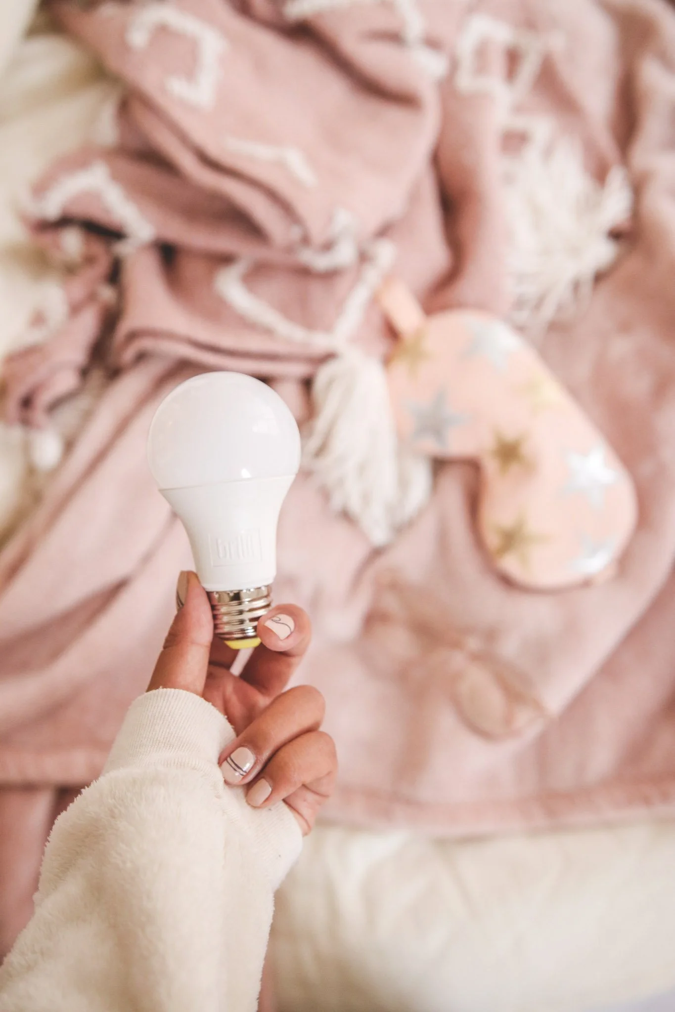
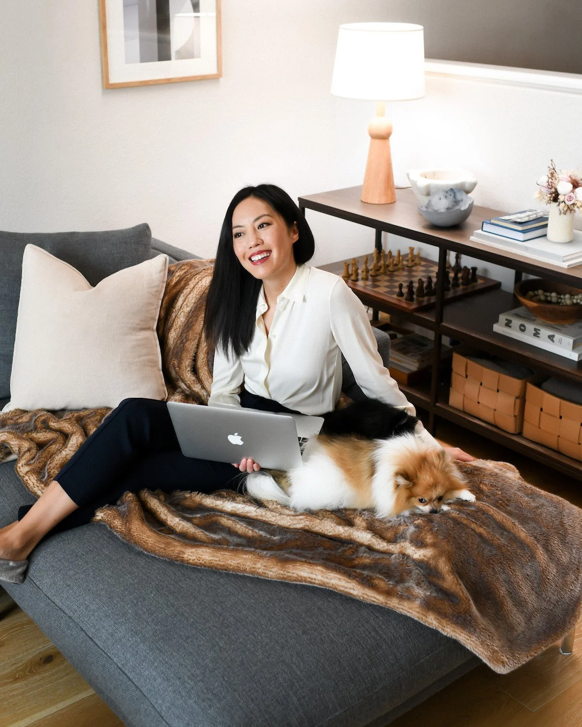
To drive brand awareness and education, I moved away from sterile, stock-image-driven social media marketing and toward a ‘Real-Life, Real Wellness’ strategy. I led an influencer program that prioritized authenticity, partnering with creators who looked and lived like our core audiences, just with a little more health, wellness, and style (the ‘clean girl’ aesthetic).
Market Perception: Lighting was viewed as a boring commodity, highly efficient, and not often considered as a potential source of daily wellness.
Brand Voice: The existing brand felt overly technical and lacked emotional resonance. Showcasing how circadian wellness could be easily integrated into daily living was a core goal of this initiative.
Visual Fatigue: The use of stock photography created a sterile, "big-box" retail feel that didn't align with the brand’s high-end products or adequately convey the scientifically proven wellness benefits.
The Approach
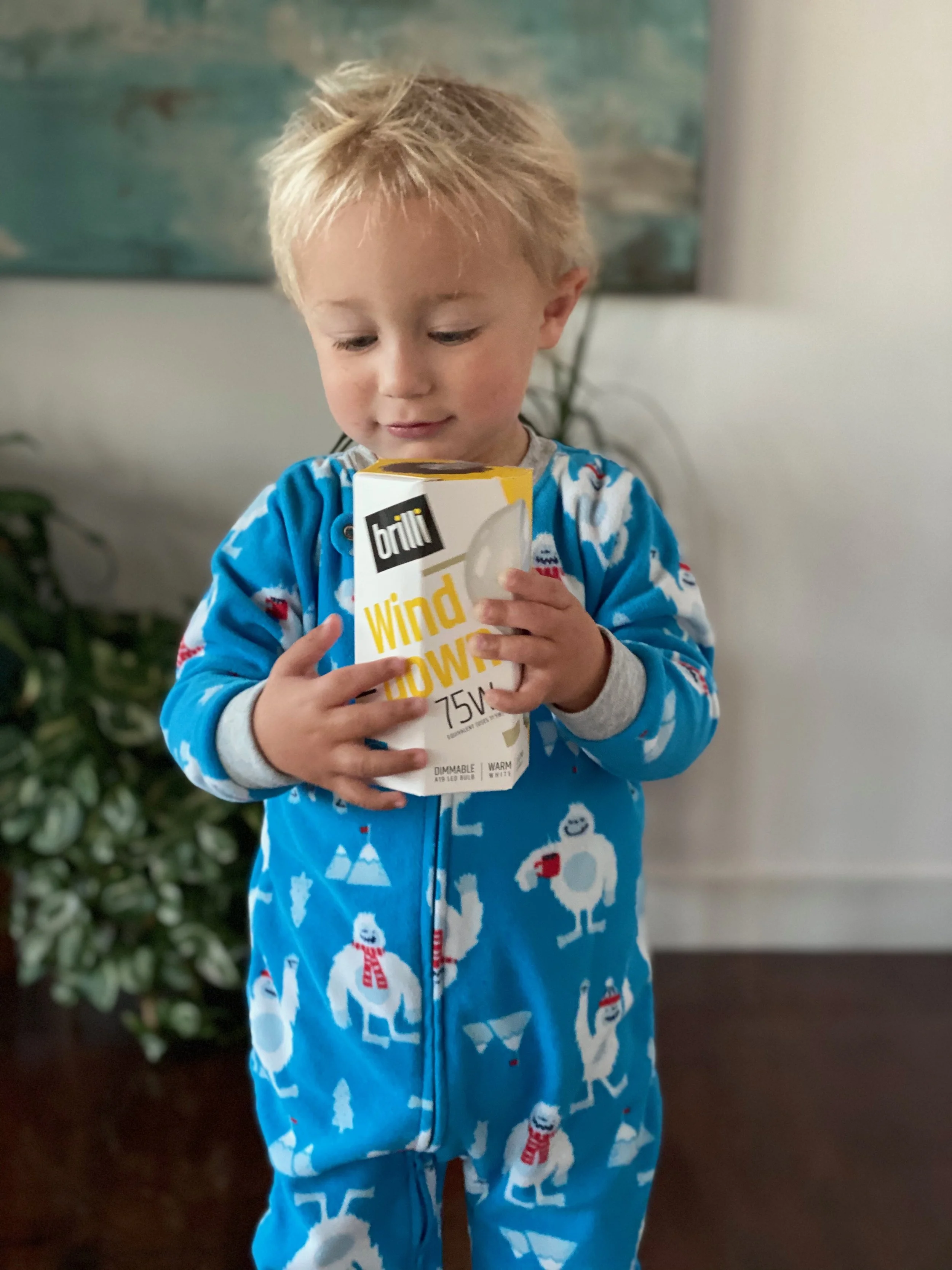
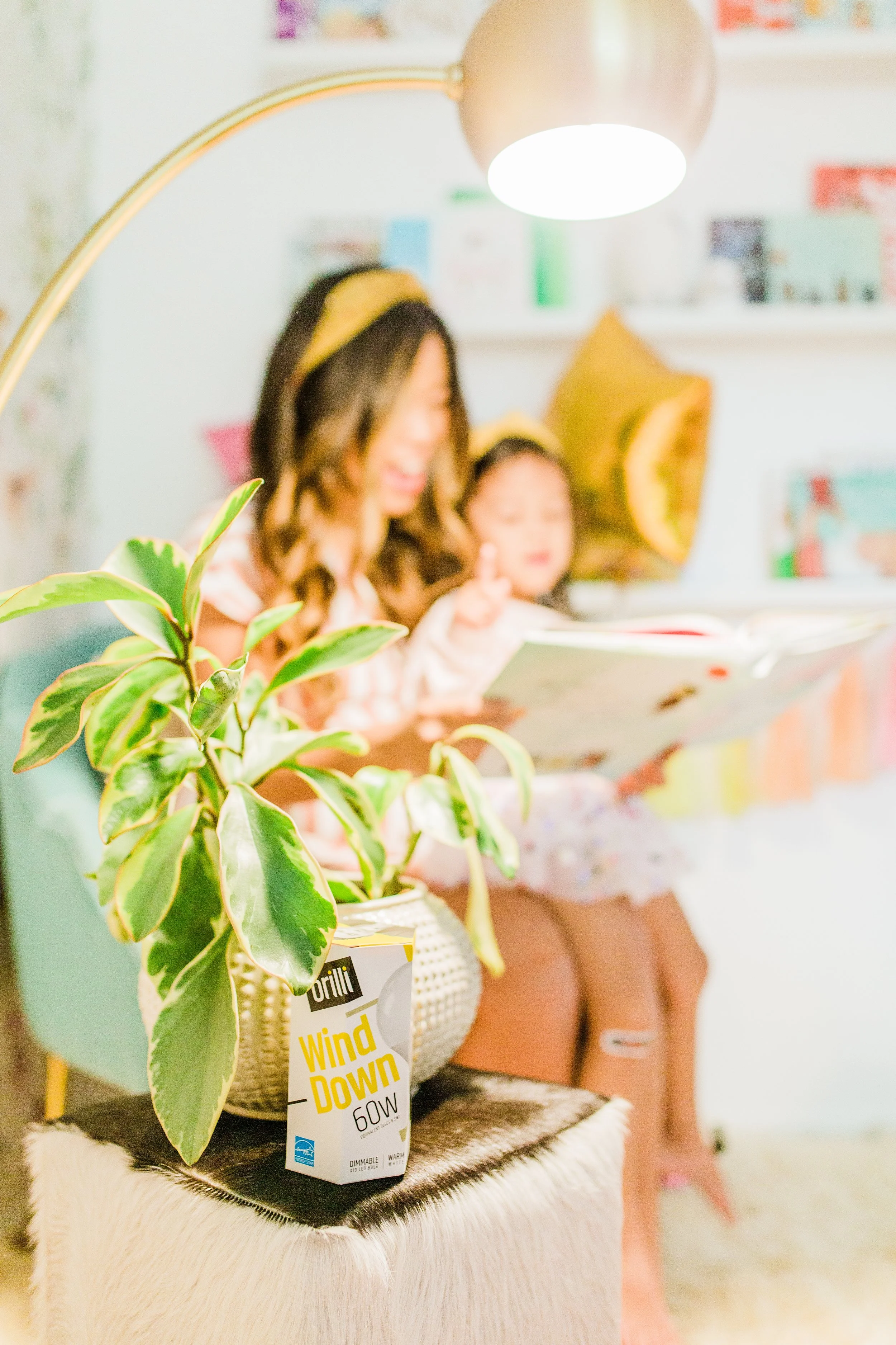
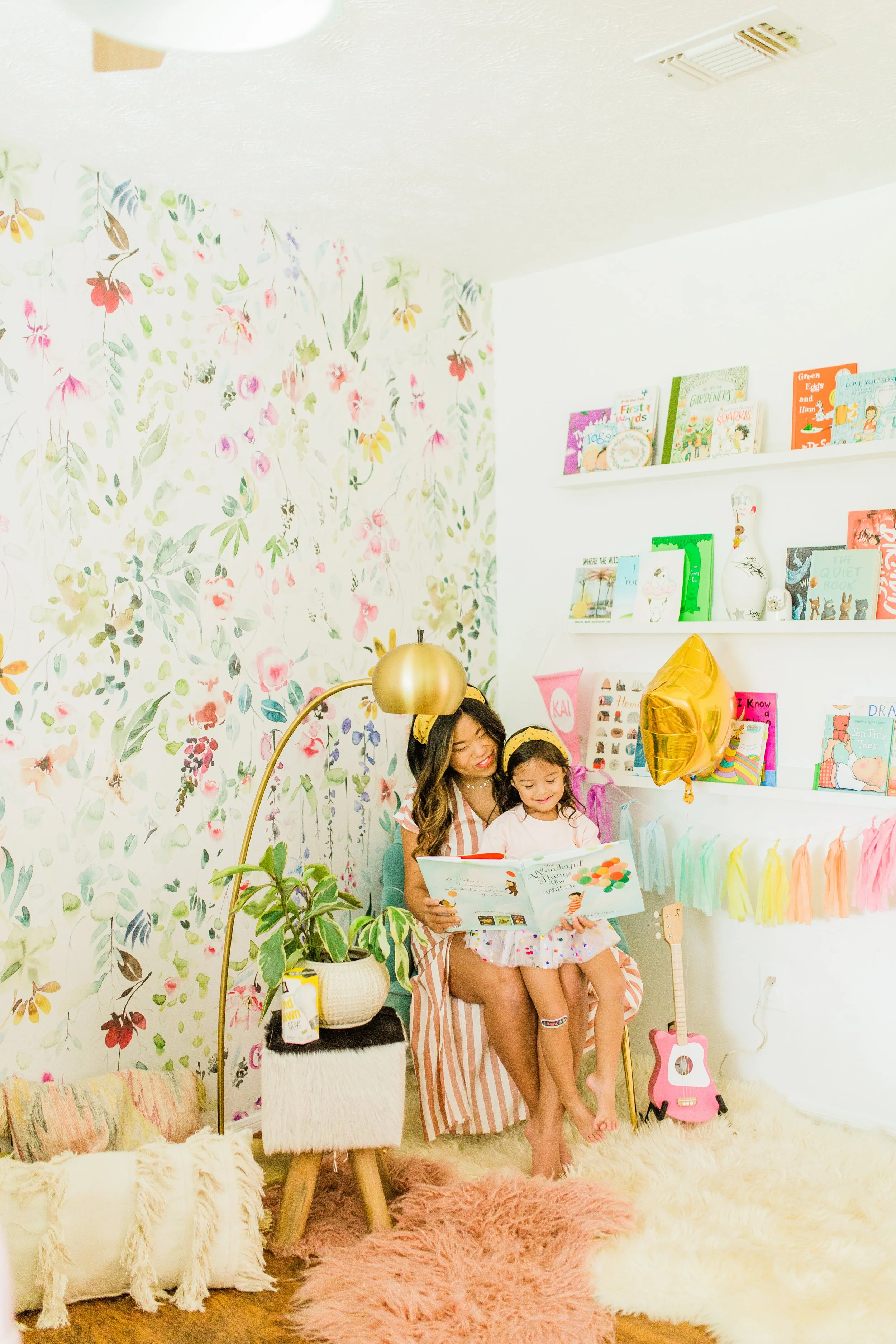
Influencer Selection = Demographic Alignment: Partnered with influencers who represented our core customer demographics (new moms, wellness-minded millennials) in an elevated but related way, keeping diversity, ease, and approachability at the forefront.
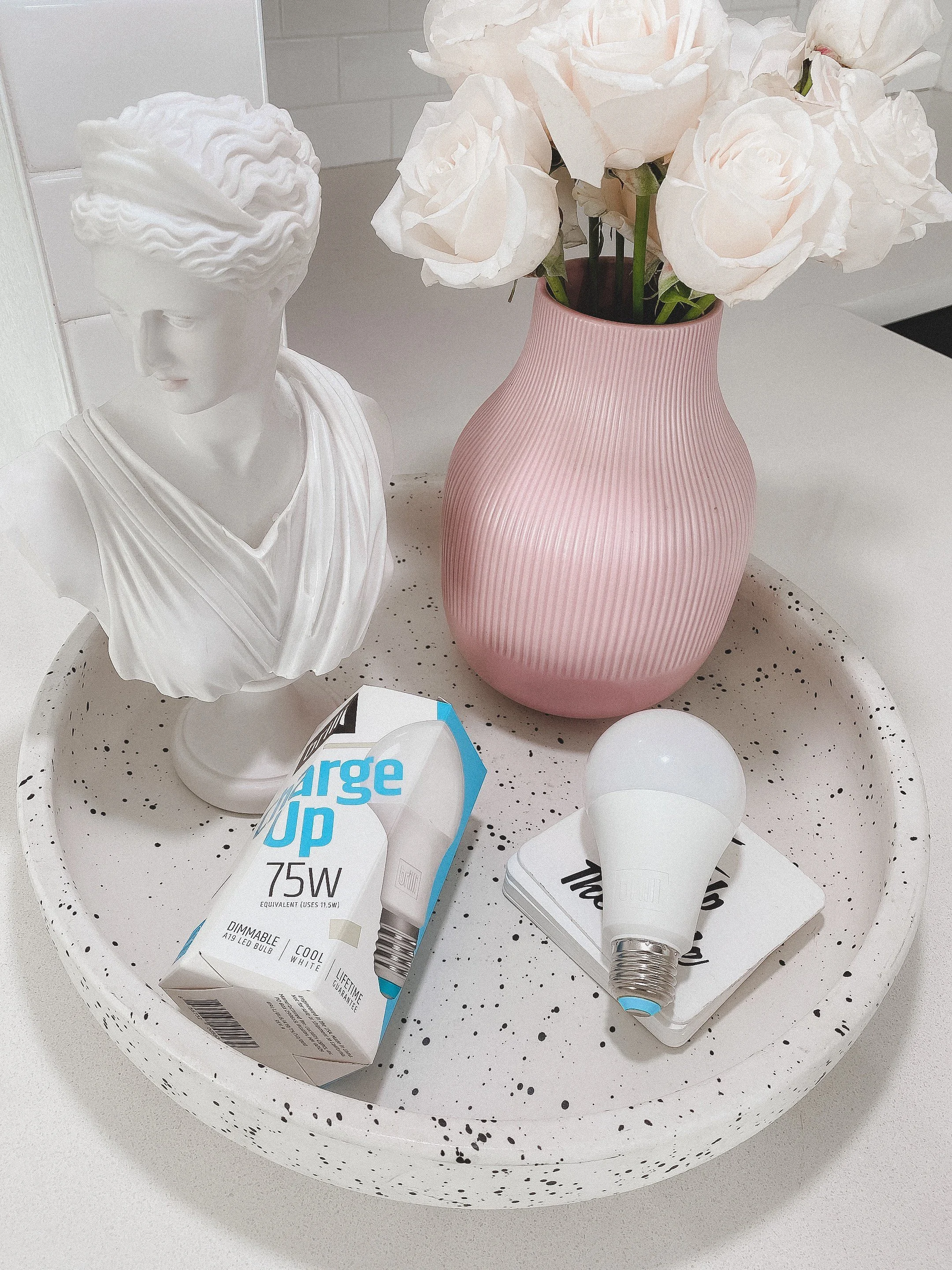
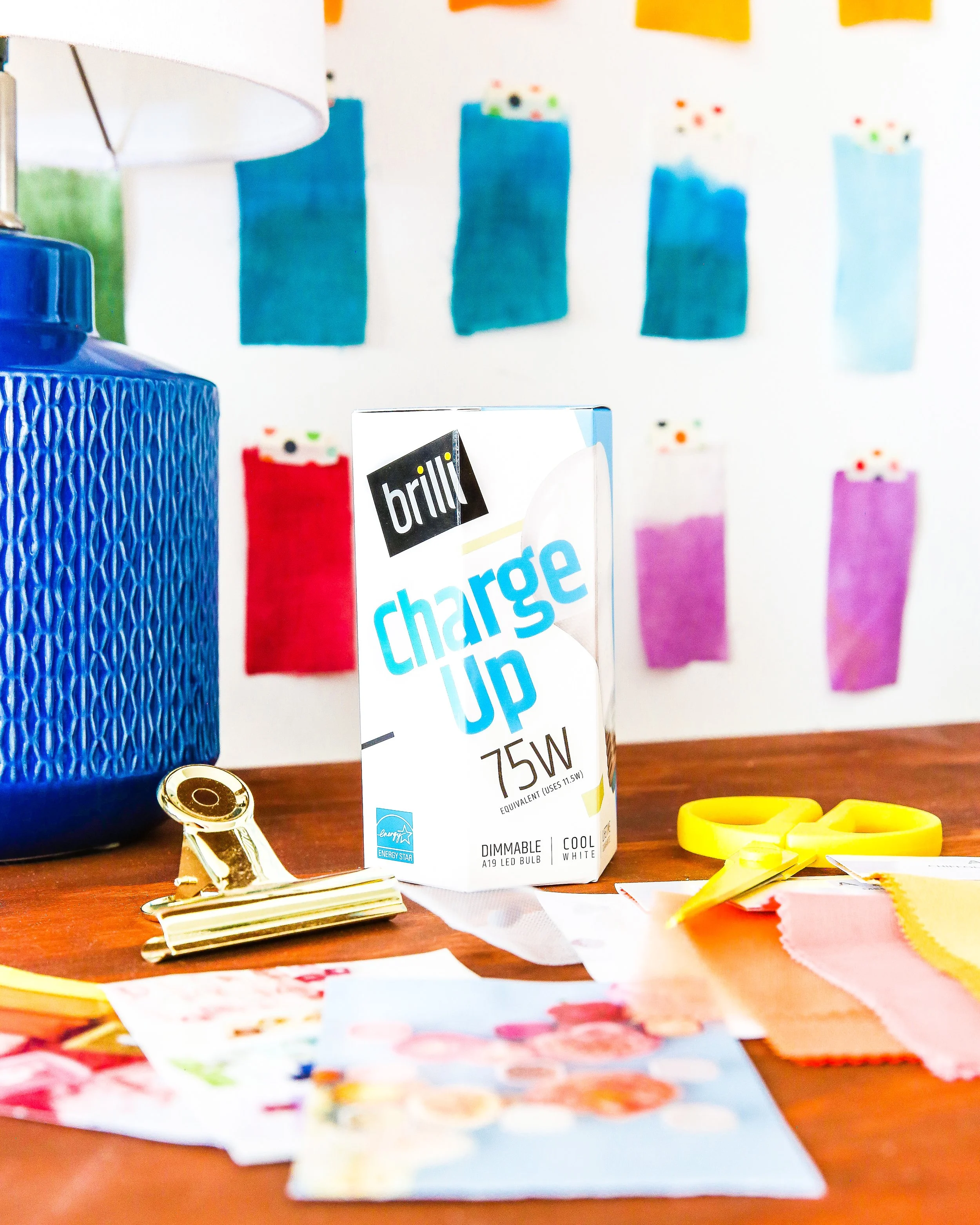
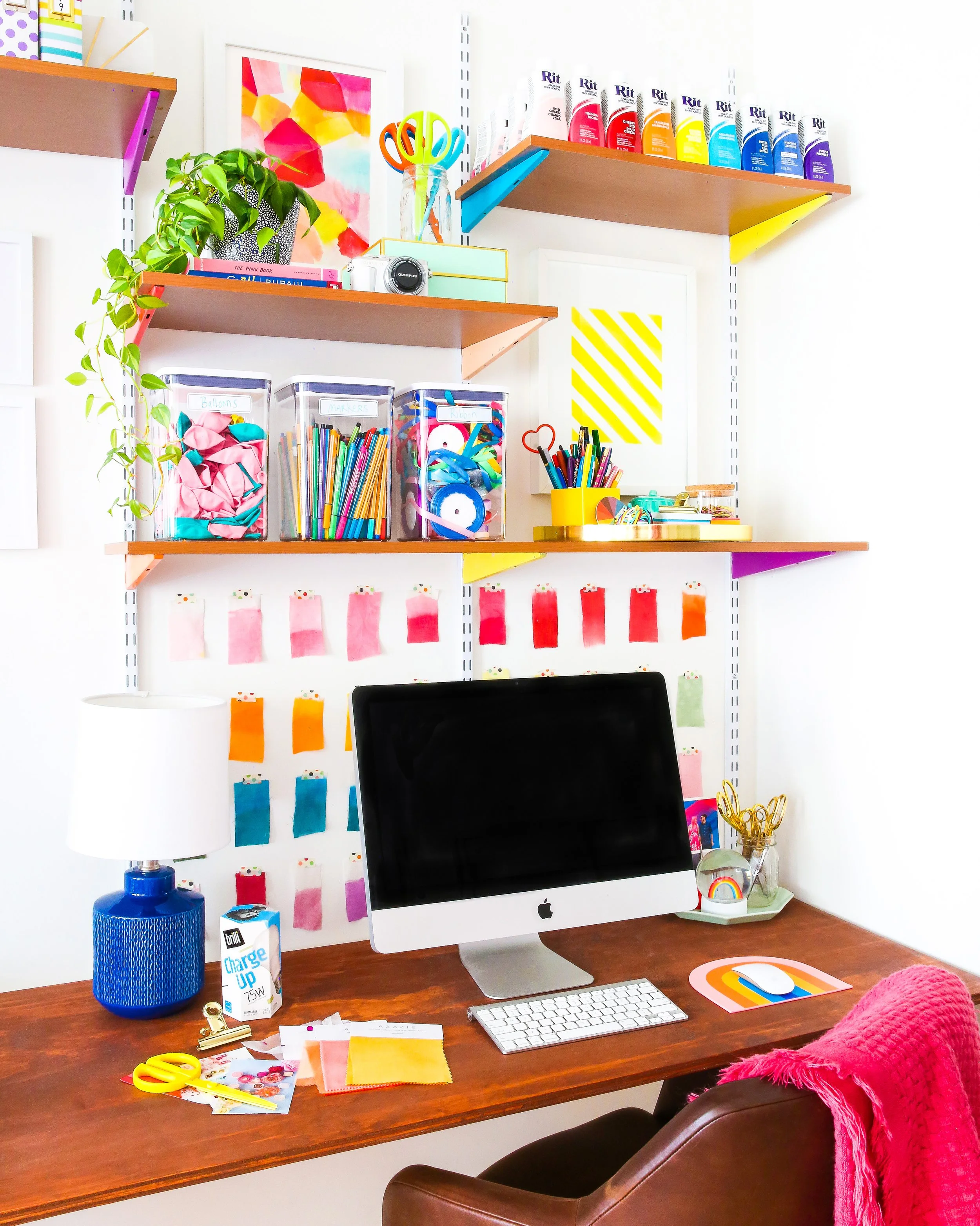
Making the ‘Invisible’ Visible: Through creative direction, I coached influencers to capture the quality of the light in their own homes and how it made them feel, using organic photography, relevant locations, and props to prove the aesthetic value alongside its health benefits.
Color Logic: Implemented a dual-system visual language: blue for Charge Up (daytime focus) and amber yellow for Wind Down (evening relaxation), which also helped to reinforce brand and product awareness.
Improving Marketing ROI through Image Rights: Negotiated long-term image licensing rights from influencers, so select images could be reused on e-commerce platforms, in marketing emails, and even on packaging; amplifying our return-on-spend.
Educational Storytelling: Translated complex circadian science into digestible Instagram carousels and Reels.
Tailored Content: Developed high-fidelity visual content for the Instagram feed while utilizing Stories for real-time Q&As and "behind-the-science" education

the results
retail & e-tail partnerships
3.45%
Engagement Rate
vs. 1% industry Benchmark
1.2M+
potential impressions
Strategic agency collaboration
More Case Studies of creative excellence
-
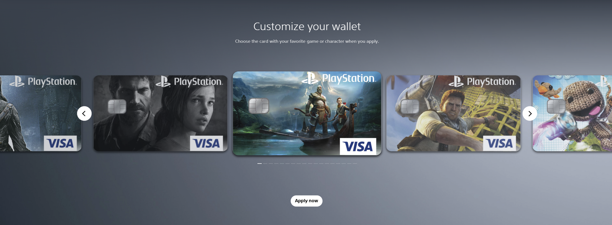
![Screenshots of PlayStation digital wallet customization interface showing several customized Visa game and character-themed credit cards, with navigation arrows and an 'Apply now' button.]()
Sony PlayStation & Visa Acquisition Campaign
-
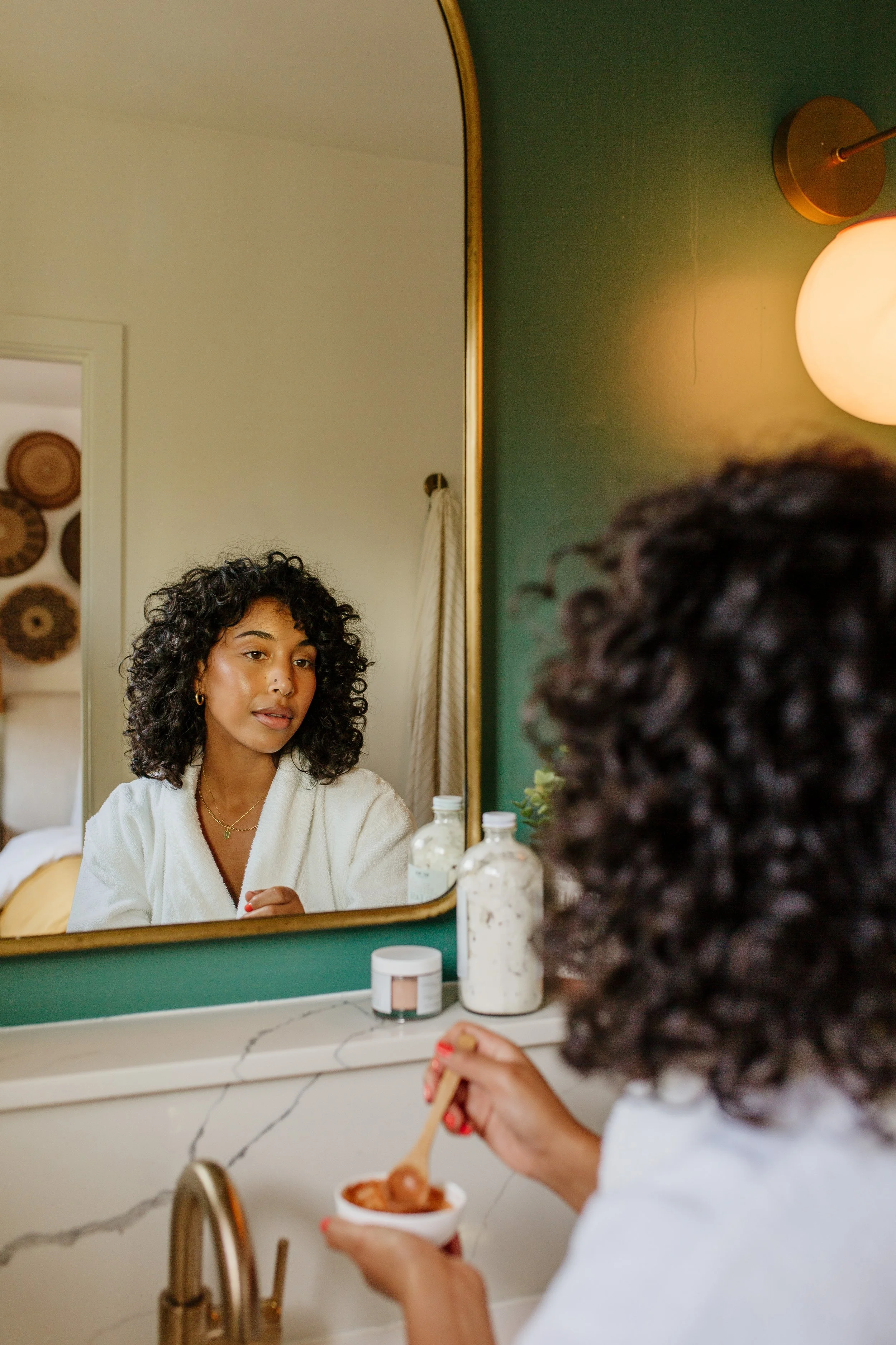
![A young woman with curly hair and gold earrings looking at herself in a mirror while holding a spoon and a bowl of ice cream in a bathroom with a marble countertop and a green wall.]()
Brilli Wellness Lighting Lifestyle Photography
-
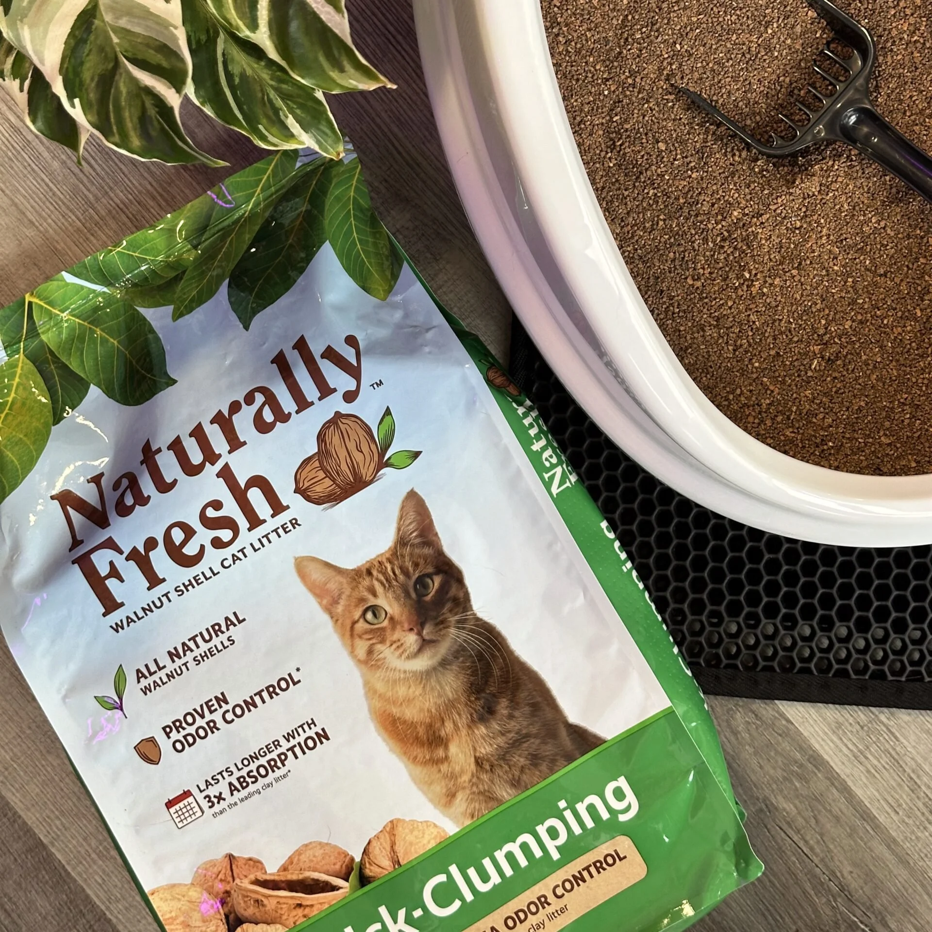
![Packet of natural cat litter with a picture of an orange tabby cat, green plants, and walnut shells on the packaging. Part of a white litter box and a black litter scoop are visible on a brown textured surface.]()
Naturally Fresh Digital Creative Strategy
-
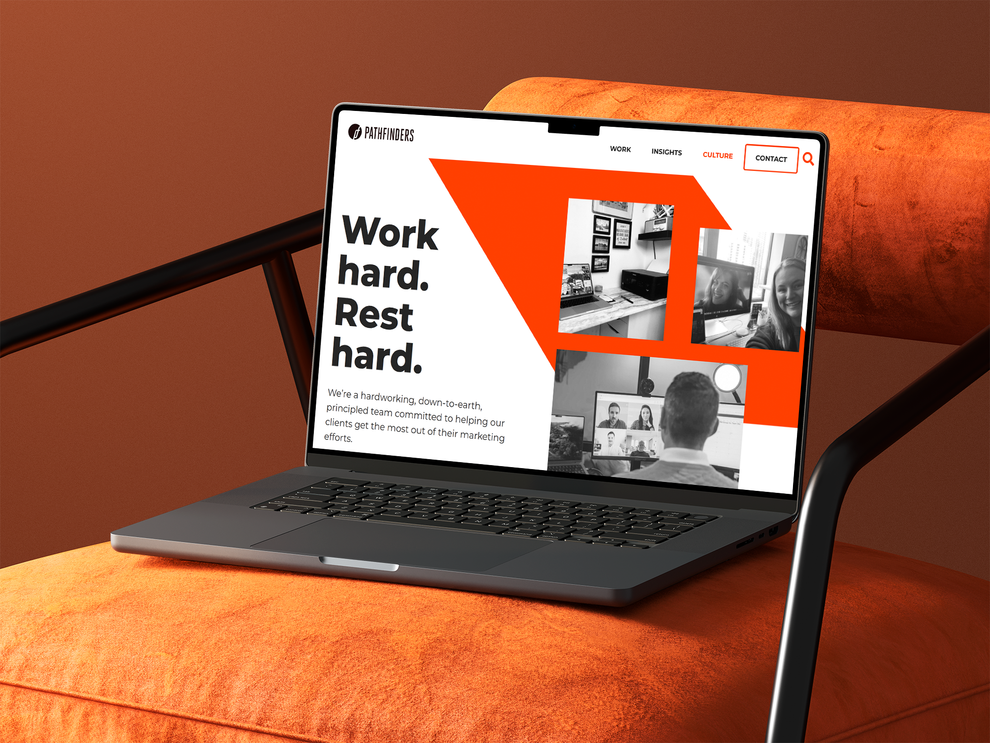
![A laptop on an orange surface displaying a webpage with the title 'Work hard. Rest hard.' and a menu bar with options including Work, Insights, Culture, Contact, and a search icon. The webpage features black and white images of people working on video calls and in office settings.]()
Pathfinders Advertising Digital Growth Strategy
-
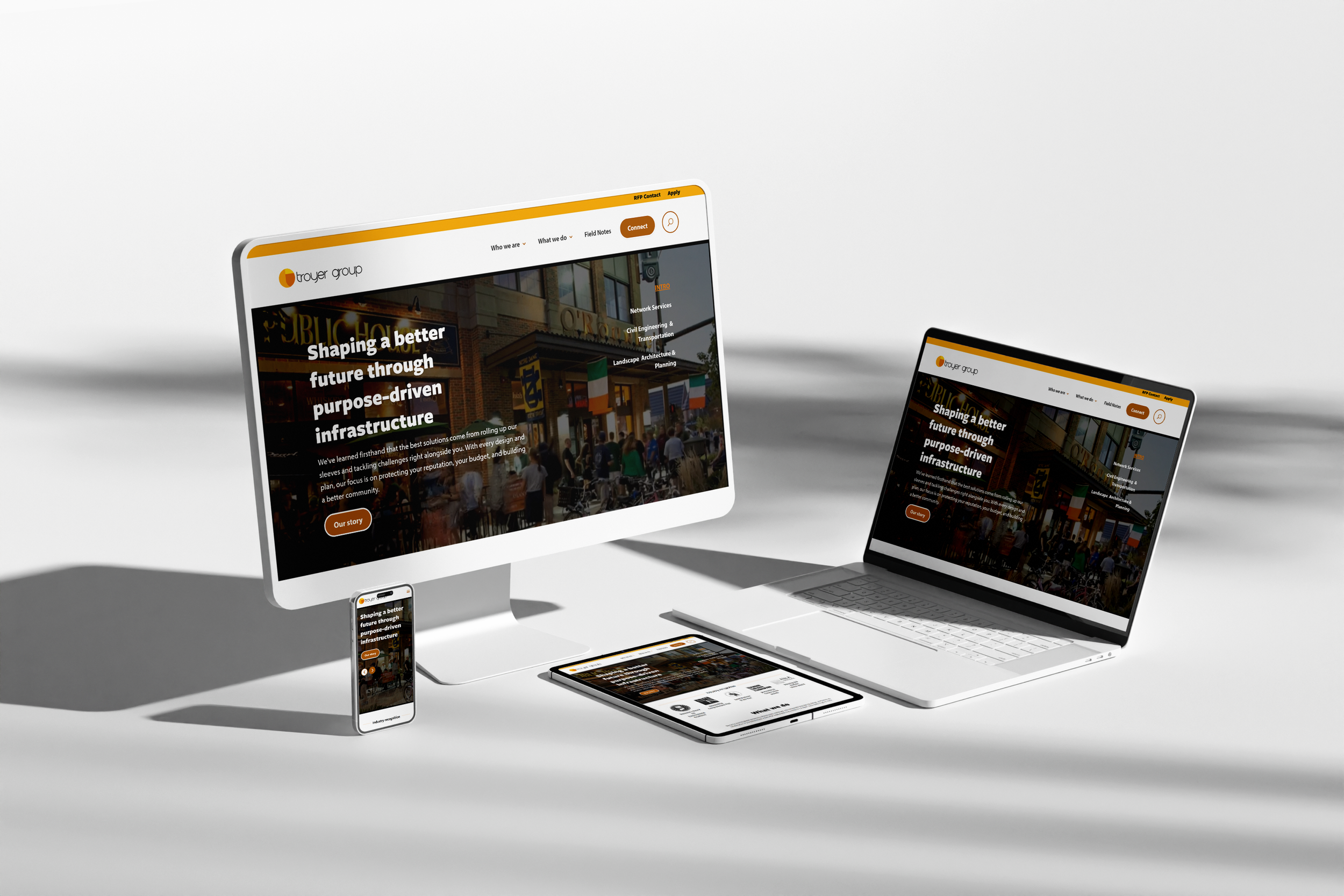
![Multiple electronic devices including a desktop monitor, laptop, smartphone, and tablet displaying the same website for Troyer Group, with a white background.]()
Troyer Group Architectural Firm Digital Strategy
-
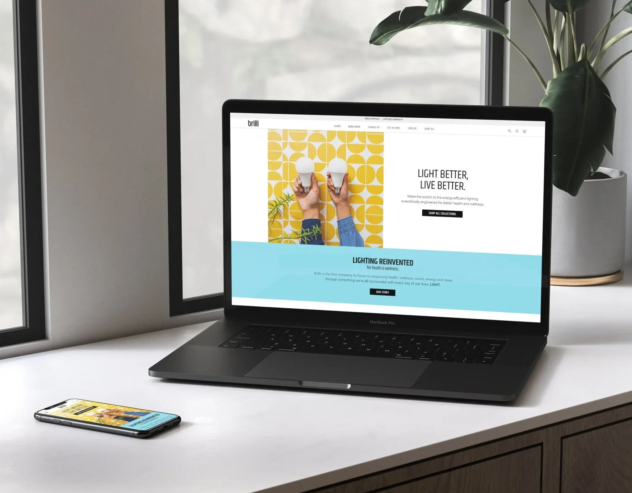
![A workspace with a MacBook Pro laptop displaying a website for Brilli, a smartphone showing the same website, and a potted plant with large green leaves on a windowsill in the background.]()
Brilli Wellness Lighting Brand & Digital Strategy
-
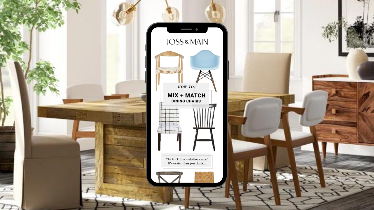
![Interior of a dining room with a wooden table, white and upholstered chairs, large windows, plants, and modern lighting fixtures. A smartphone in the foreground displays a furniture website with images of dining chairs and matching tips.]()
Joss & Main Email Strategy & Design
-
![Close-up of a smartphone showing the time 9:41, with signal, Wi-Fi, and battery icons on a gradient background.]()
Brilli Wellness Mobile App Product Management
-
![Close-up of a person using a mirror to touch up their lipstick with their finger, with the brand name 'brillii' visible on the mirror's base.]()
Brilli Wellness Lighting Video Direction
-
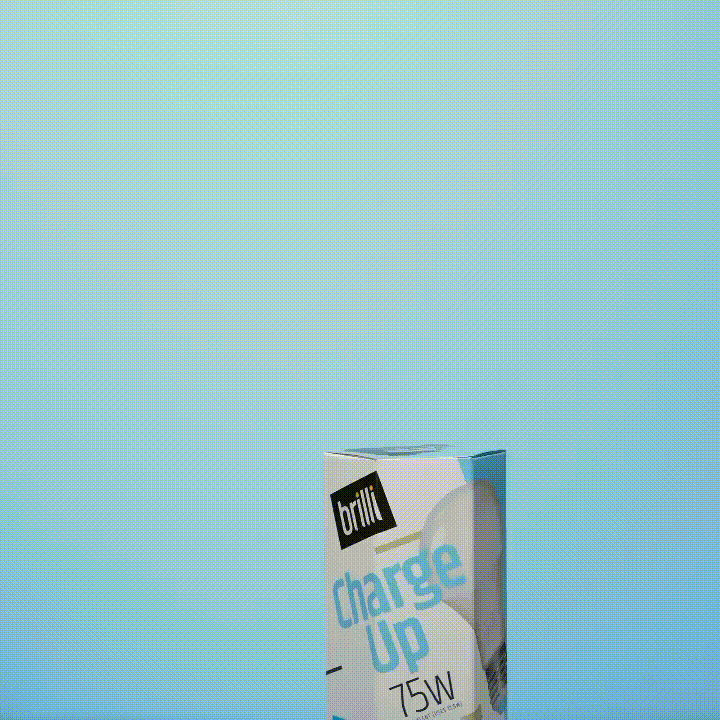
![A box of bright charge up 75W LED light bulb against a blue background.]()
Brilli Wellness Lighting Social Media Strategy & Influencer Management
-
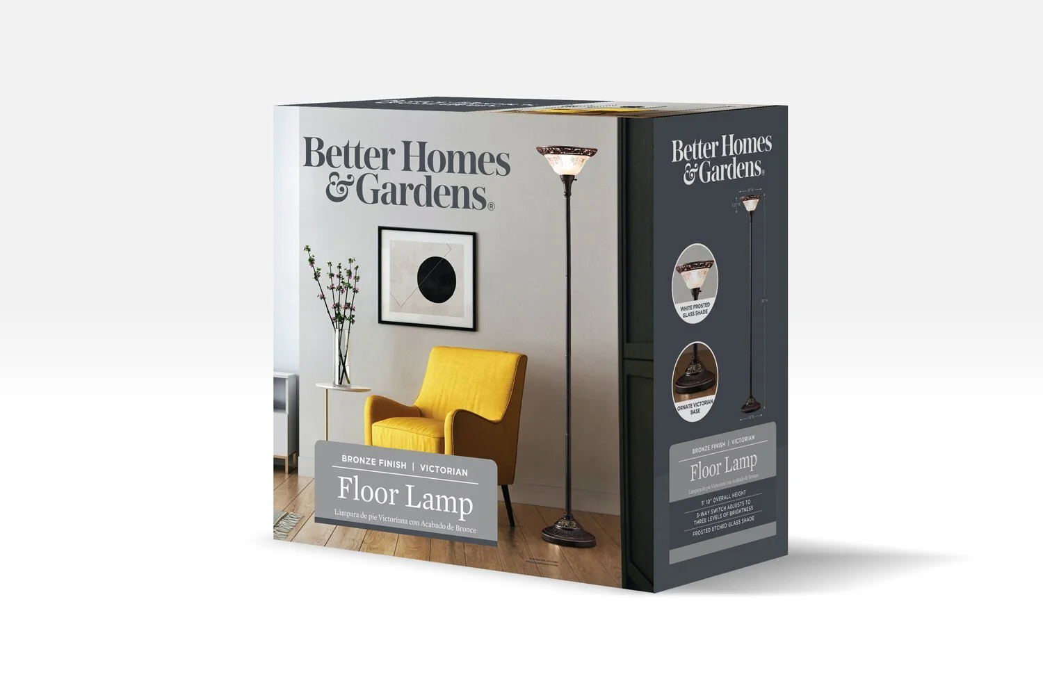
![Product packaging for a Victorian style floor lamp with a bronze finish, showing a living room scene with a yellow armchair, a small side table with a vase of flowers, artwork on the wall, and the lamp turned on.]()
Better Homes & Gardens (Walmart) Packaging Design Direction
-
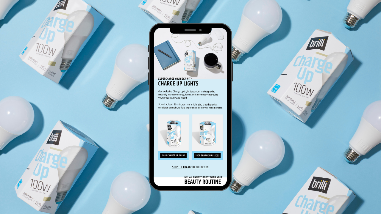
![Smartphone displaying a webpage about Brilli Charge Up LED light bulbs, surrounded by multiple boxed bulbs and unboxed LED bulbs on a blue background.]()
Brilli Wellness Email Strategy & Design
-
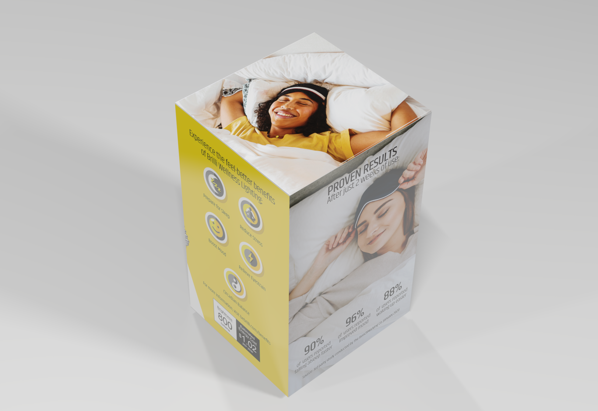
![A product packaging box featuring a smiling woman sleeping on a bed, with text promoting wellness benefits like better sleep, stress reduction, mood boost, and energy. The box also shows some statistics and pricing information.]()
Brilli Wellness Lighting Packaging & POP Design Direction
-
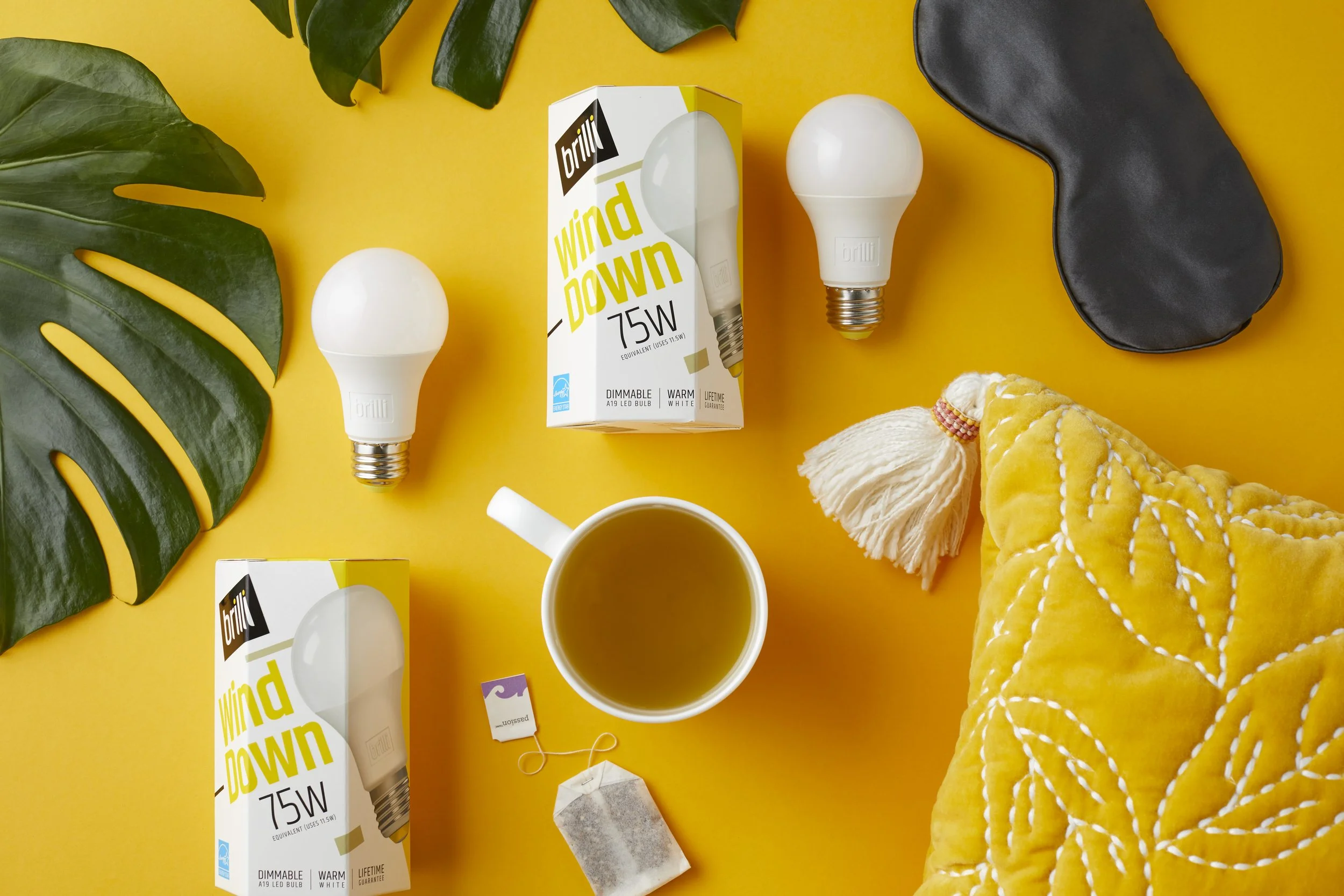
![Yellow background with two white LED bulbs, one in a box labeled 'brilli wind down 75W', a black eye mask, a white mug of tea, a yellow quilted blanket, green leaves, a tea bag, and a string.]()
Brilli Wellness Product Photography
-
![A yellow mid-century modern loveseat with wooden legs set against an orange and white background.]()
AllModern (Wayfair) Art & Animation Direction
-
![]()
Protective's ADA Insurance for Dentists Digital Transformation