Trend-Led creative Strategy that increased sales by over +1,000%
Brilli Wellness Circadian Lighting
Creative Director & Brand Strategist
To enhance brand and product awareness for the circadian lighting start-up Brilli Wellness during the peak of the COVID-19 pandemic, I spearheaded a strategic rebranding initiative. This effort aimed to align the brand’s aesthetic and core messaging with its mission, products, and target customer audiences, meeting the growing global demand for health and wellness products.
To enhance brand and product awareness for the circadian lighting start-up Brilli Wellness during the peak of the COVID-19 pandemic, I spearheaded a strategic rebranding initiative. This effort aimed to align the brand’s aesthetic and core messaging with its mission, products, and target audiences, to meet the growing global demand for health and wellness products, and to encompass a reimagining of the brand guidelines, website, imagery, packaging, messaging, and more.
The Approach
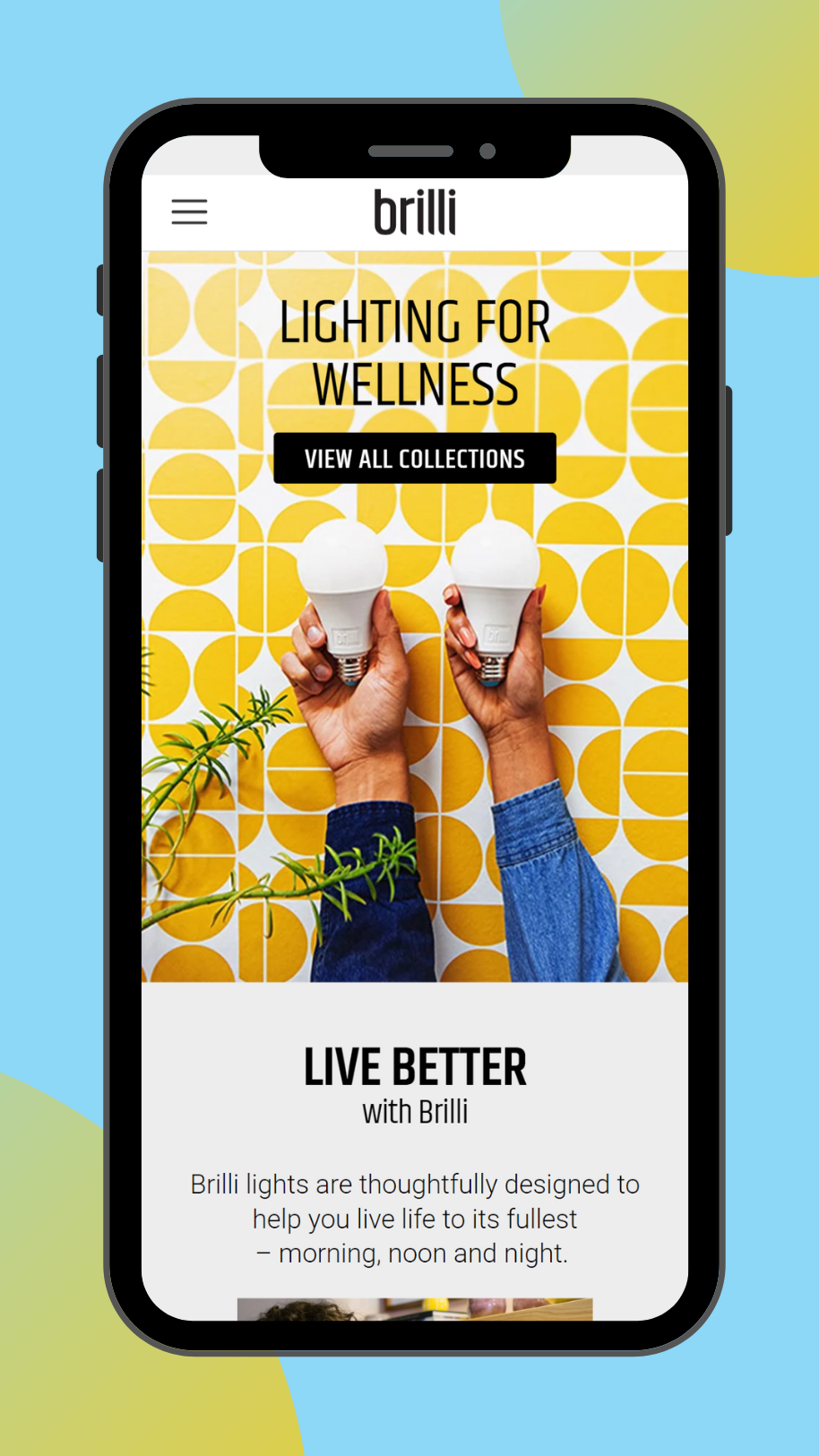
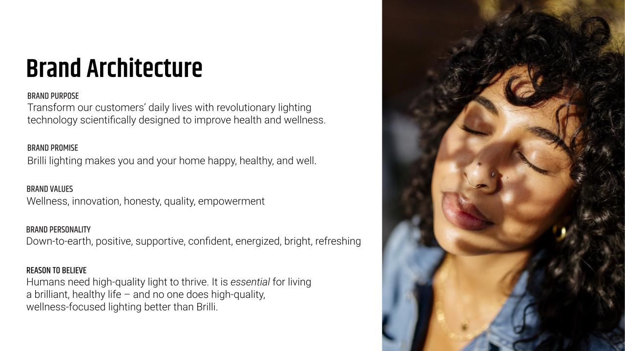
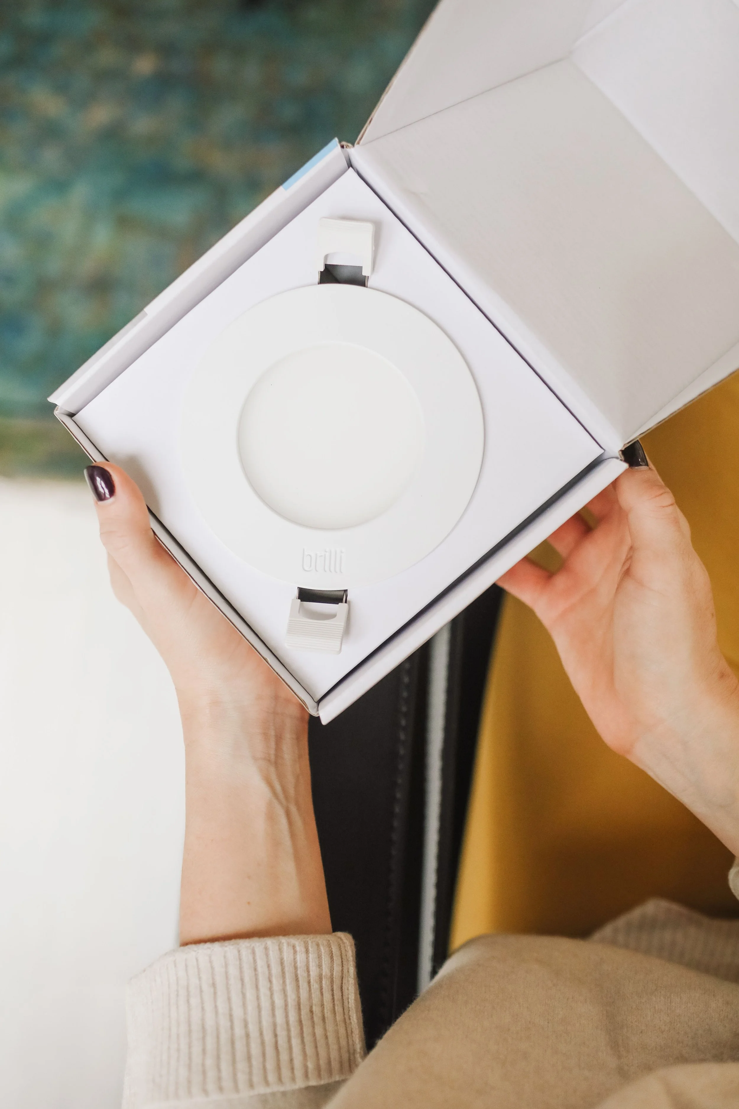
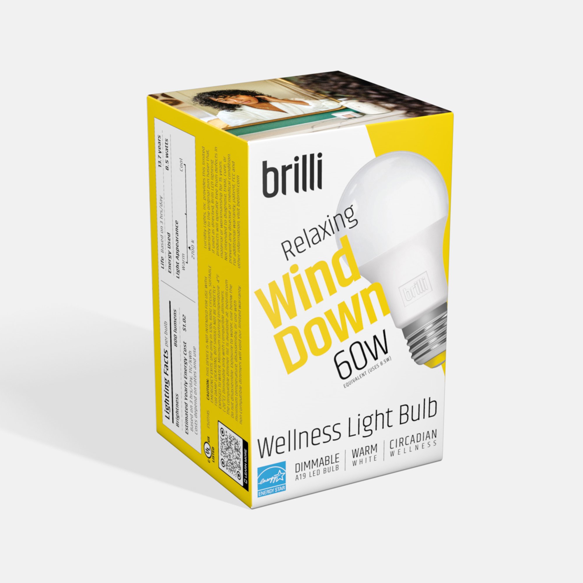
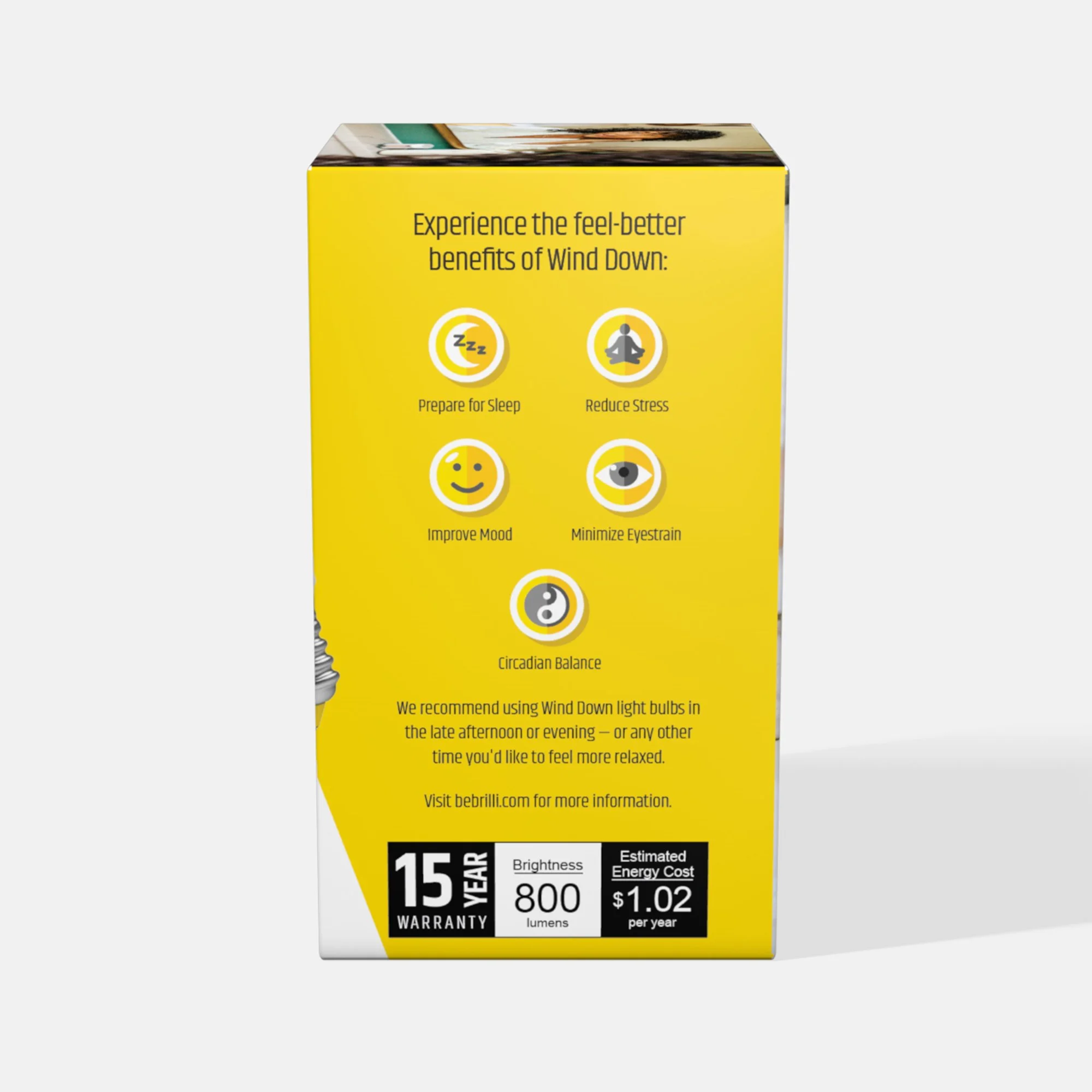
I led Brilli’s brand evolution, shifting from a bold (but also stark and bleak) Bauhaus style to a more contemporary, fresh look inspired by the "clean girl aesthetic.“ This new design direction included:
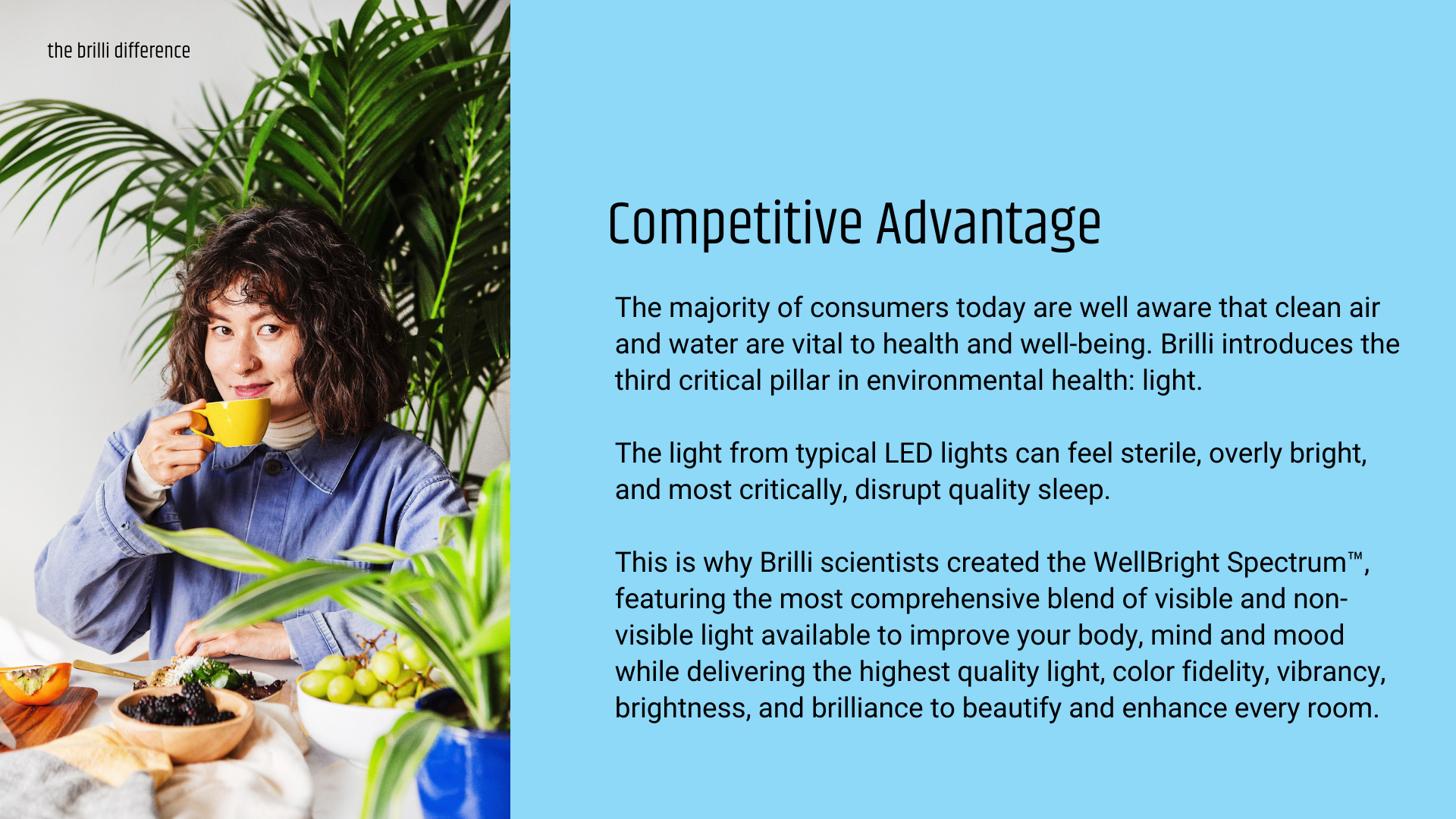
A brighter, lighter color palette paired with airy white space to create a clean look that appealed to wellness-minded Millennials, Brilli’s core customer demographic.
Increased usage of lowercase headings to soften the brand voice in visual messaging, in contrast to the previous all-caps approach.
Incorporation of angles that connect the circadian products with concepts of the sun, light, and shadow.
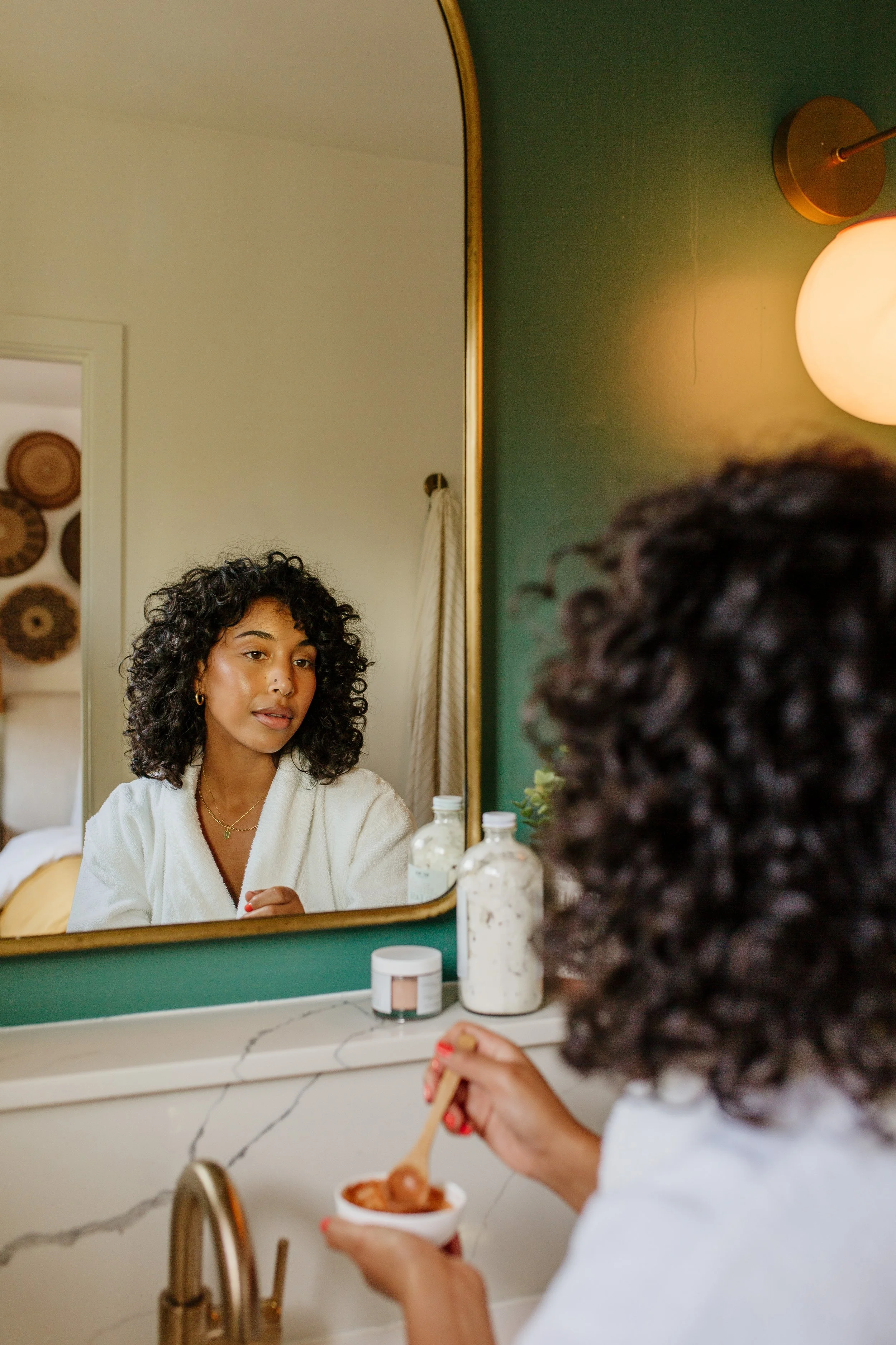
A transition from stock photography to cohesive, proprietary full-color lifestyle images captured in partnership with Dabito.
While my design decisions were primarily influenced by the positive impact of Brilli’s products on health and wellness, I also drew on insights from brand surveys and demographics—including age, gender, geographic location, and typical lifestyles —alongside current market trends and design movements.
Key Considerations
We maintained the modern lowercase logo, primary font, and diagonal angle accents for continuity, ensuring that the updated color palette and font sizing met or exceeded ADA web accessibility standards.
The results
Nationwide partnerships with Target and Home Depot
+1000% increase in product sales YoY (2020 vs. 2019)
+21% higher click-through rates in A/B testing across digital campaigns
Earned coverage in People Magazine

the results
retail & e-tail partnerships
earned media coverage
21%+
Higher click-through rates in display ad a/b testing
1000%+
increase in product sales yoy
(2019 vs. 2020)
More Case Studies of creative excellence
-
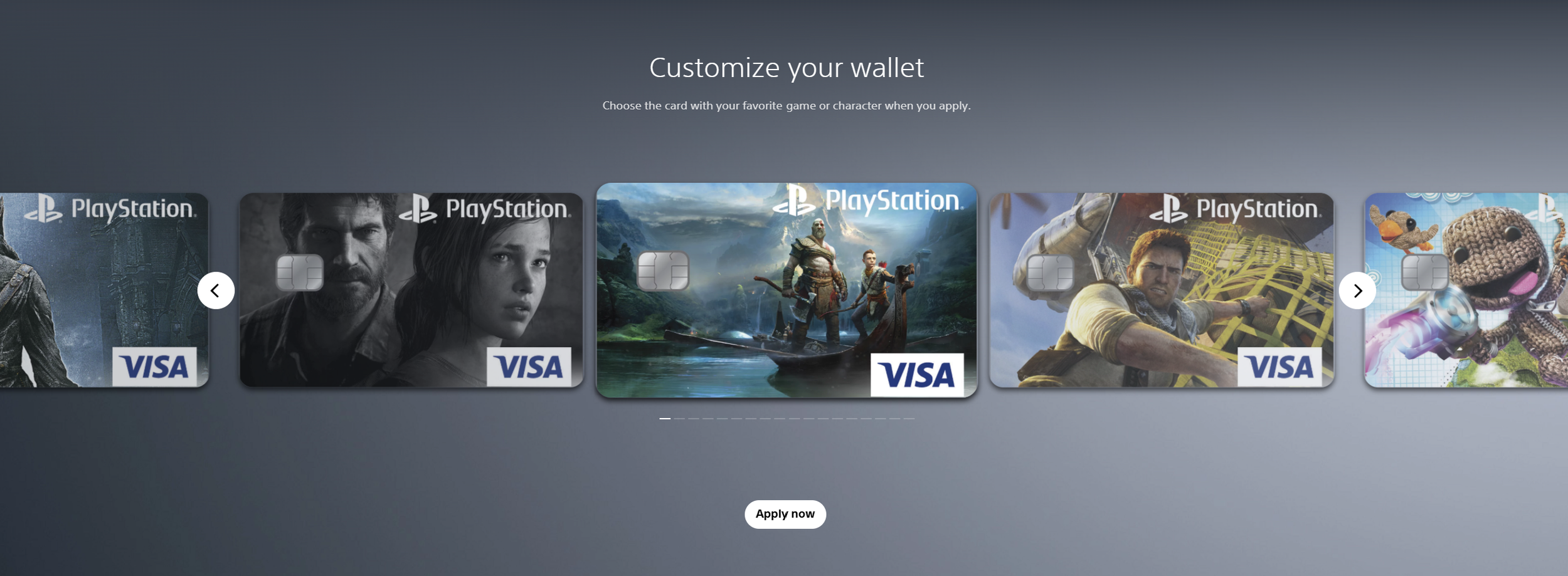
![Screenshots of PlayStation digital wallet customization interface showing several customized Visa game and character-themed credit cards, with navigation arrows and an 'Apply now' button.]()
Sony PlayStation & Visa Acquisition Campaign
-
![A young woman with curly hair and gold earrings looking at herself in a mirror while holding a spoon and a bowl of ice cream in a bathroom with a marble countertop and a green wall.]()
Brilli Wellness Lighting Lifestyle Photography
-
![Packet of natural cat litter with a picture of an orange tabby cat, green plants, and walnut shells on the packaging. Part of a white litter box and a black litter scoop are visible on a brown textured surface.]()
Naturally Fresh Digital Creative Strategy
-
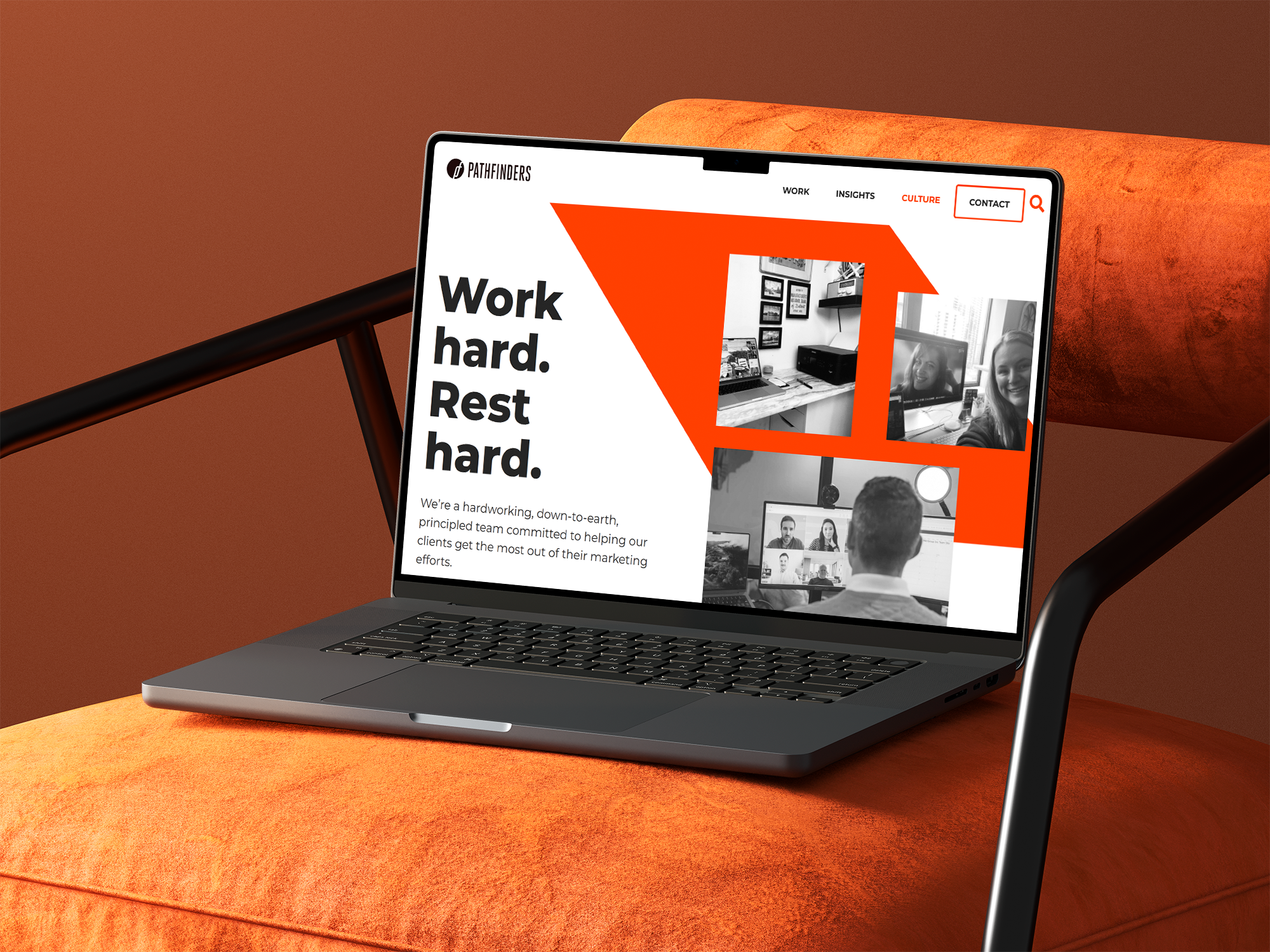
![A laptop on an orange surface displaying a webpage with the title 'Work hard. Rest hard.' and a menu bar with options including Work, Insights, Culture, Contact, and a search icon. The webpage features black and white images of people working on video calls and in office settings.]()
Pathfinders Advertising Digital Growth Strategy
-
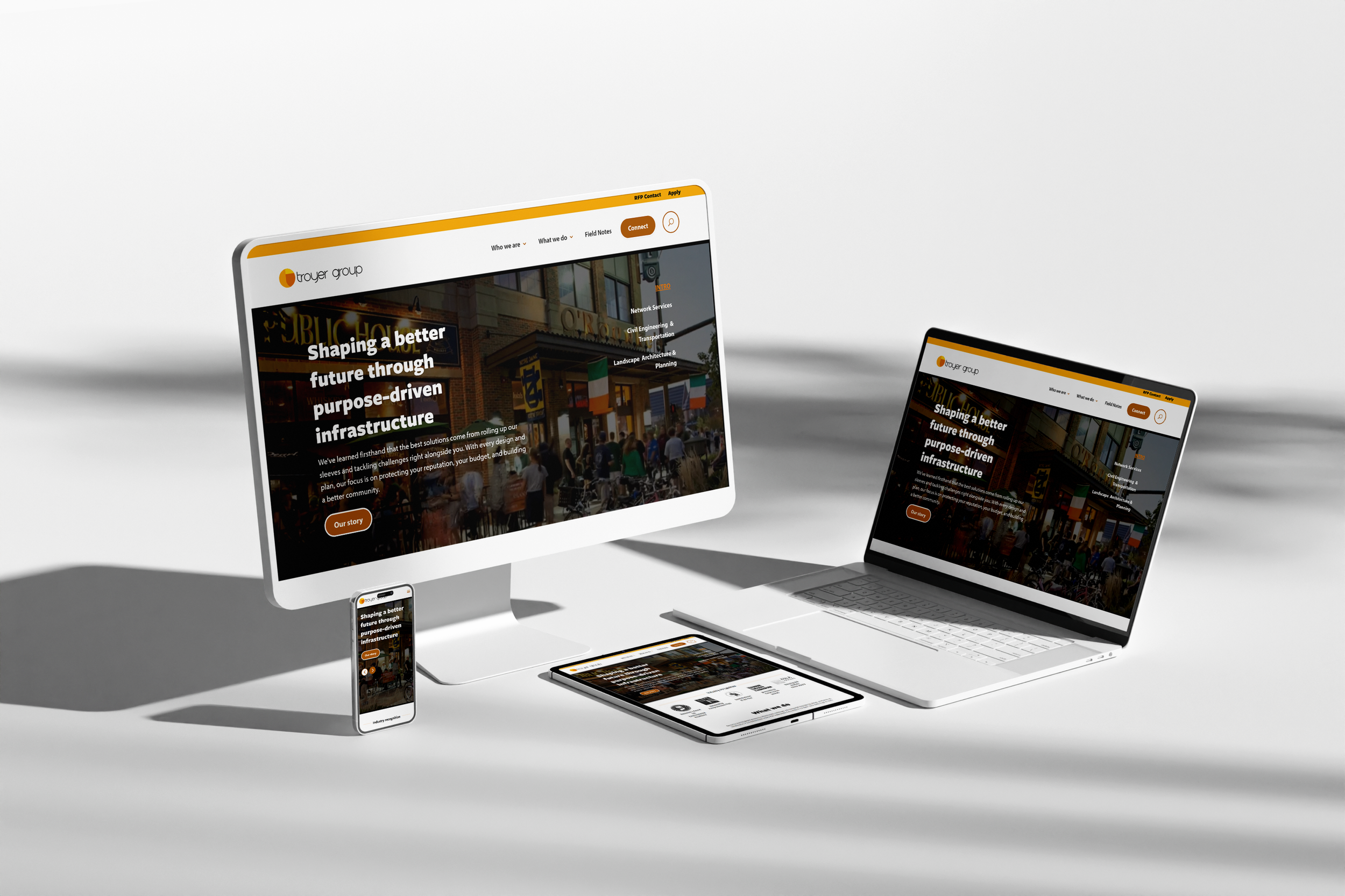
![Multiple electronic devices including a desktop monitor, laptop, smartphone, and tablet displaying the same website for Troyer Group, with a white background.]()
Troyer Group Architectural Firm Digital Strategy
-
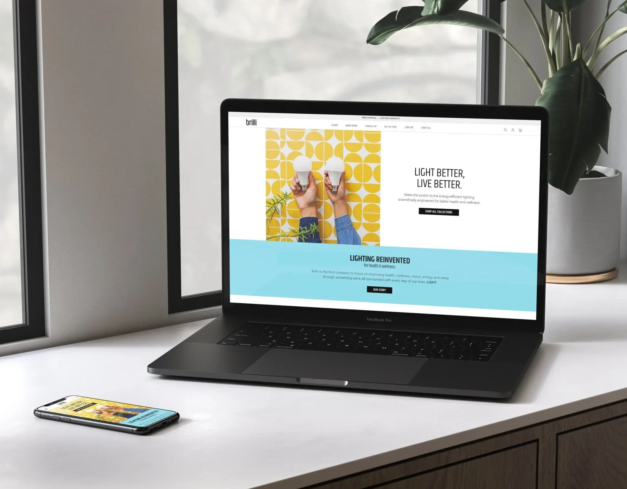
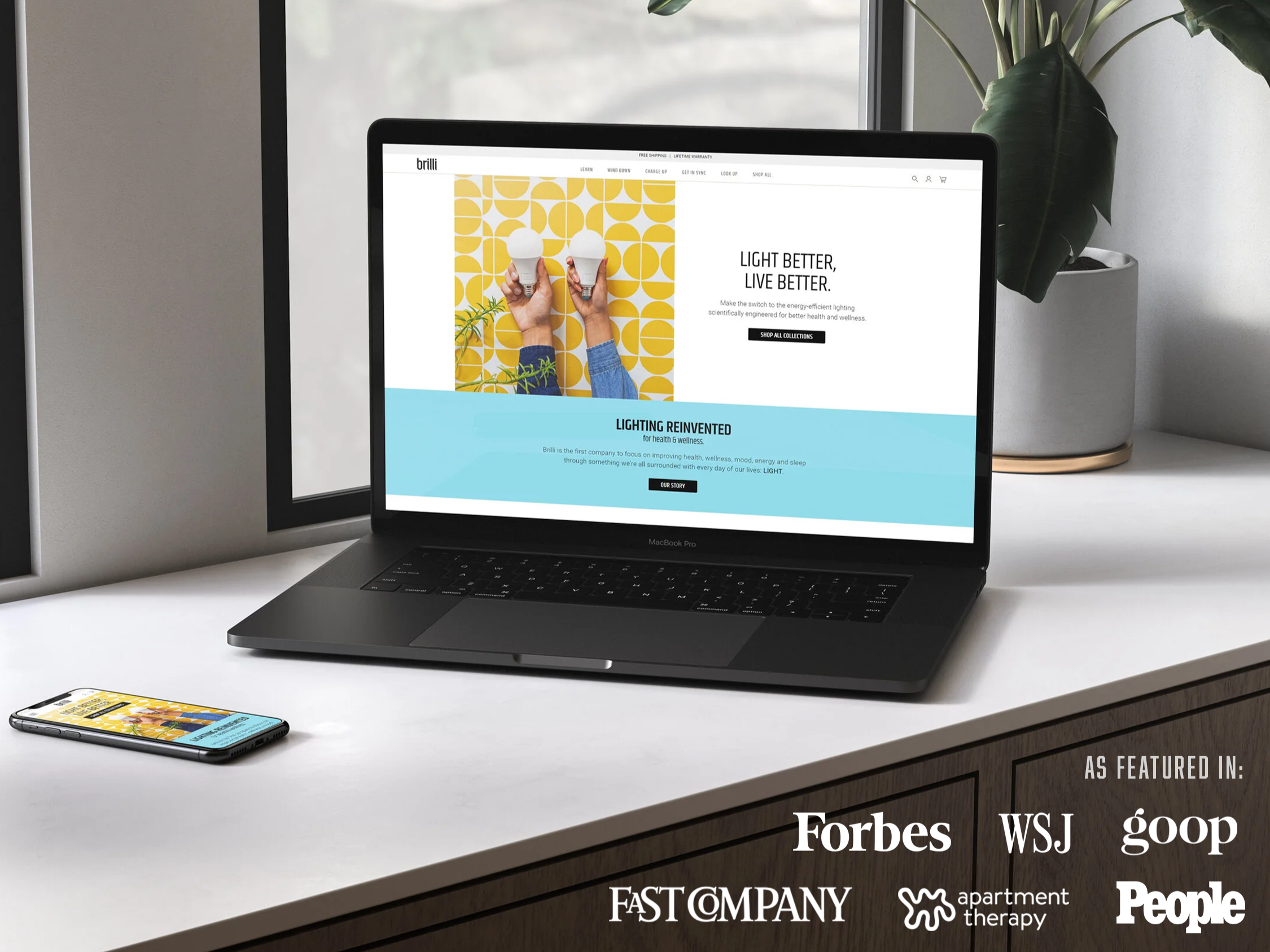
![A workspace with a MacBook Pro laptop displaying a website for Brilli, a smartphone showing the same website, and a potted plant with large green leaves on a windowsill in the background.]()
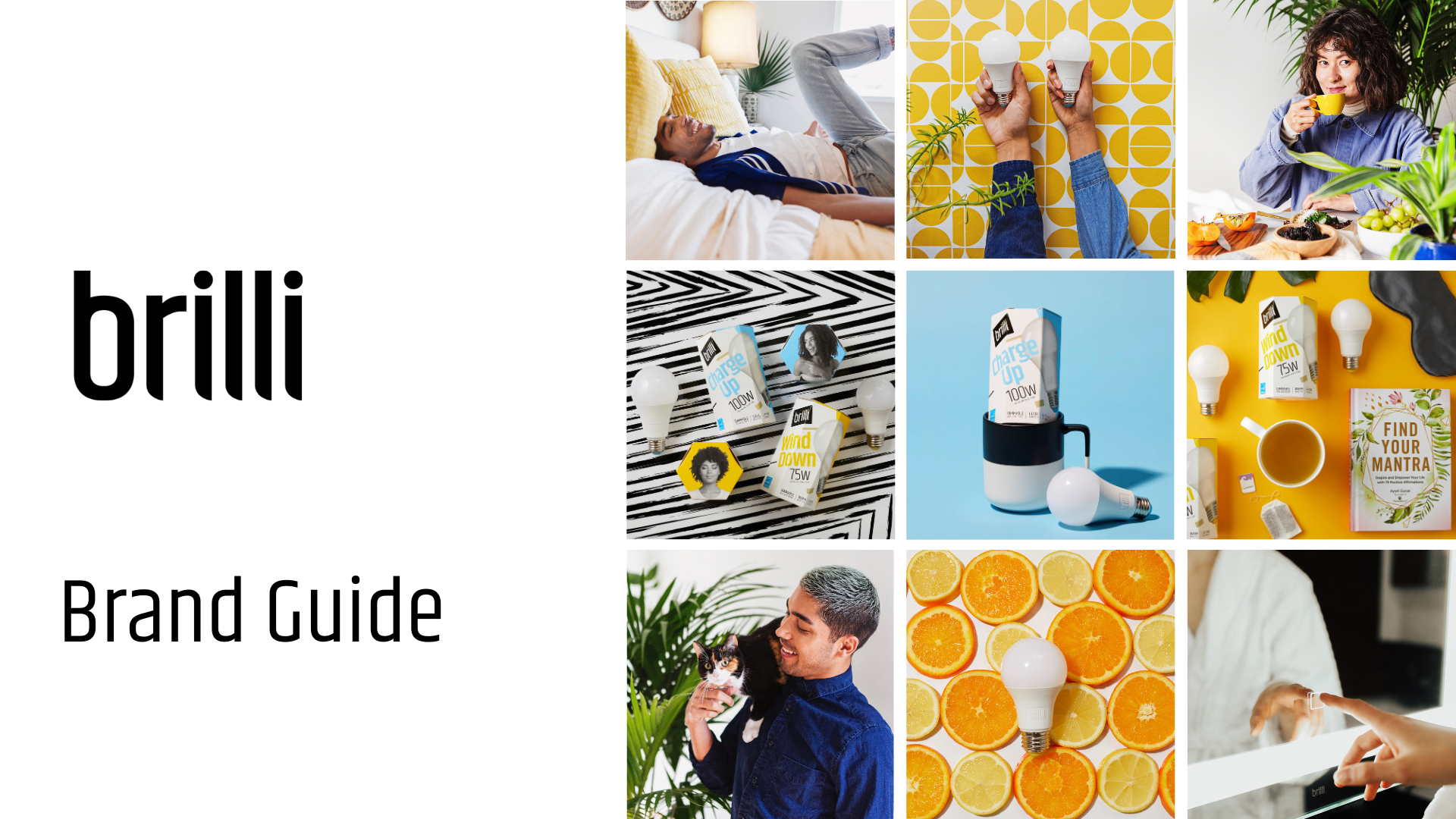
Brilli Wellness Lighting Brand & Digital Strategy
-
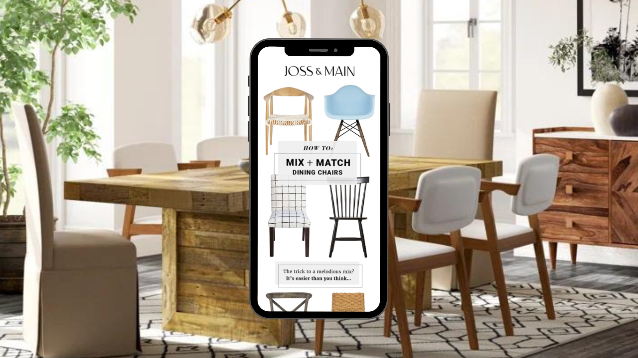
![Interior of a dining room with a wooden table, white and upholstered chairs, large windows, plants, and modern lighting fixtures. A smartphone in the foreground displays a furniture website with images of dining chairs and matching tips.]()
Joss & Main Email Strategy & Design
-
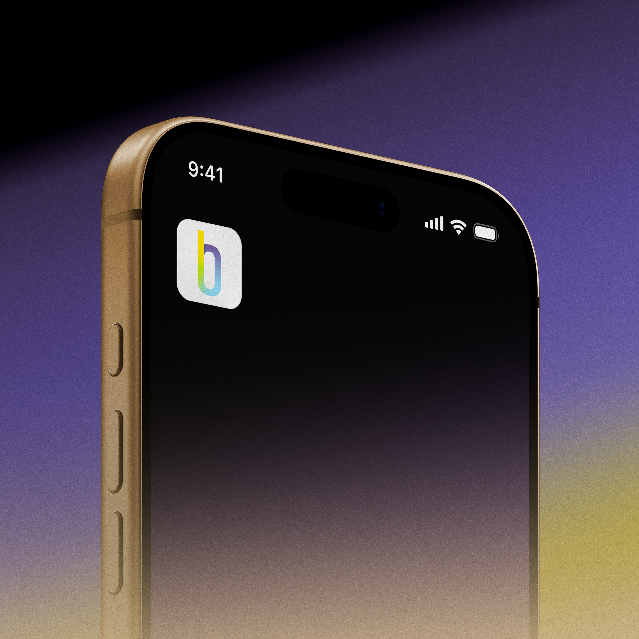
![Close-up of a smartphone showing the time 9:41, with signal, Wi-Fi, and battery icons on a gradient background.]()
Brilli Wellness Mobile App Product Management
-
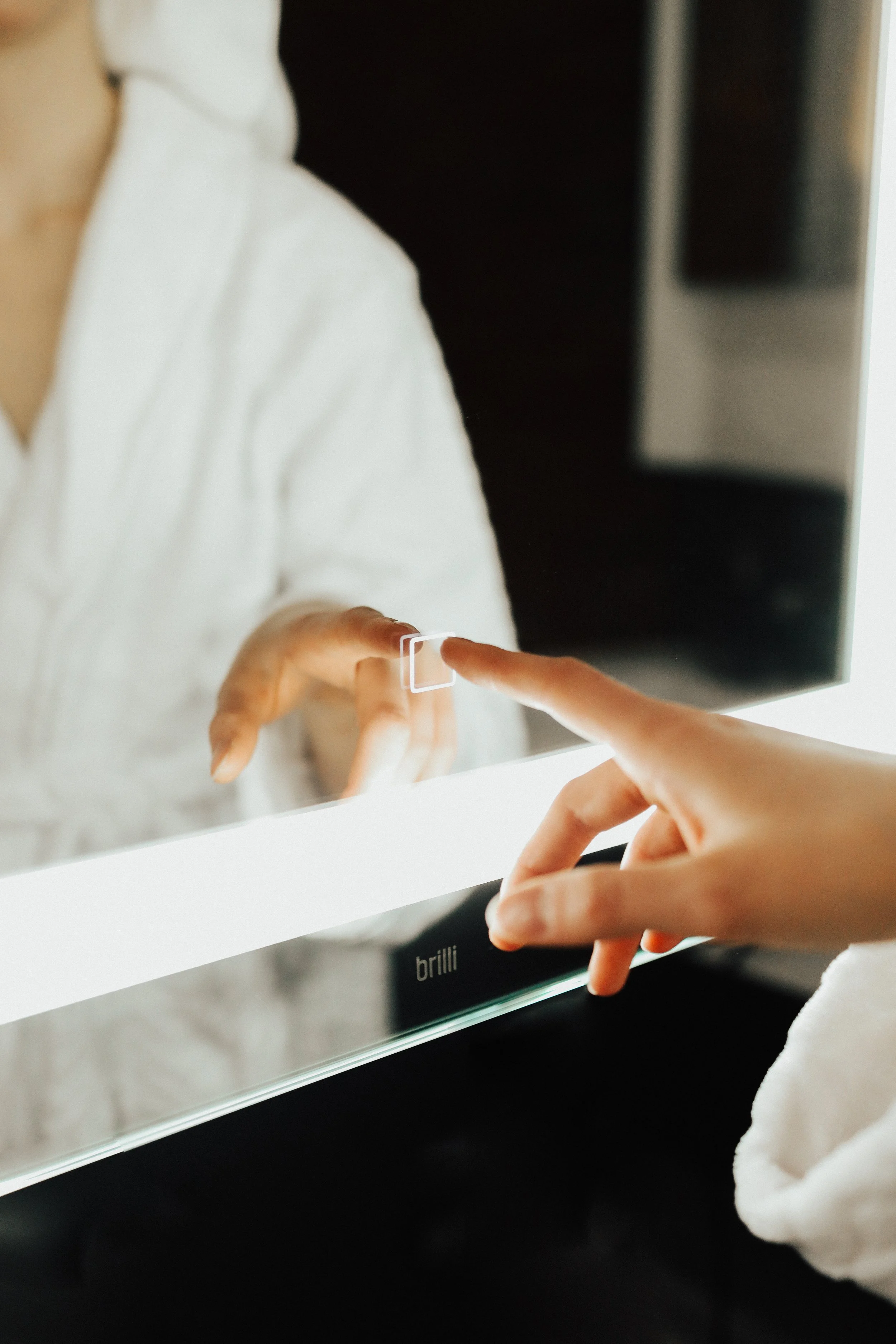
![Close-up of a person using a mirror to touch up their lipstick with their finger, with the brand name 'brillii' visible on the mirror's base.]()
Brilli Wellness Lighting Video Direction
-
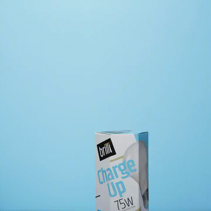
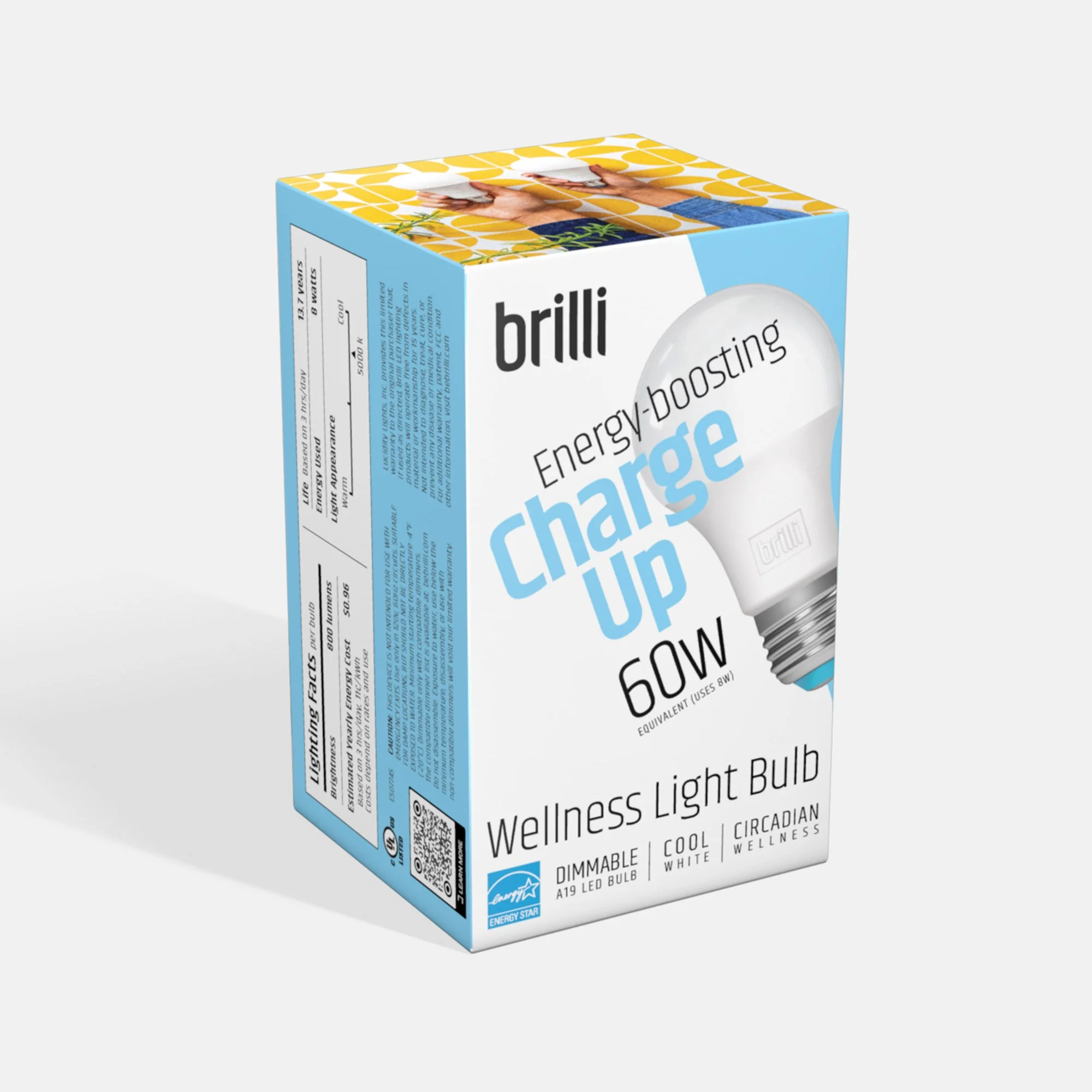
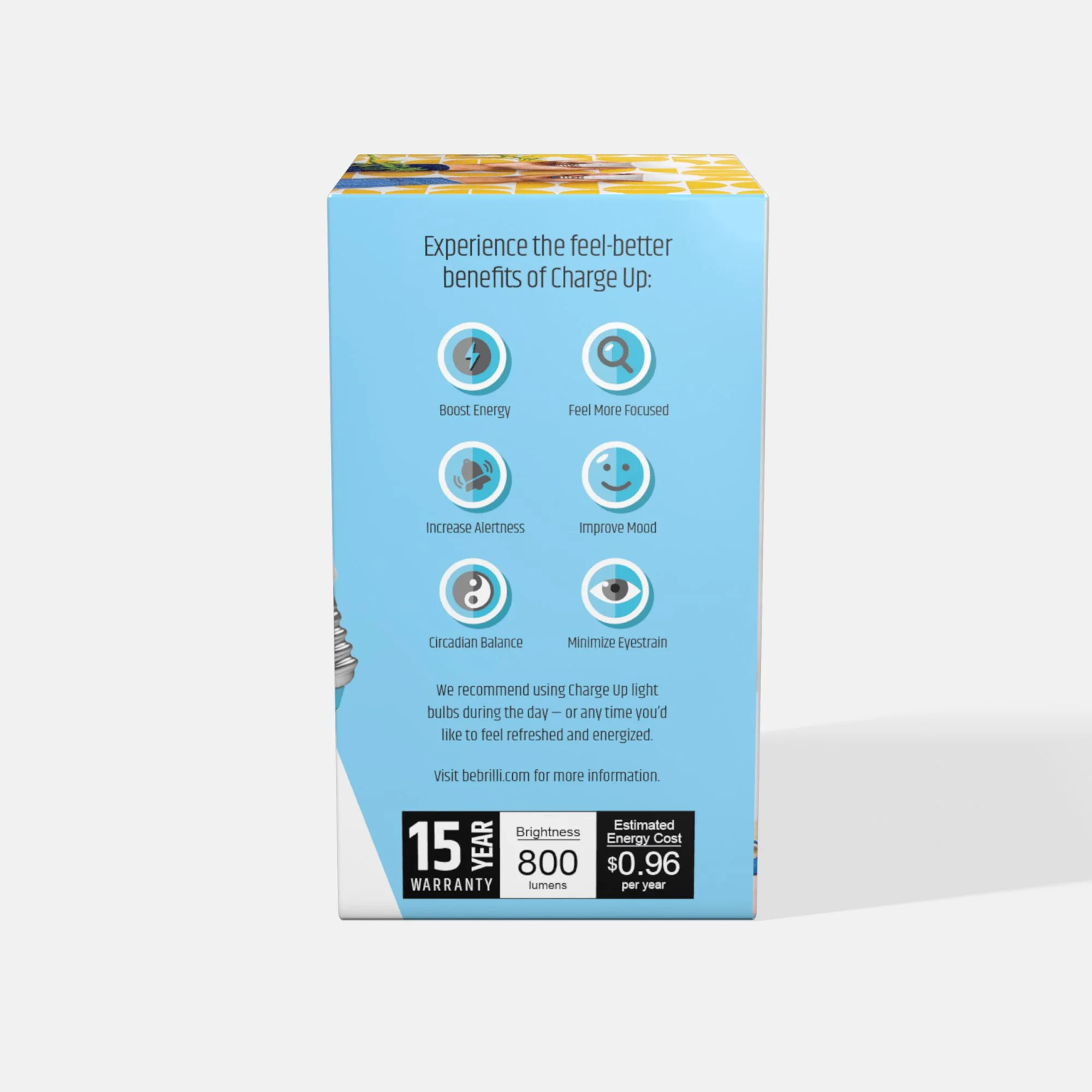
![A box of bright charge up 75W LED light bulb against a blue background.]()
Brilli Wellness Lighting Social Media Strategy & Influencer Management
-
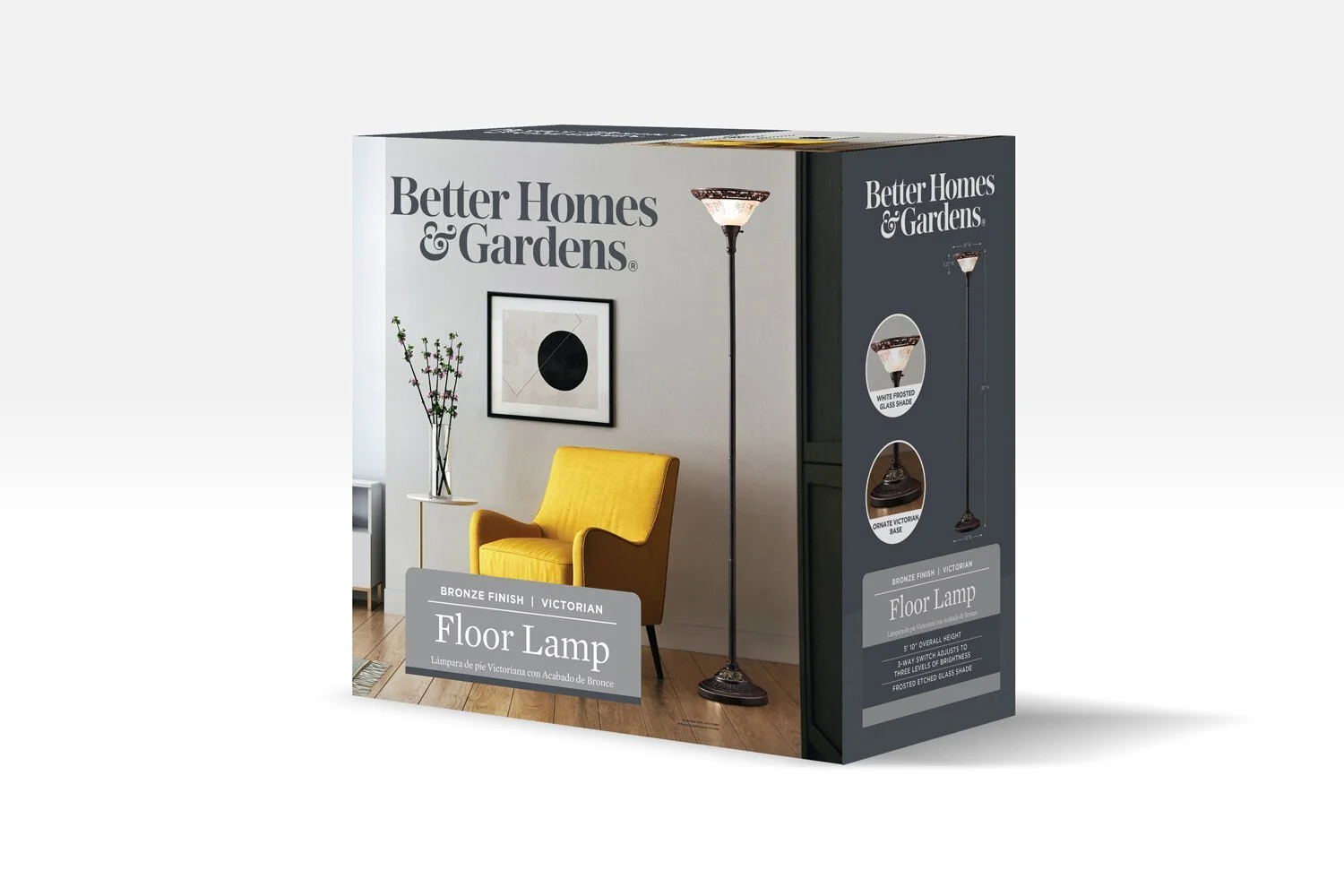
![Product packaging for a Victorian style floor lamp with a bronze finish, showing a living room scene with a yellow armchair, a small side table with a vase of flowers, artwork on the wall, and the lamp turned on.]()
Better Homes & Gardens (Walmart) Packaging Design Direction
-
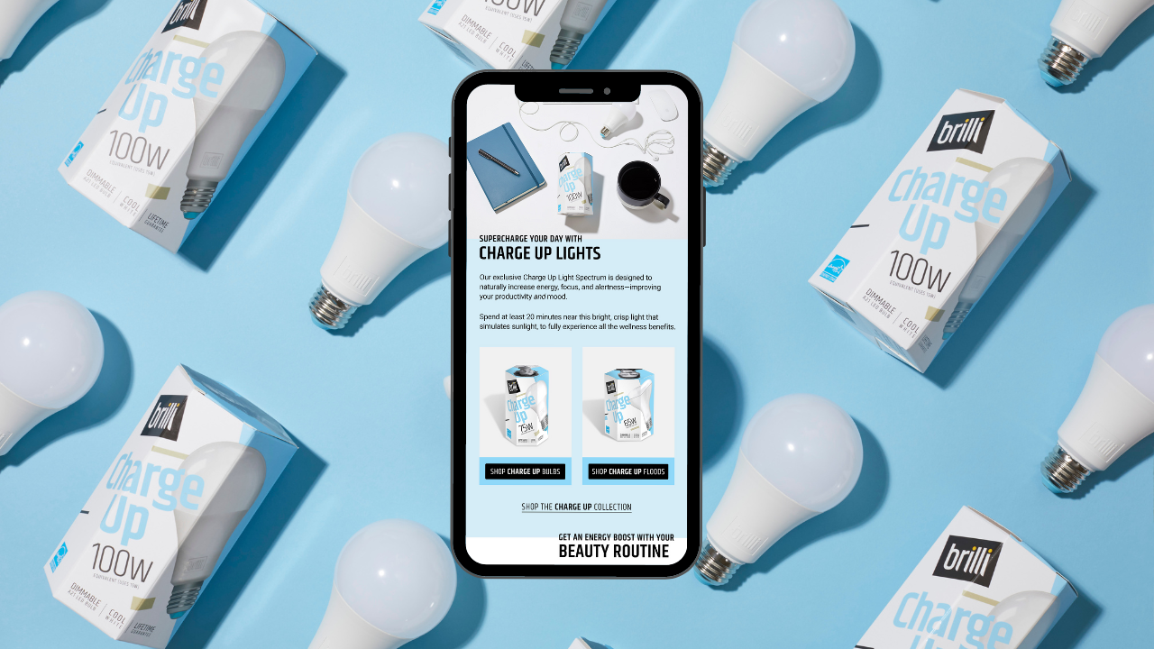
![Smartphone displaying a webpage about Brilli Charge Up LED light bulbs, surrounded by multiple boxed bulbs and unboxed LED bulbs on a blue background.]()
Brilli Wellness Email Strategy & Design
-
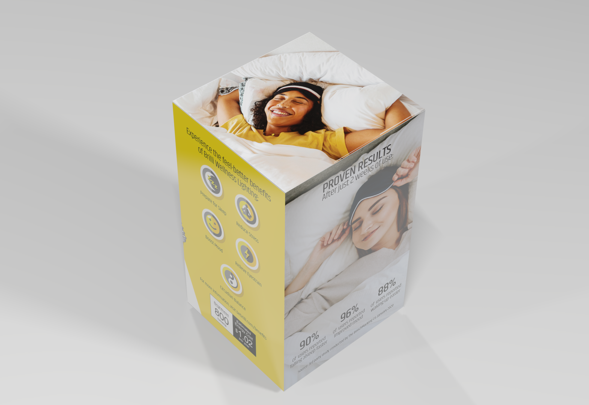
![A product packaging box featuring a smiling woman sleeping on a bed, with text promoting wellness benefits like better sleep, stress reduction, mood boost, and energy. The box also shows some statistics and pricing information.]()
Brilli Wellness Lighting Packaging & POP Design Direction
-
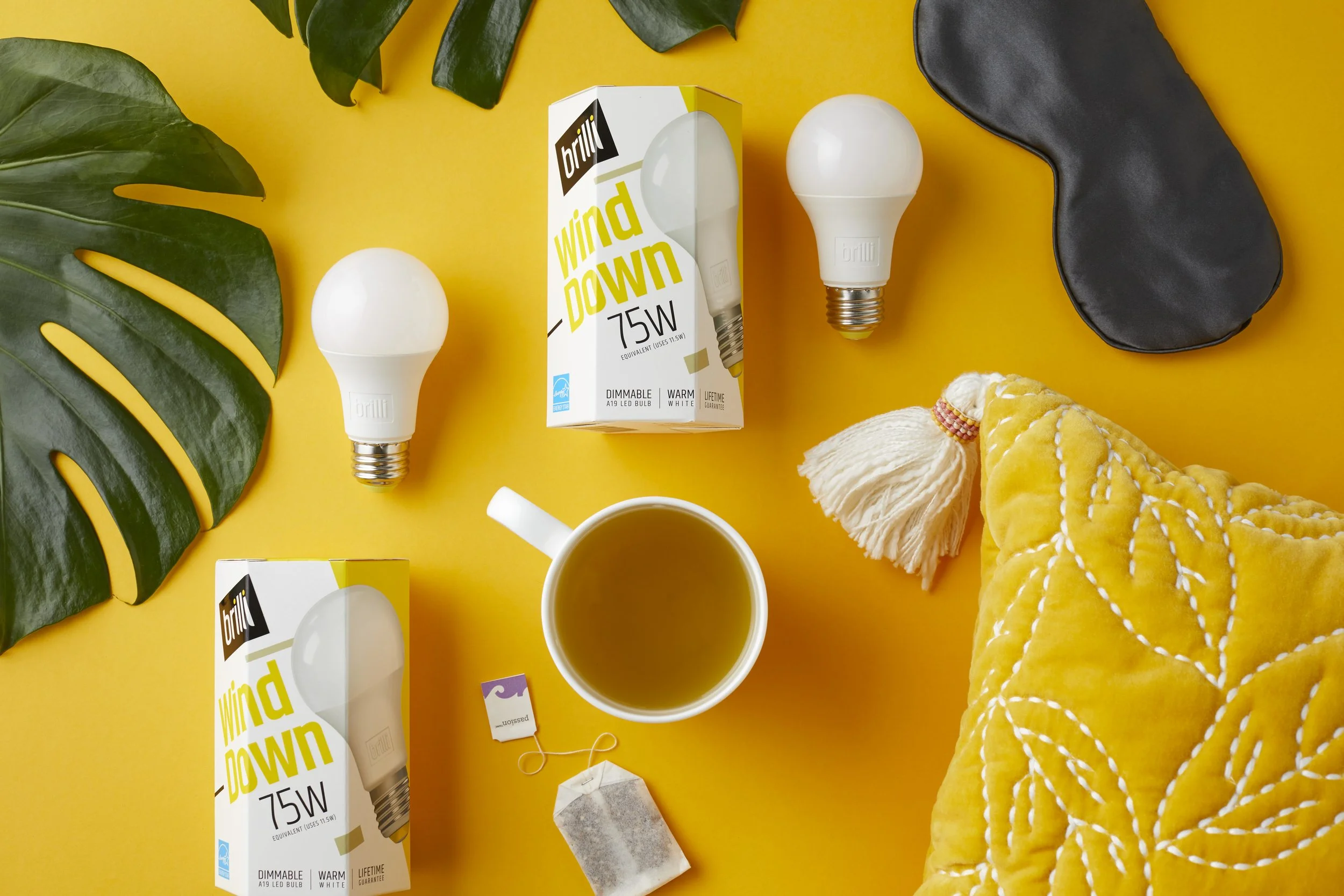
![Yellow background with two white LED bulbs, one in a box labeled 'brilli wind down 75W', a black eye mask, a white mug of tea, a yellow quilted blanket, green leaves, a tea bag, and a string.]()
Brilli Wellness Product Photography
-
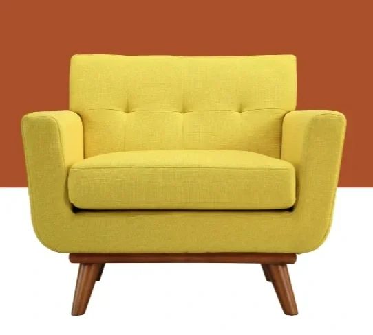
![A yellow mid-century modern loveseat with wooden legs set against an orange and white background.]()
AllModern (Wayfair) Art & Animation Direction
-
![]()
Protective's ADA Insurance for Dentists Digital Transformation