branding a category disruptor, securing nationwide rollout
Brilli Bright Clean
Creative Director, Brand Strategist, Digital Strategist
Brand strategy is more than just a new logo or name; it is an intentional pivot to articulate a brand's purpose, define its utility, and secure optimal equity in the consumer’s mind.
Following Lucidity Lights’ 2020 acquisition of Ellumi and its revolutionary antimicrobial technology, I led the strategic rebranding and relaunch of the product line as a sub-brand for Brilli Wellness Lighting, now known as Brilli Bright Clean. This extensive omnichannel initiative aimed to bring category-defining clinical innovation to the everyday consumer, and even included a first-of-its-kind mobile application.
Brilli bright clean
The challenge
When Lucidity Lights acquired Ellumi in the height of the pandemic in 2020, the brand was struggling to market what was an excellent and necessary product for the home: energy-efficient LED lighting that eliminated viruses, bacteria, mold, and even odors, safely.
Ellumi’s brand, when we acquired it, was associated with low brand awareness, few repeat customers, negative reviews, and unclear messaging about the core features, benefits, and effectiveness of the products.
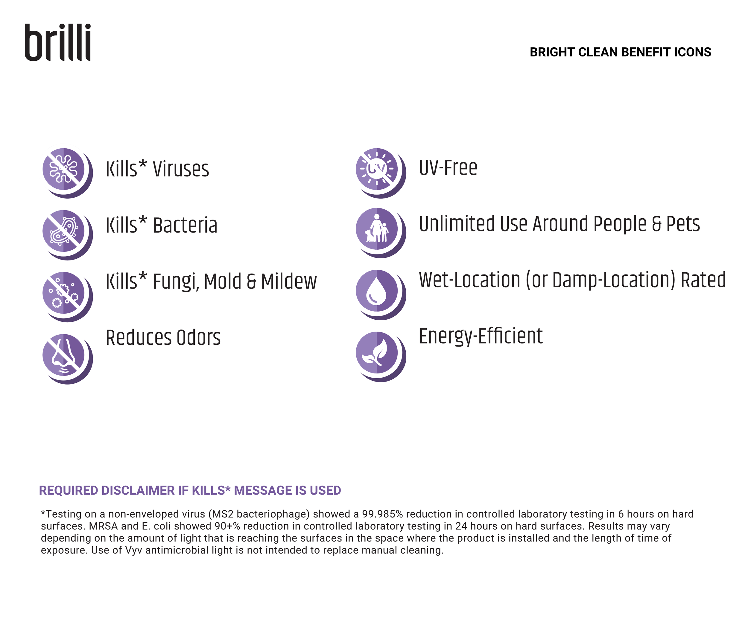
That said, Ellumi’s technology was an excellent addition to the Brilli family of products; it just needed a new brand strategy that emphasized the product’s safe, UV-free technology and proven efficacy, especially since it killed viruses and bacteria. However, as a highly regulated product, we also had to navigate strict compliance guidelines around messaging and imagery.
The goals of the rebranding initiative were to:
Re-launch the brand, transforming equity and driving awareness by clearly conveying the benefits of the safe, energy-efficient LED antimicrobial lighting technology.
Attract and secure partnerships with major retail partners like Target, Home Depot, and Lowe’s.
Drive sales, not only in the D2C space, but also in B2B markets.
original Brand Identity
brand identity Following redesign
The strategic Approach
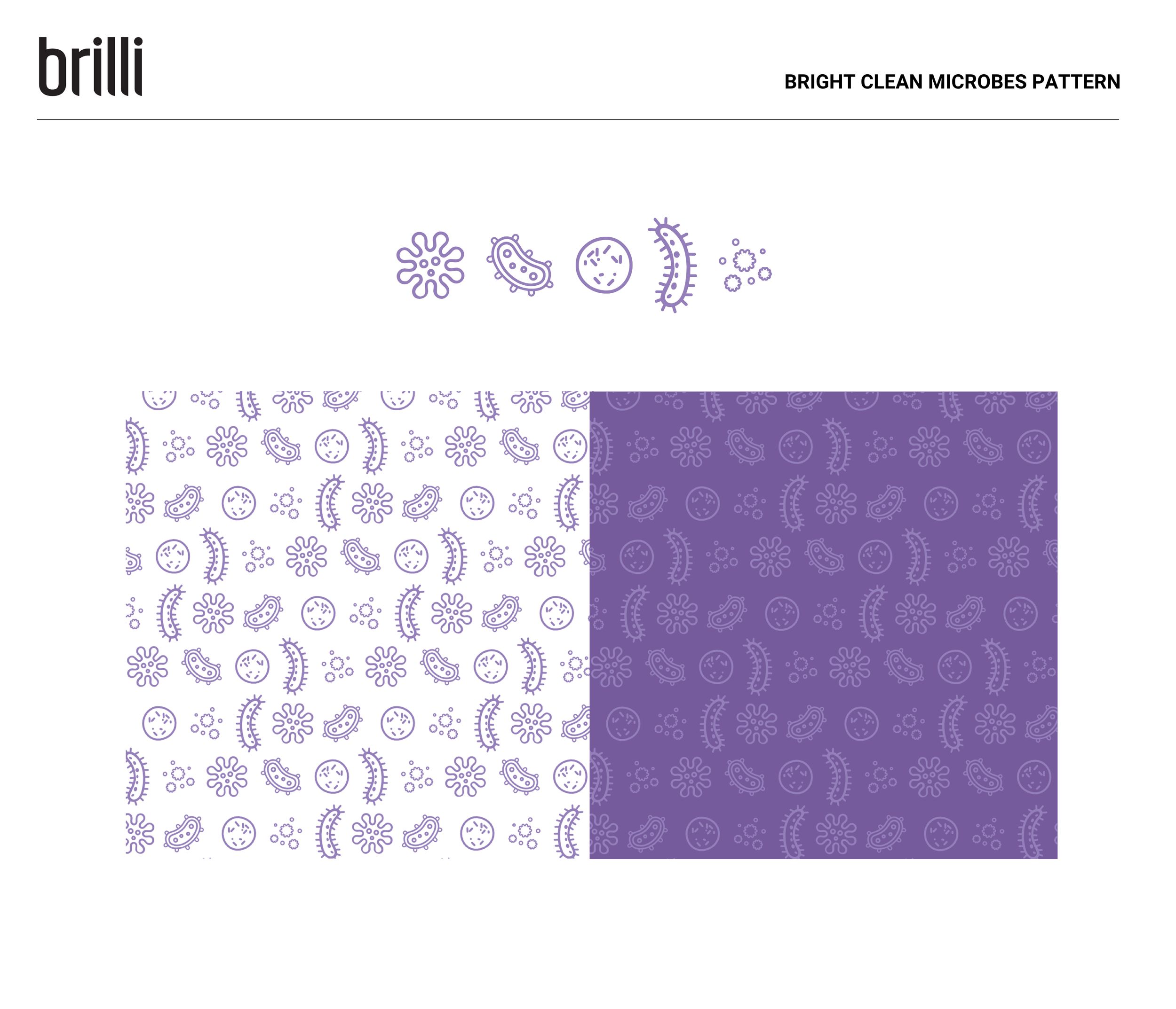
To transform the brand’s equity, I focused on humanizing the rather complex technology and scientifically proven benefits, making the regulated product feel approachable and safe, yet premium.
Unlike other virus-killing lighting products, this one was safe for use around humans, setting it apart.
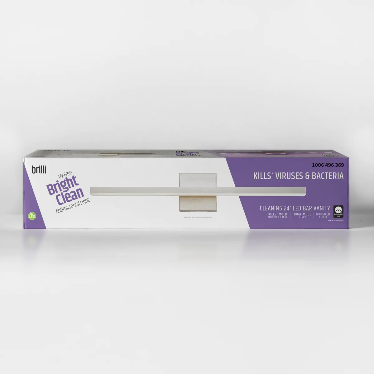
When Brilli Wellness Lighting acquired Ellumi, an innovative LED technology that safely eliminates viruses and odors, I was responsible for rebranding it under Brilli’s family. I emphasized the product’s core benefits—illumination and cleaning power—with a modern, minimalist design and clear messaging backed by scientific validation.
I ensured the packaging was accessible and easy to understand, even in a retail setting like Home Depot. The new branding highlighted tangible results through visuals showing how the product worked, even when “invisible.”
For inspiration, I looked to trusted tech brands like Dyson and iRobot, as well as sustainability-focused brands like Rothy’s and Seventh Generation. Ellumi's original branding was cluttered, so I knew that a minimalist approach would clarify its messaging around technology and effectiveness.
the results
exclusive partnerships
$24M
In record annual revenue
award recognition from
Award recognition from
Dive Deeper: brand guide
Dive Deeper: packaging design strategy
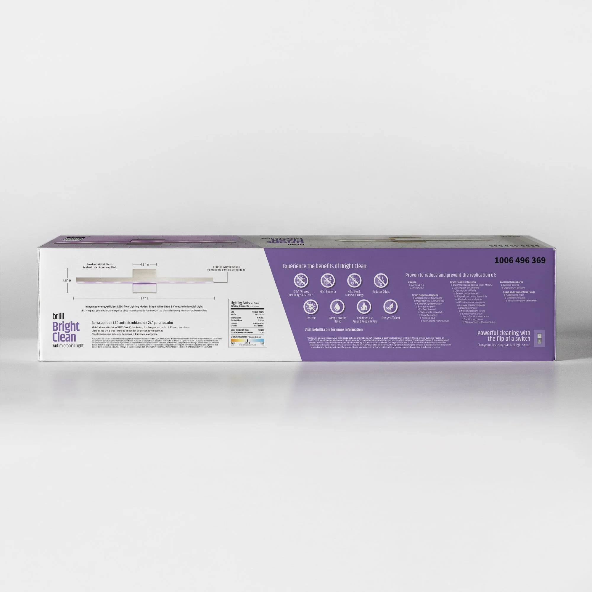
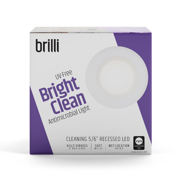
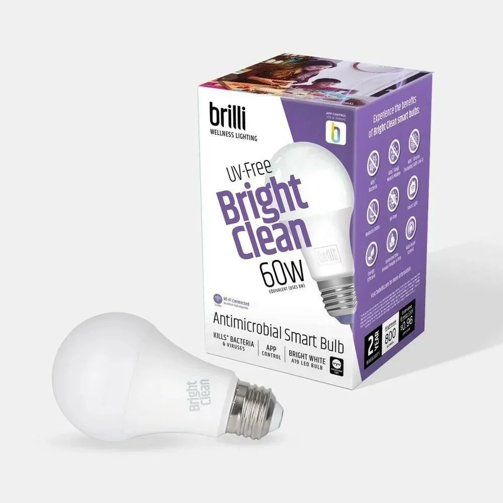
A critical aspect of our overall go-to-market strategy and retail partnership pitches was the packaging strategy and design.
It was vital that the packaging, much like the new brand name, clearly tell the story of the product’s proven benefits, key features, and safety. We did this by:
Highlighting key product features on the side
Clearly calling out that it was “UV-Free” (and therefore safe for humans and pets) on the front of the box
Including BOTH the words “antimicrobial” and “cleaning” also on the front
Including QR codes on the top of the box that drove to detailed product landing pages, explainer videos, additional scientific testing results, plus testimonials, and reviews.
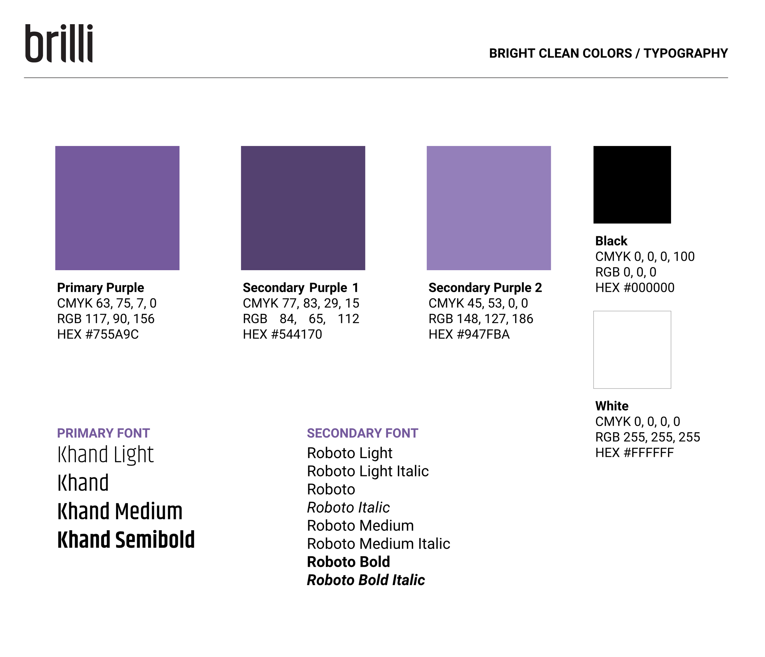
We also wanted to ensure that the packaging would “match” Brilli’s other products, as this was an extension under the same brand umbrella. We achieved this by giving Bright Clean its own unique color scheme (purple, the color of the light when it was in “cleaning” mode), the same logo, and diagonal styling.
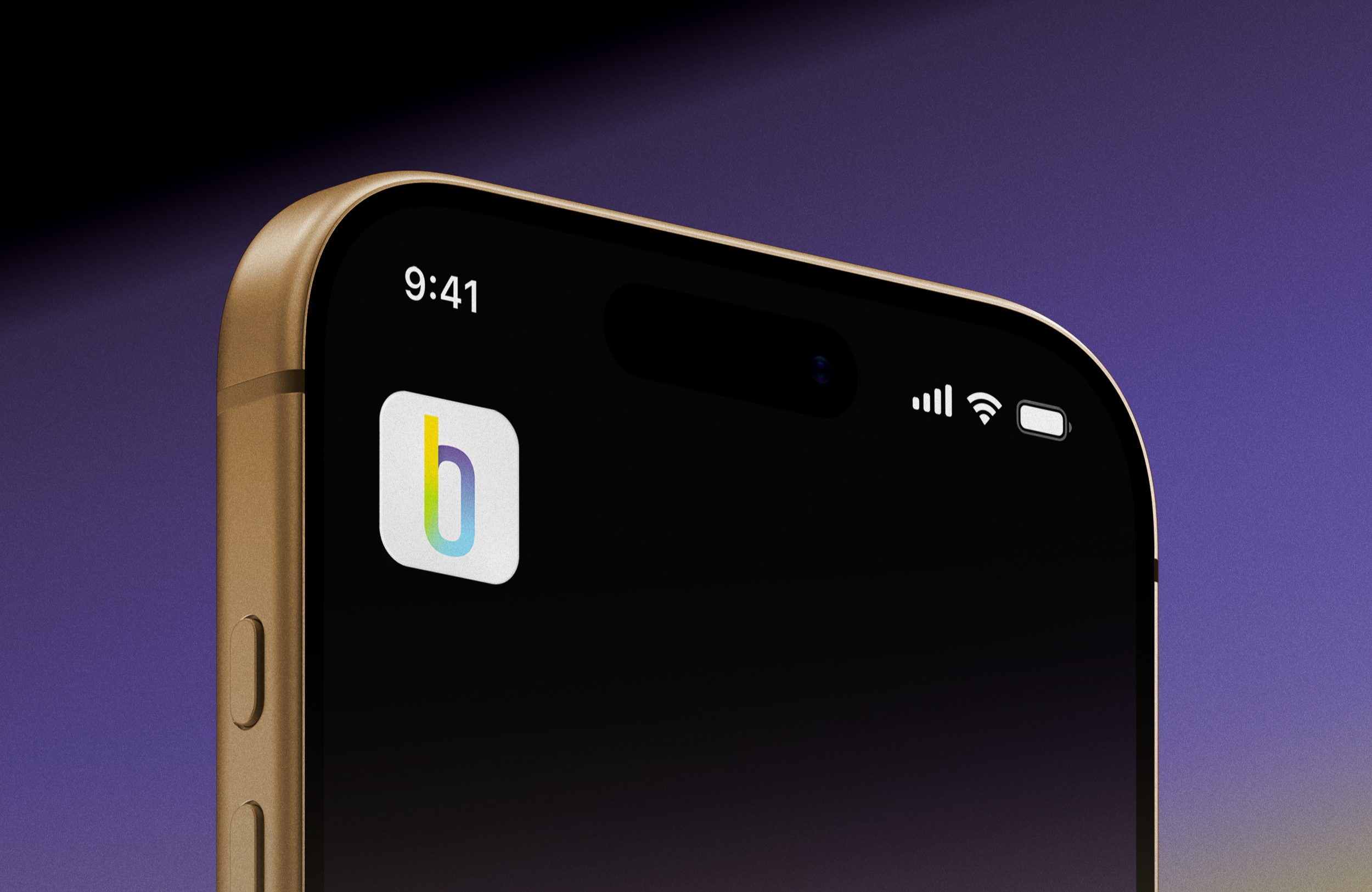
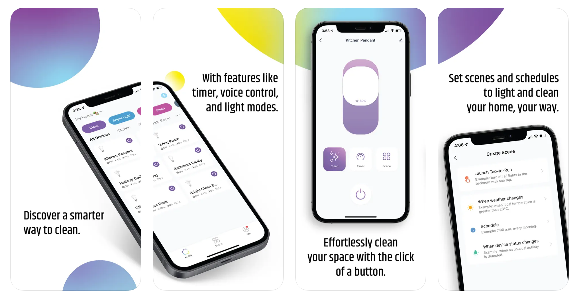
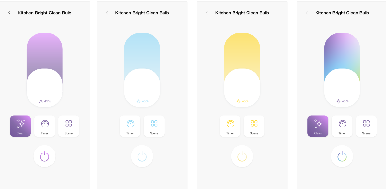
Dive Deeper: mobile application Design Direction & product Mangement
To support the launch of the smart-enabled Bright Clean line, I oversaw the creative direction for the mobile app interface and user education.
We focused on a "set it and forget it" UX strategy, allowing users to automate antimicrobial cleaning cycles through custom scheduling and scene-setting.
By integrating the app experience into our retail packaging and e-commerce storytelling, we successfully transformed the virus, bacteria, and mold-eliminating lighting technology into a comprehensive Smart Home Wellness service, the first of its kind.


Dive Deeper: brand concept pitch & Strategy presentation, 2020
The following are selected slides from the brand strategy pitch presentation.
For concept inspiration, I looked to technology brands known for effective, long-lasting, trusted products, like Dyson and iRobot, and approachable, sustainability-focused brands like Rothy’s and Seventh Generation.
Ellumi’s brand was busy and the messaging overcomplicated, particularly on packaging, but even in the logo. I knew that minimalism would elevate the brand and make the core product messaging around its technology and effectiveness easier to understand.
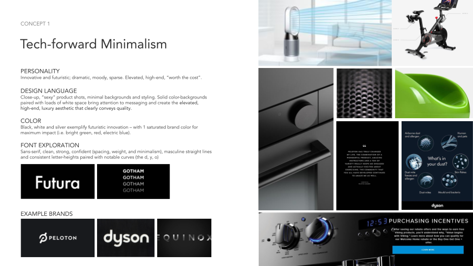
Brand Concept 1
Tech-forward Minimalism
Sleek and futuristic, dramatic, elevated, and “worth the cost”.
Aspirational brands that embody this concept include: Peloton, Dyson, and Equinox.
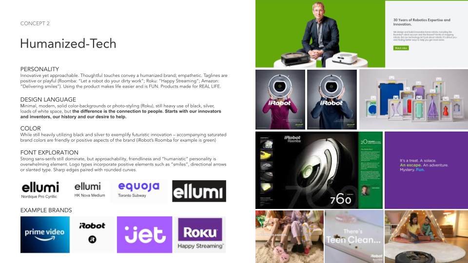
Brand Concept 2
Humanized-Technology
Innovative yet approachable, humanized technology brands are positive, playful, and empathetic.
“Service”-oriented, functionality, reliability, and “ease of use” are key characteristics.
Aspirational brands that embody this concept include: Amazon Prime, Roku, and Jet.
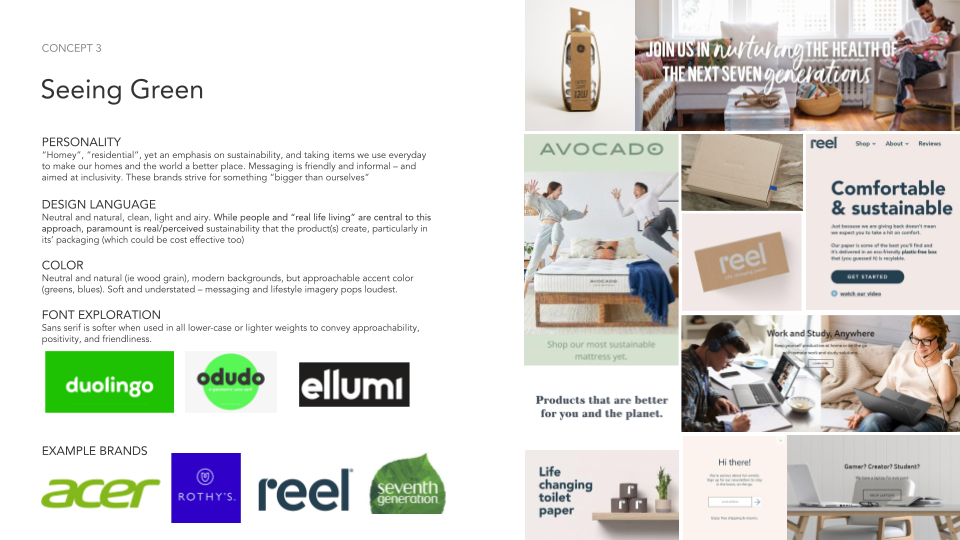
Brand Concept 3
Seeing Green
Brands that are for everyone, every day (“everyday use”). These brands emphasize sustainability as their primary mission, and blend seamlessly into your day-to-day life.
Aspirational brands that embody this concept include: Rothy’s, Reel, and Seventh Generation.
More Case Studies of creative excellence
-
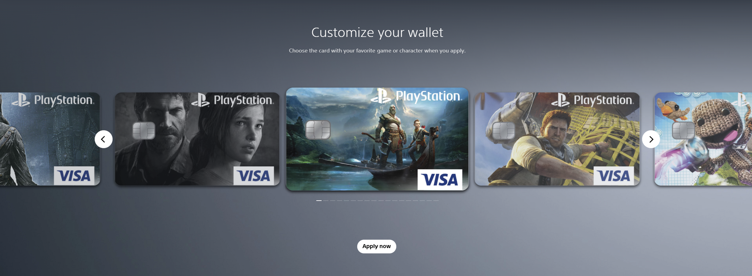
![Screenshots of PlayStation digital wallet customization interface showing several customized Visa game and character-themed credit cards, with navigation arrows and an 'Apply now' button.]()
Sony PlayStation & Visa Acquisition Campaign
-
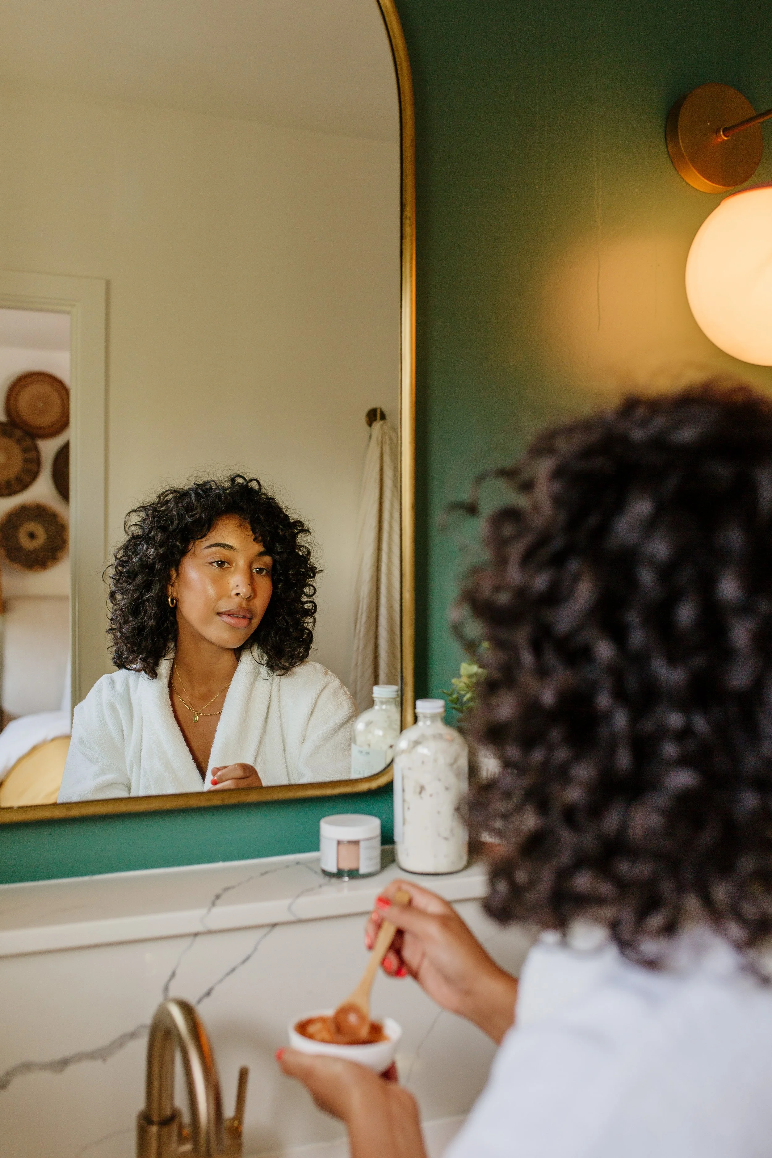
![A young woman with curly hair and gold earrings looking at herself in a mirror while holding a spoon and a bowl of ice cream in a bathroom with a marble countertop and a green wall.]()
Brilli Wellness Lighting Lifestyle Photography
-
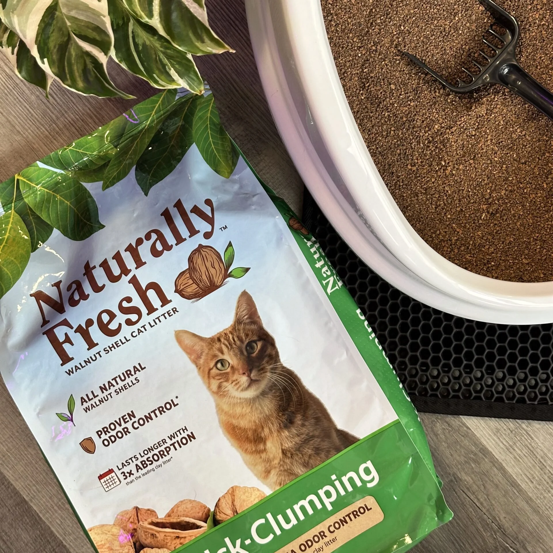
![Packet of natural cat litter with a picture of an orange tabby cat, green plants, and walnut shells on the packaging. Part of a white litter box and a black litter scoop are visible on a brown textured surface.]()
Naturally Fresh Digital Creative Strategy
-
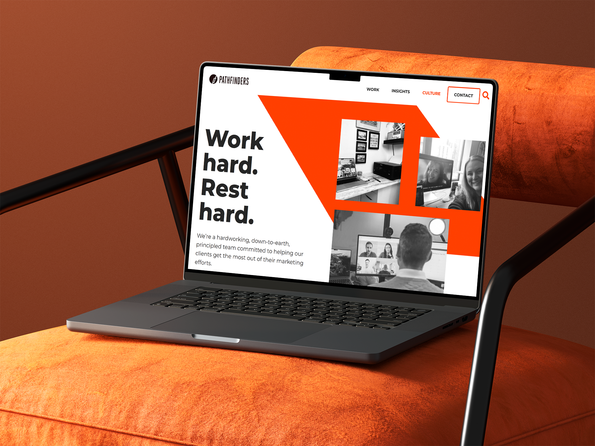
![A laptop on an orange surface displaying a webpage with the title 'Work hard. Rest hard.' and a menu bar with options including Work, Insights, Culture, Contact, and a search icon. The webpage features black and white images of people working on video calls and in office settings.]()
Pathfinders Advertising Digital Growth Strategy
-
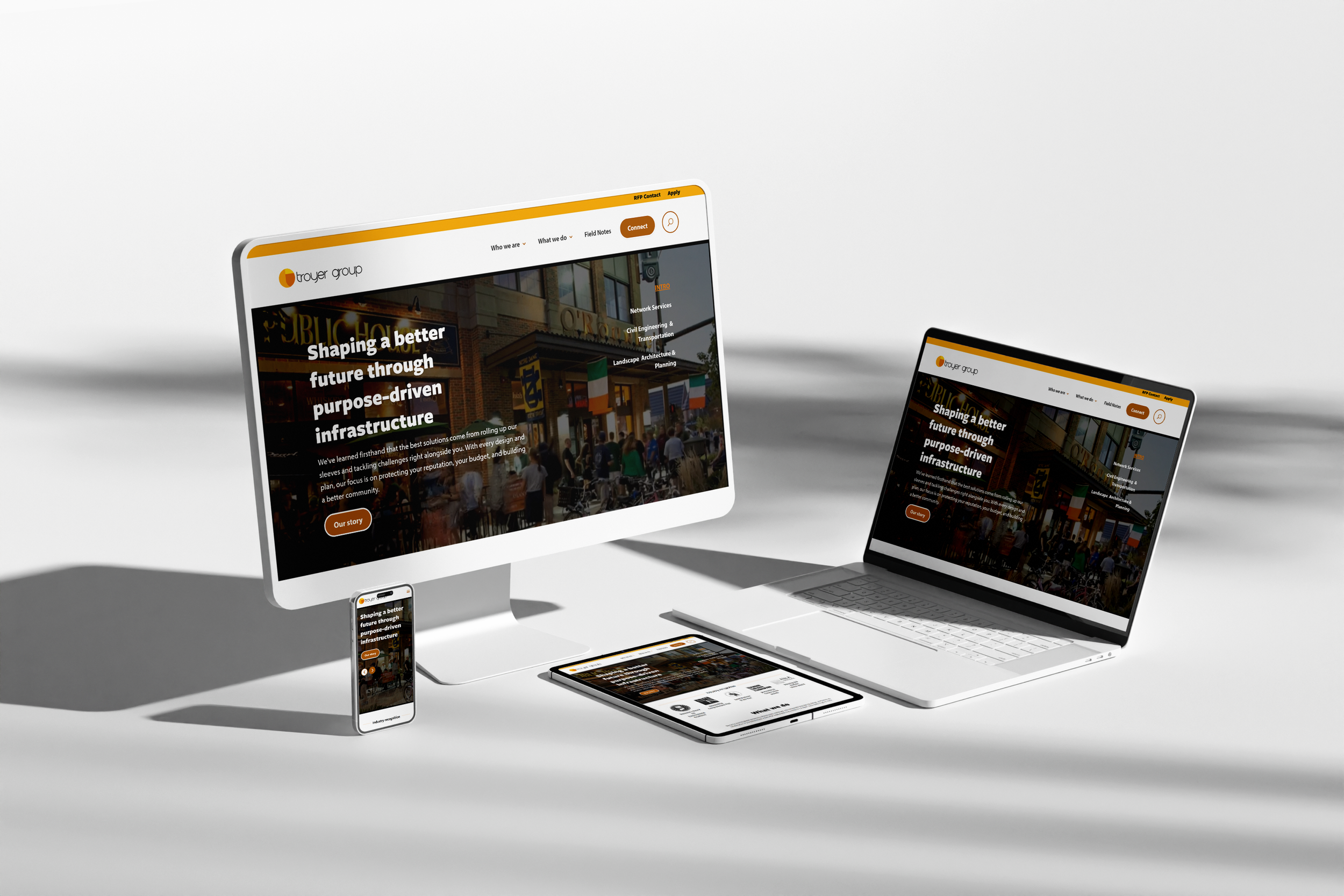
![Multiple electronic devices including a desktop monitor, laptop, smartphone, and tablet displaying the same website for Troyer Group, with a white background.]()
Troyer Group Architectural Firm Digital Strategy
-
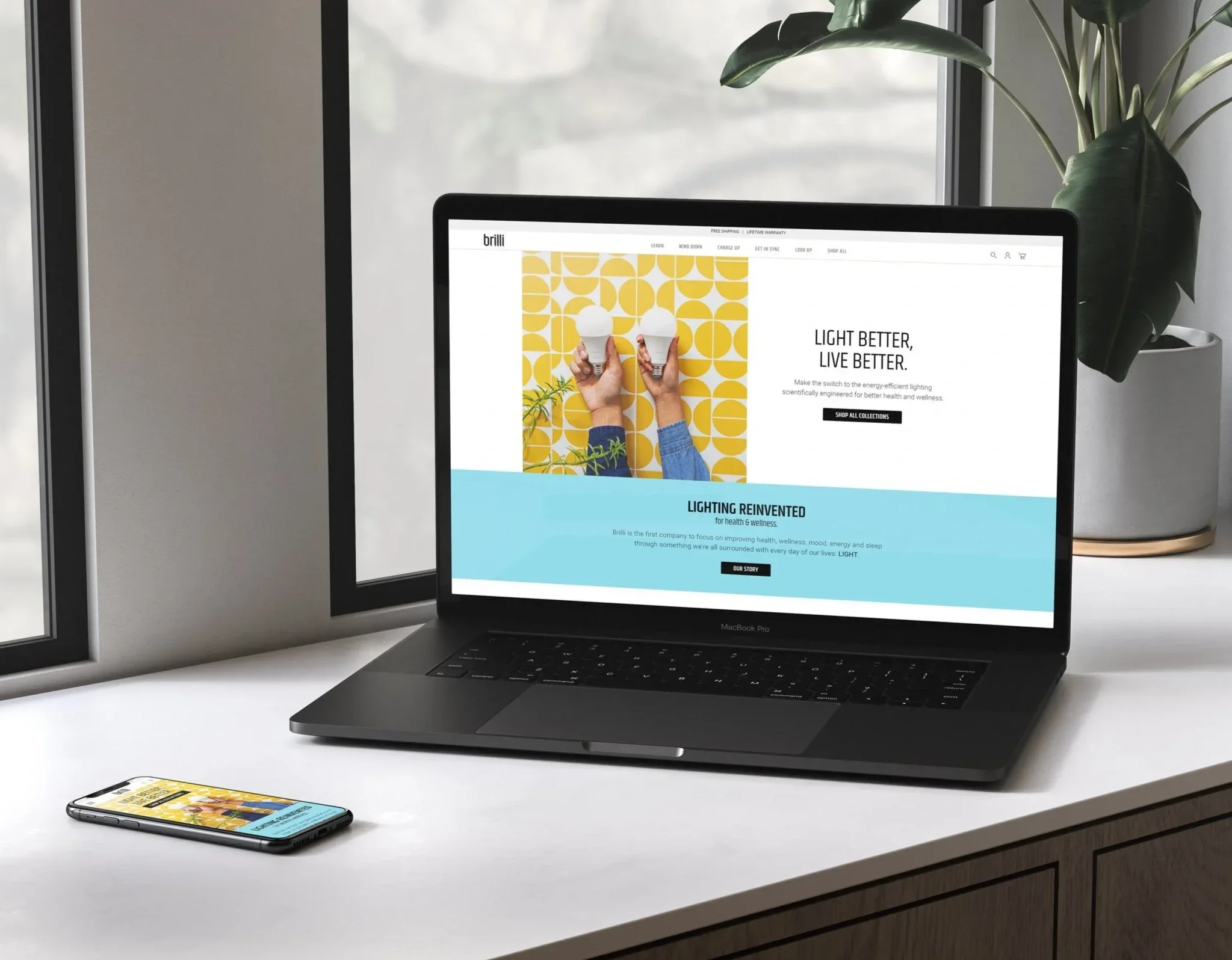
![A workspace with a MacBook Pro laptop displaying a website for Brilli, a smartphone showing the same website, and a potted plant with large green leaves on a windowsill in the background.]()
Brilli Wellness Lighting Brand & Digital Strategy
-
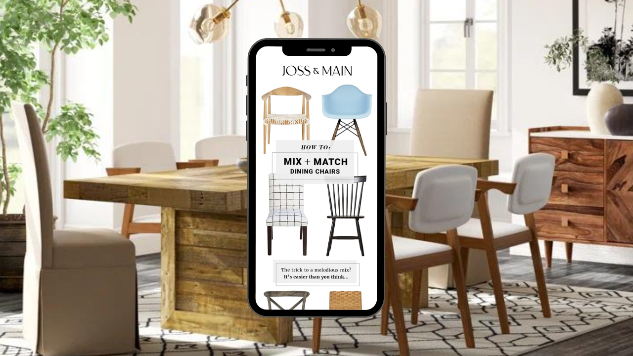
![Interior of a dining room with a wooden table, white and upholstered chairs, large windows, plants, and modern lighting fixtures. A smartphone in the foreground displays a furniture website with images of dining chairs and matching tips.]()
Joss & Main Email Strategy & Design
-
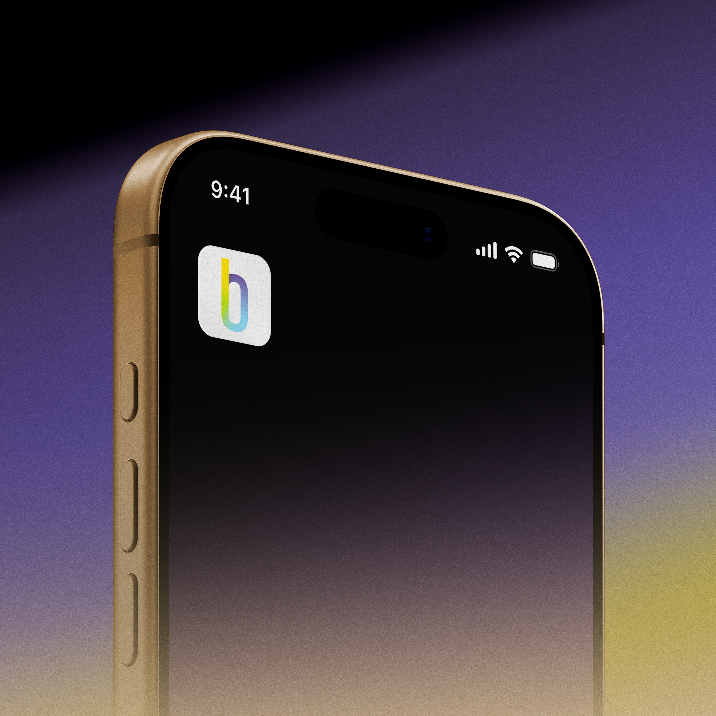
![Close-up of a smartphone showing the time 9:41, with signal, Wi-Fi, and battery icons on a gradient background.]()
Brilli Wellness Mobile App Product Management
-
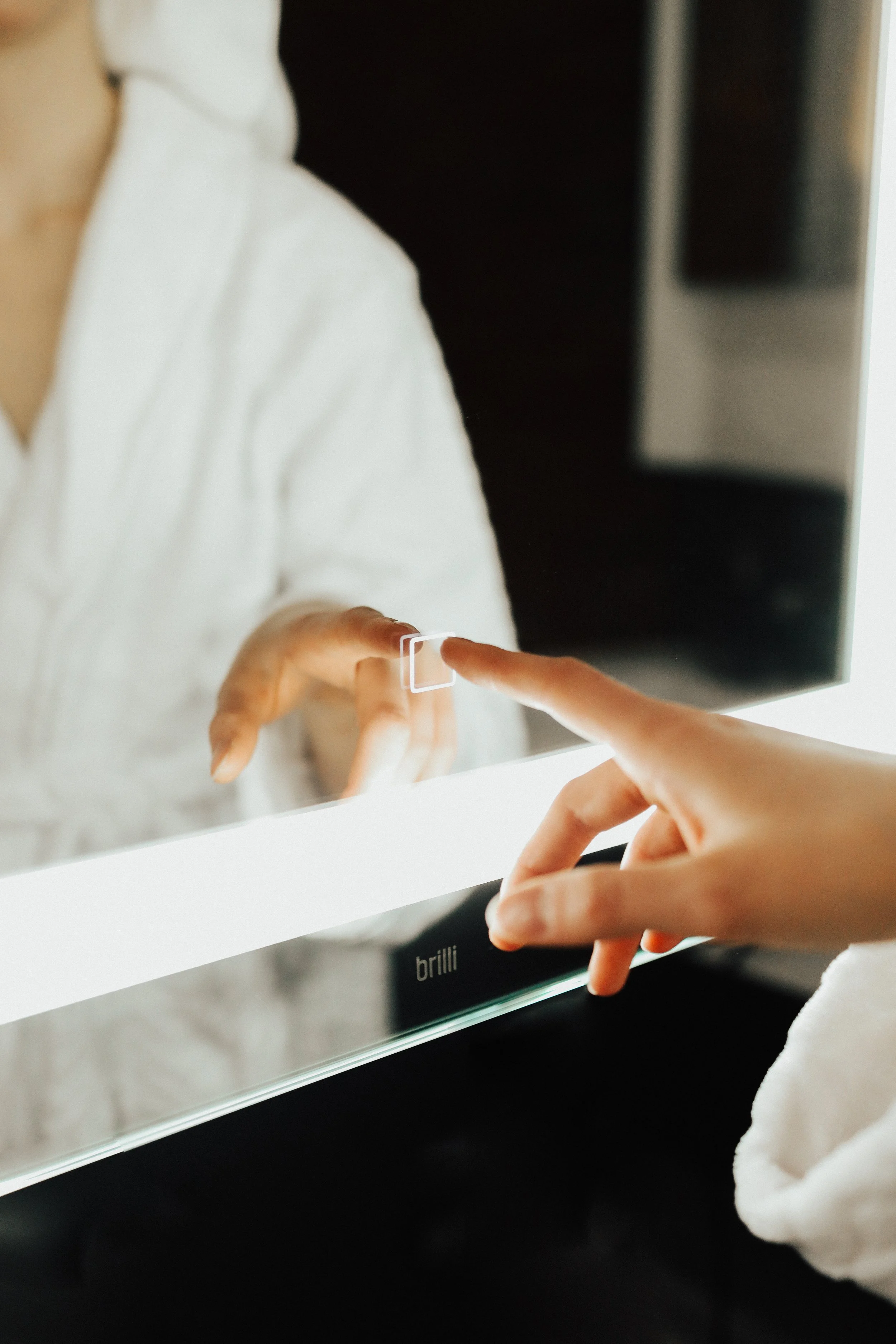
![Close-up of a person using a mirror to touch up their lipstick with their finger, with the brand name 'brillii' visible on the mirror's base.]()
Brilli Wellness Lighting Video Direction
-
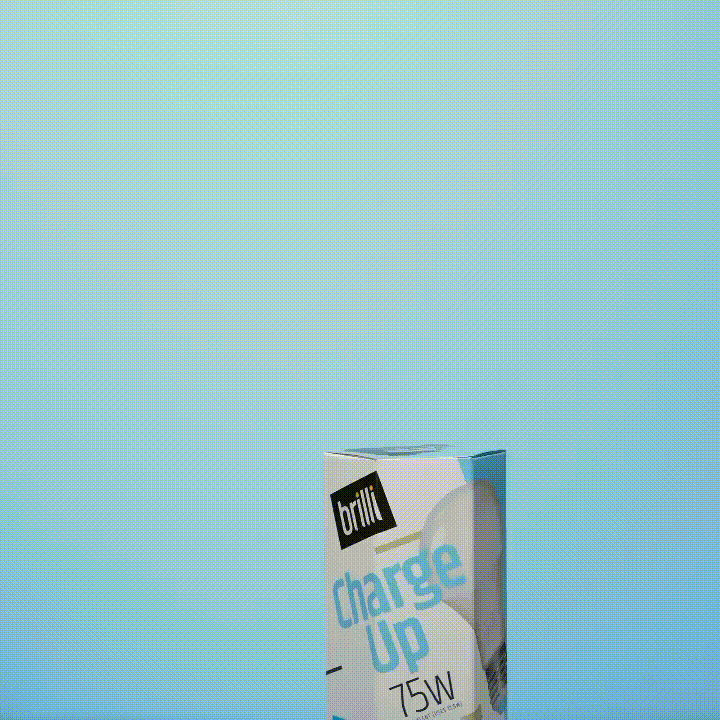
![A box of bright charge up 75W LED light bulb against a blue background.]()
Brilli Wellness Lighting Social Media Strategy & Influencer Management
-
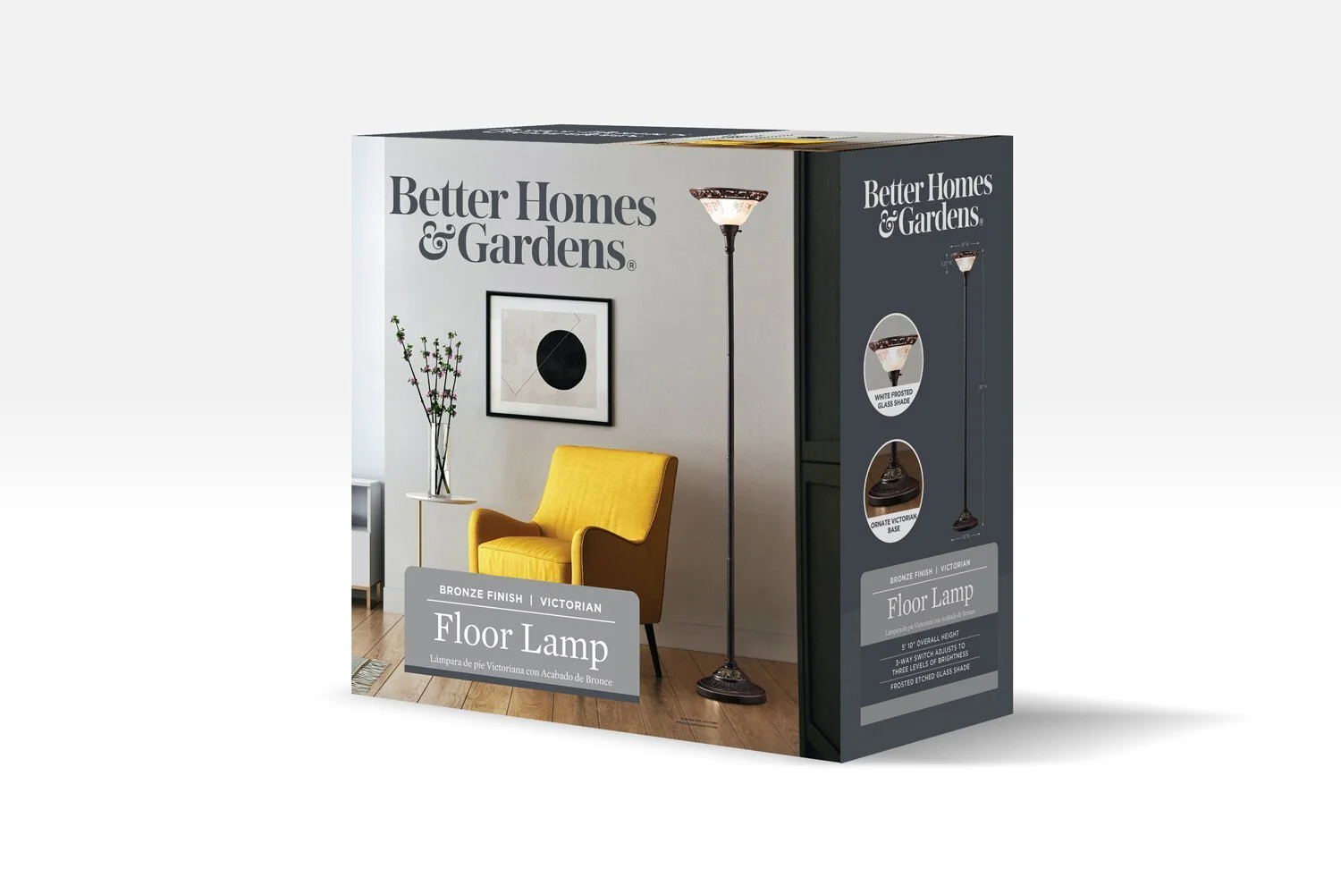
![Product packaging for a Victorian style floor lamp with a bronze finish, showing a living room scene with a yellow armchair, a small side table with a vase of flowers, artwork on the wall, and the lamp turned on.]()
Better Homes & Gardens (Walmart) Packaging Design Direction
-
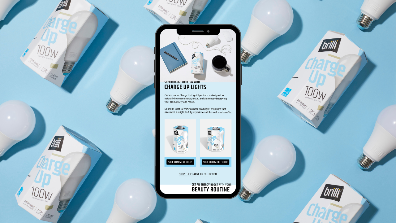
![Smartphone displaying a webpage about Brilli Charge Up LED light bulbs, surrounded by multiple boxed bulbs and unboxed LED bulbs on a blue background.]()
Brilli Wellness Email Strategy & Design
-
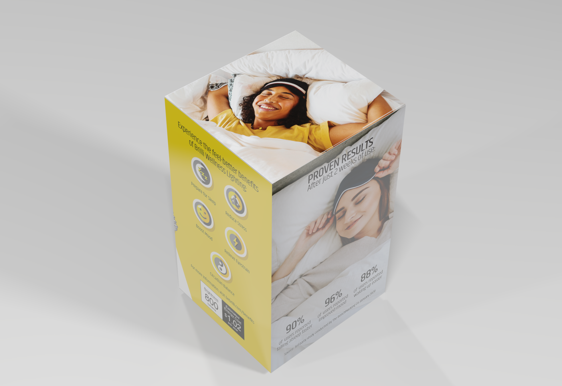
![A product packaging box featuring a smiling woman sleeping on a bed, with text promoting wellness benefits like better sleep, stress reduction, mood boost, and energy. The box also shows some statistics and pricing information.]()
Brilli Wellness Lighting Packaging & POP Design Direction
-
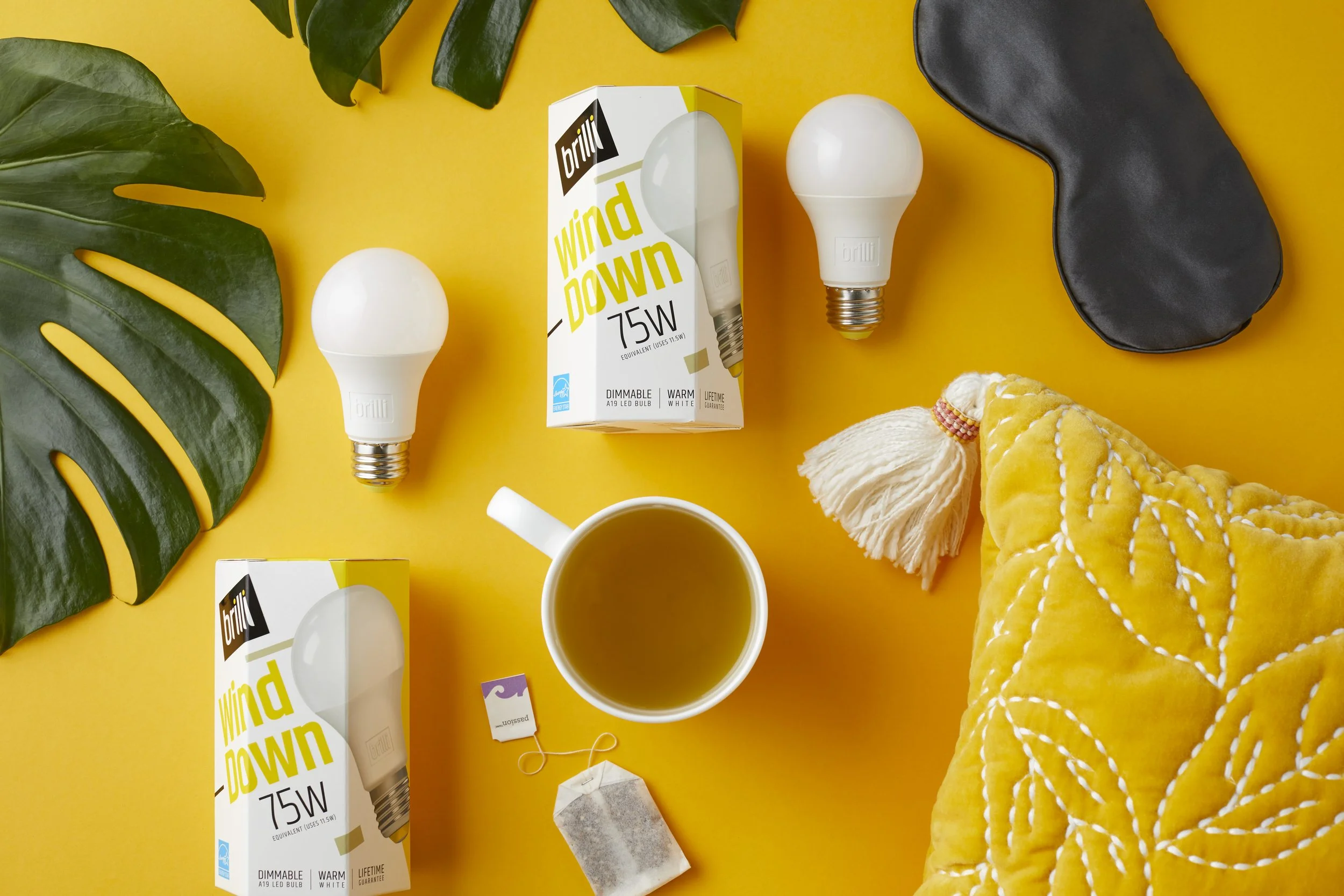
![Yellow background with two white LED bulbs, one in a box labeled 'brilli wind down 75W', a black eye mask, a white mug of tea, a yellow quilted blanket, green leaves, a tea bag, and a string.]()
Brilli Wellness Product Photography
-
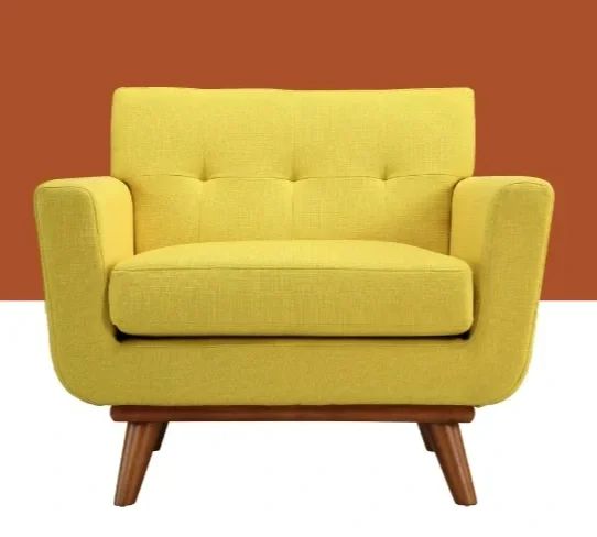
![A yellow mid-century modern loveseat with wooden legs set against an orange and white background.]()
AllModern (Wayfair) Art & Animation Direction
-
![]()
Protective's ADA Insurance for Dentists Digital Transformation