Brand Identity Refresh
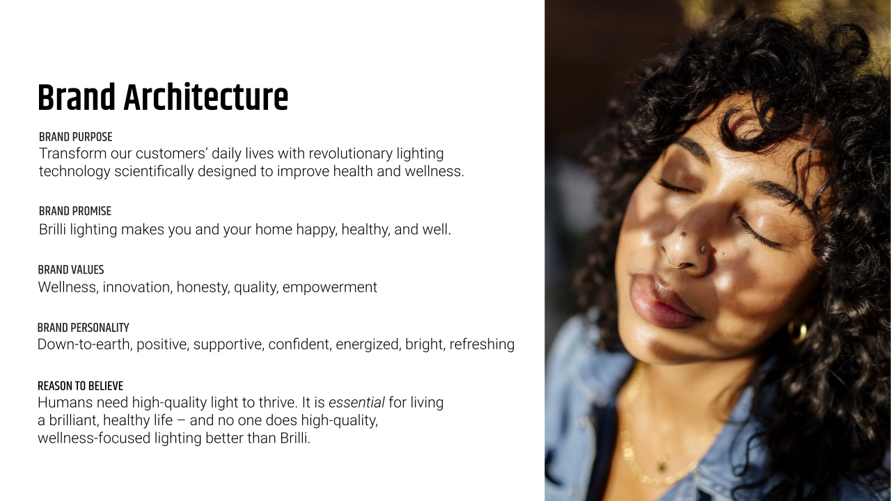
Brand
Brilli Wellness Lighting
Year
2020
Role(s)
Creative Director, Photo / Art Director, Email + Social Media Strategist, team lead
The Challenge
To enhance brand and product awareness for the circadian lighting start-up Brilli Wellness during the peak of the COVID-19 pandemic, I spearheaded a strategic rebranding initiative. This effort aimed to align the brand’s aesthetic and core messaging with its mission, products, and target customer audiences, meeting the growing global demand for health and wellness products.
My Approach
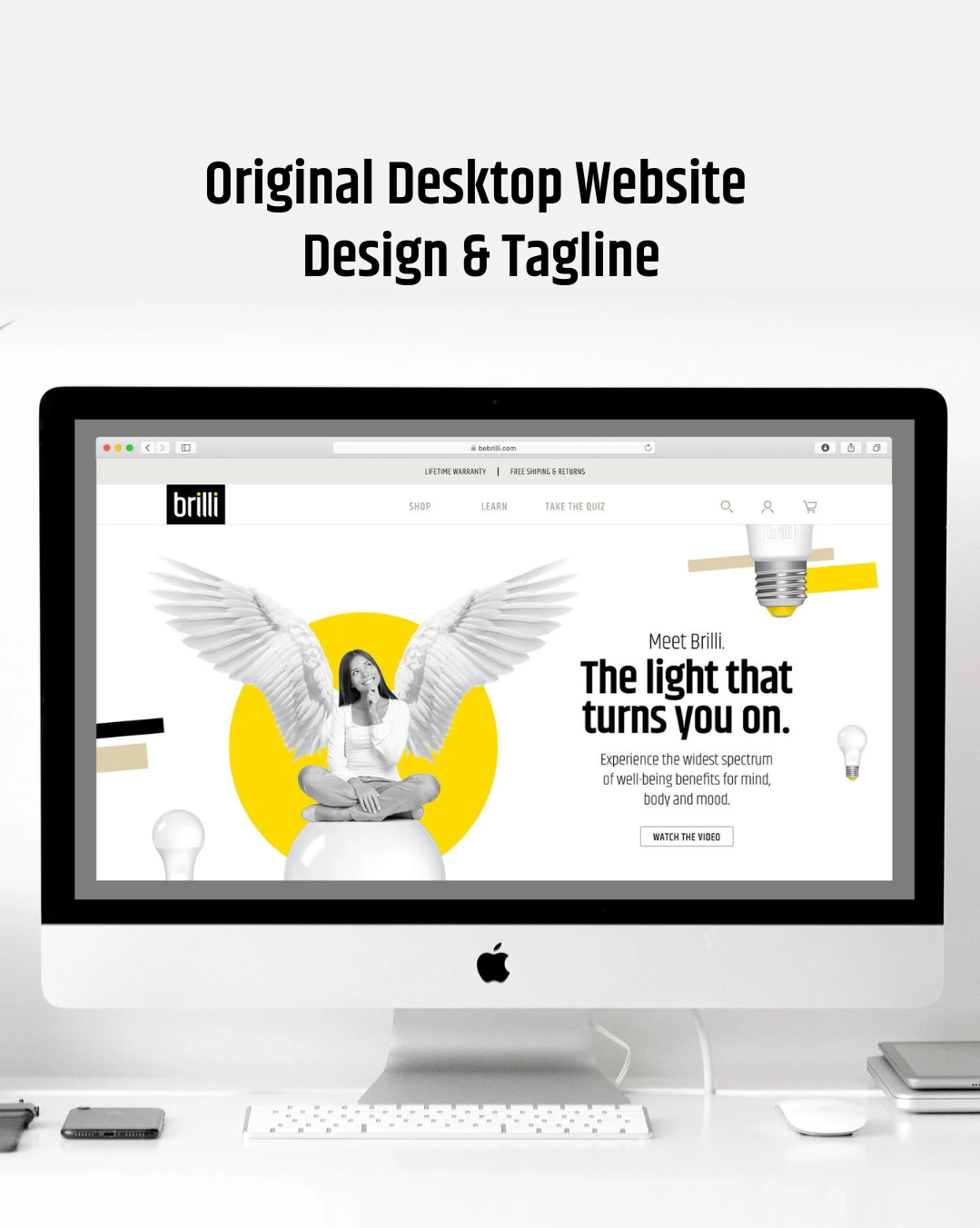
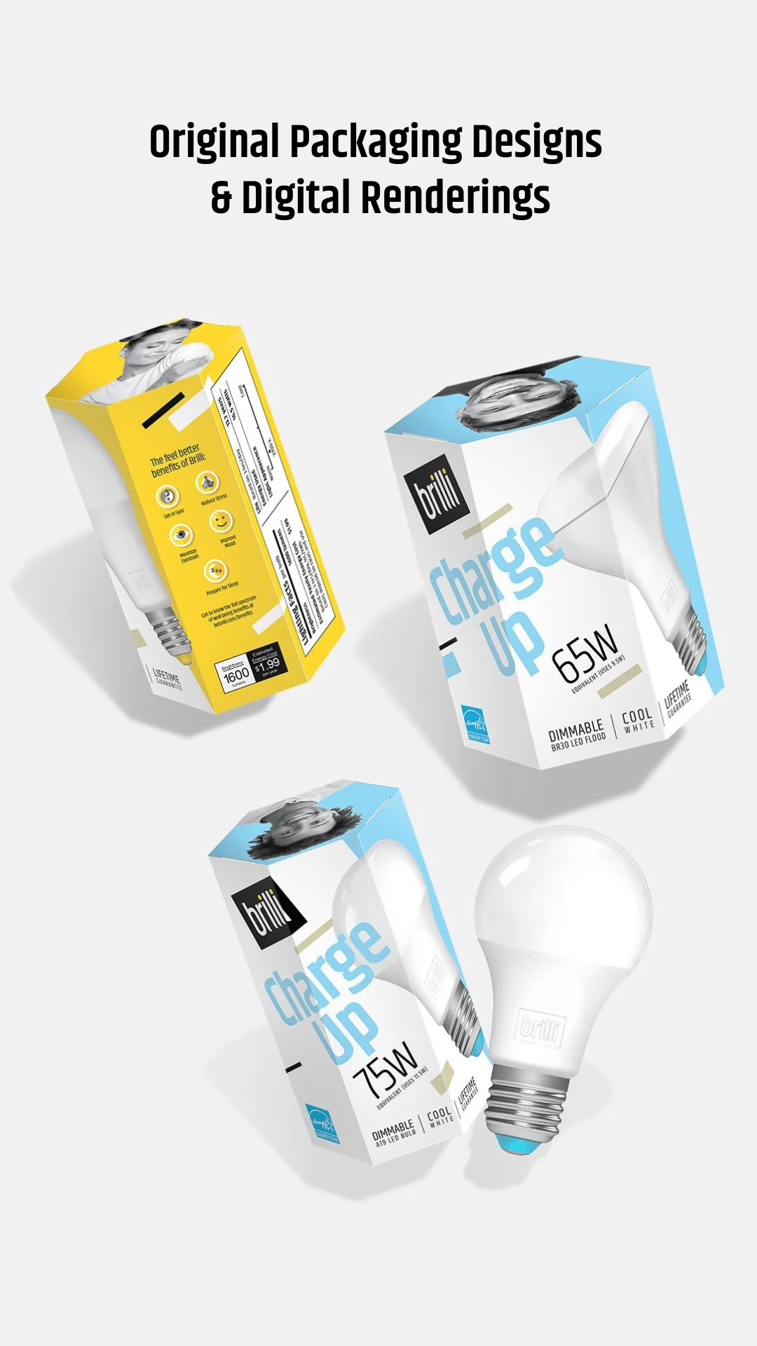
I led Brilli’s brand evolution, shifting from a bold Bauhaus style to a more contemporary look inspired by the "clean girl aesthetic." This new design direction included:
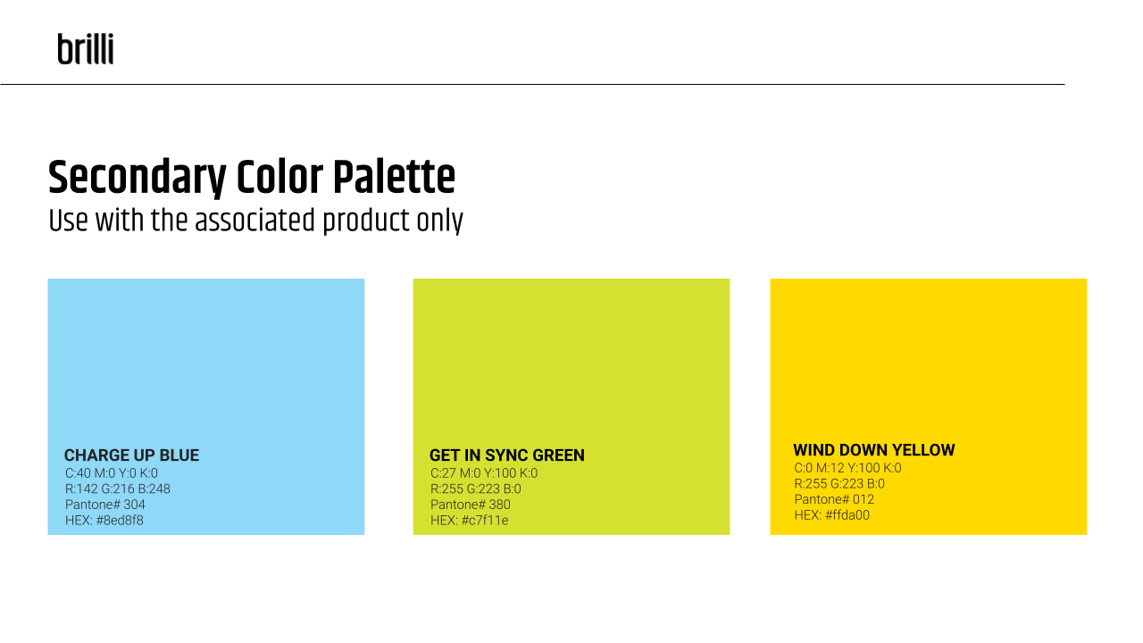
A brighter color palette that appeals to Millennials, aligning with Brilli’s core customer demographic.
Increased usage of lower-case headings to soften the brand voice in visual messaging, in contrast to the previous all-caps approach.
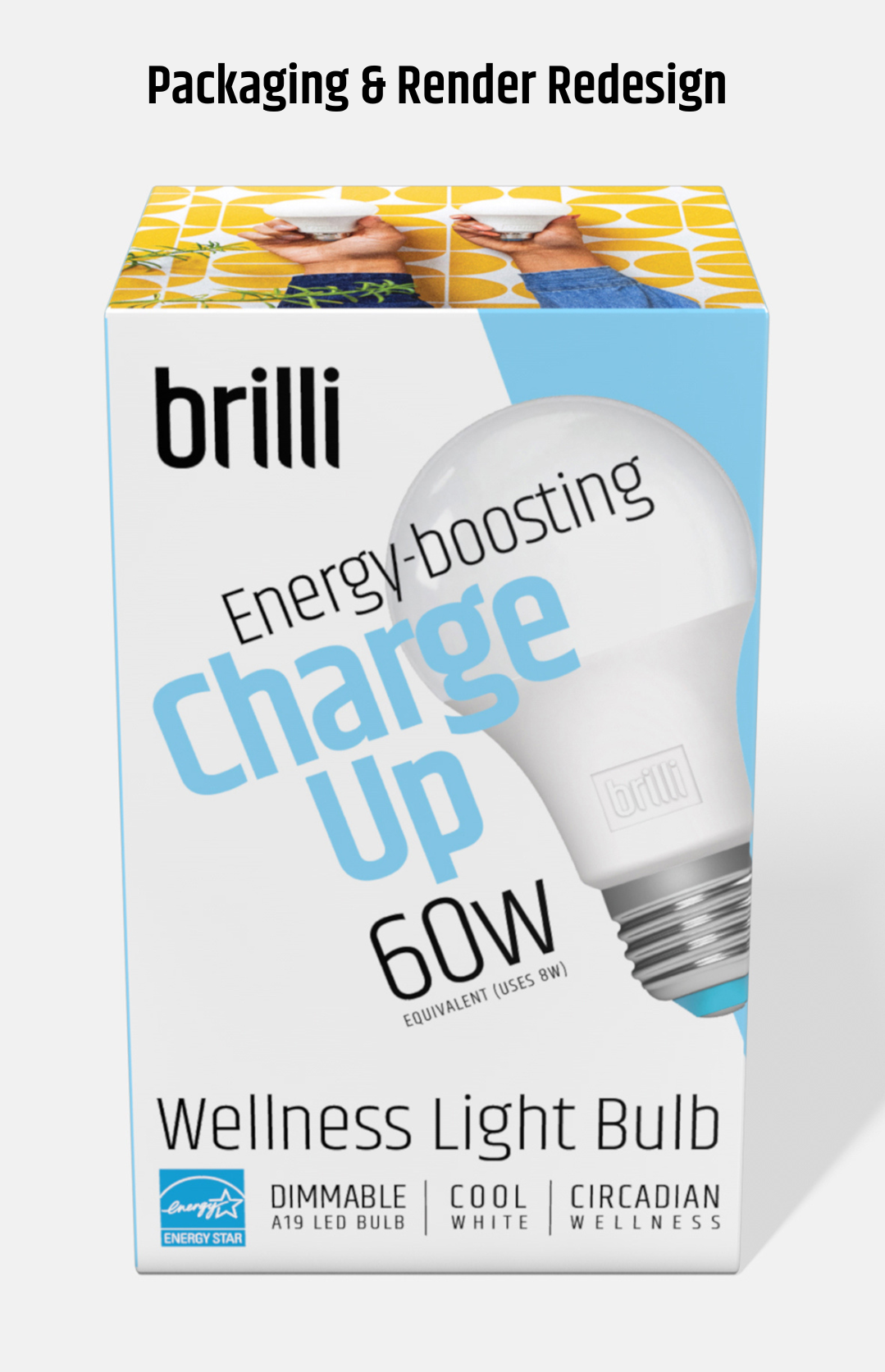
Incorporation of angles that connect the circadian products with concepts of the sun, light, and shadow.
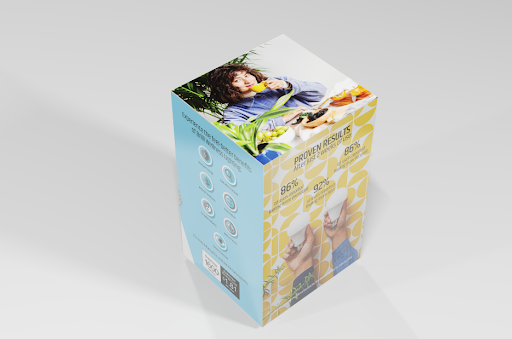
A transition from stock photography to cohesive, proprietary lifestyle images captured in partnership with Dabito. View more results from the lifestyle shoot in my portfolio.
While my design decisions were primarily influenced by the positive impact of Brilli’s products on health and wellness, I also utilized insights from brand surveys and demographics—including age, gender, geographic location, and typical lifestyles—alongside current market trends and design movements.
Key Considerations
We maintained the modern lowercase logo, primary font, and diagonal angle accents for continuity, and ensured that the updated color palette and font sizing met or exceeded ADA web accessibility standards.
Results
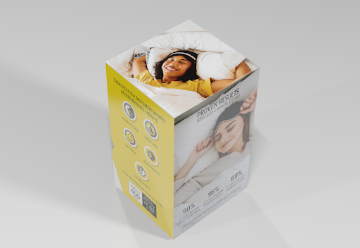
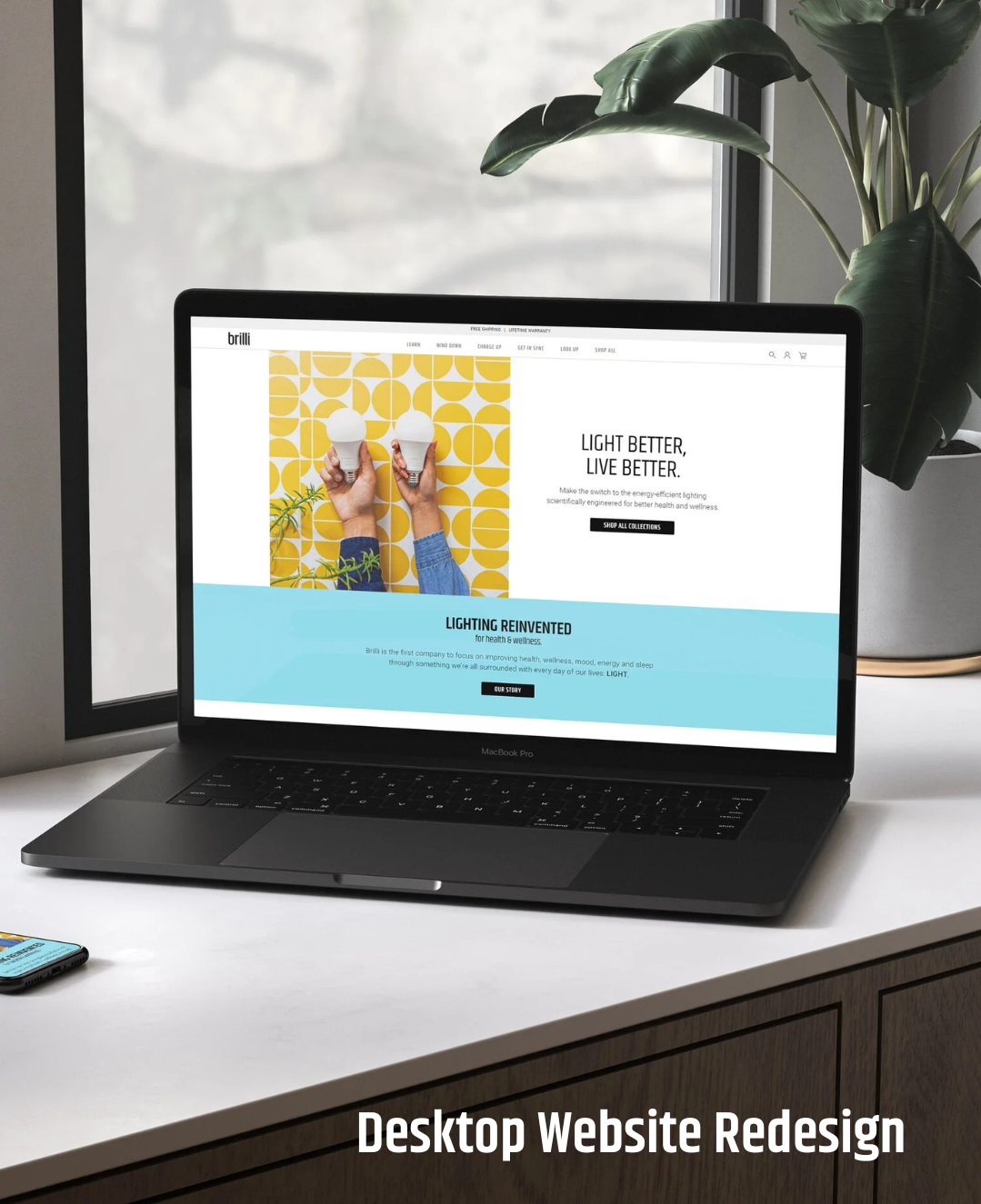
The new visual direction informed a comprehensive refresh of Brilli’s website, emails, press kit, and packaging, resulting in a cohesive, relevant, and elevated brand experience - and helped to propel the brand’s sales to $9M in just the first year of launch.
The updated brand direction delivered:
1000%+ increase in annual sales YoY (2020 vs 2019, per annual financial reporting)
New retail partnerships with Target and Home Depot
21% higher click-through rates on Facebook display ads
Earned media in People, Forbes, and Prevention as of 2021
Before


After


-
![Smartphone displaying an online product page for Brilli Charge Up Light bulbs on a blue background surface. Surrounding the phone are several boxed and unboxed white LED light bulbs and a black coffee mug. The product boxes and bulbs are arranged with some boxes showing the label 'Charge Up 100W'.]()
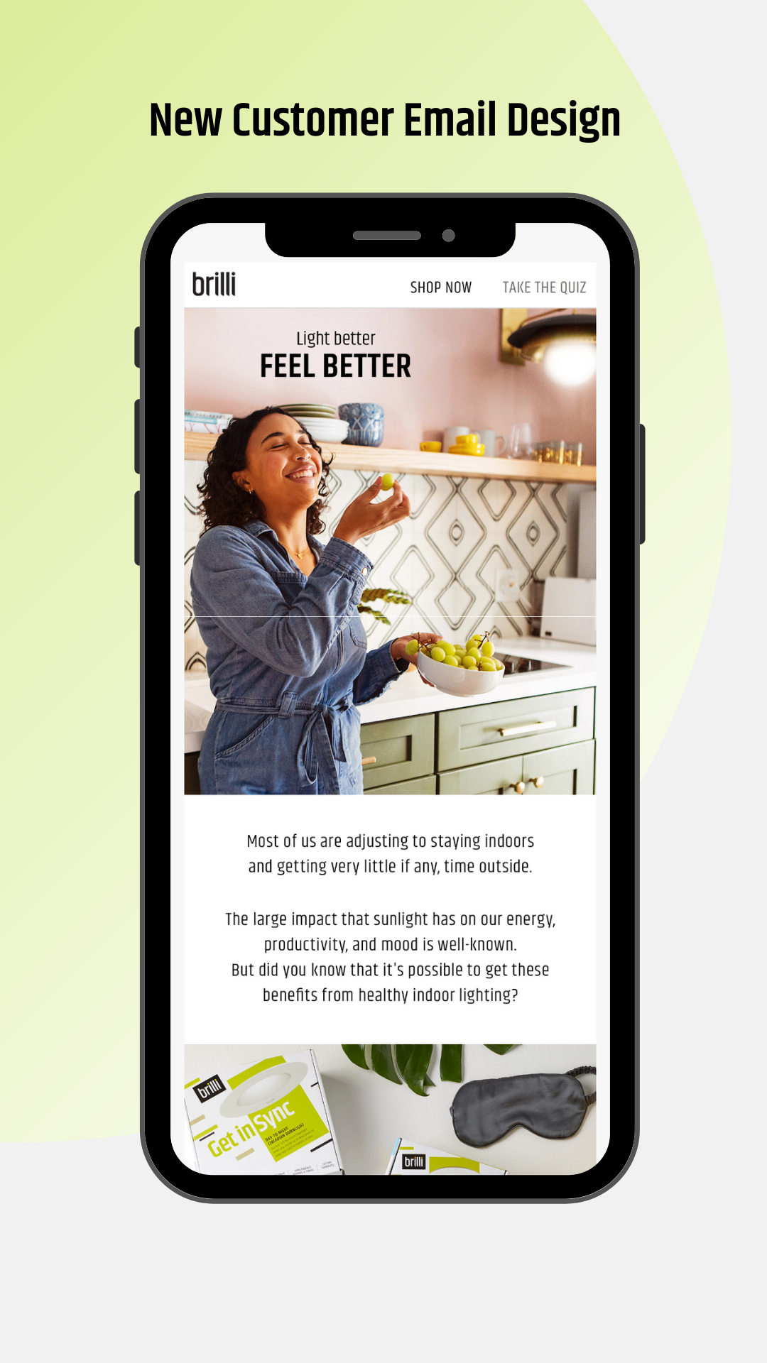
Email Strategy, Brilli Wellness
-
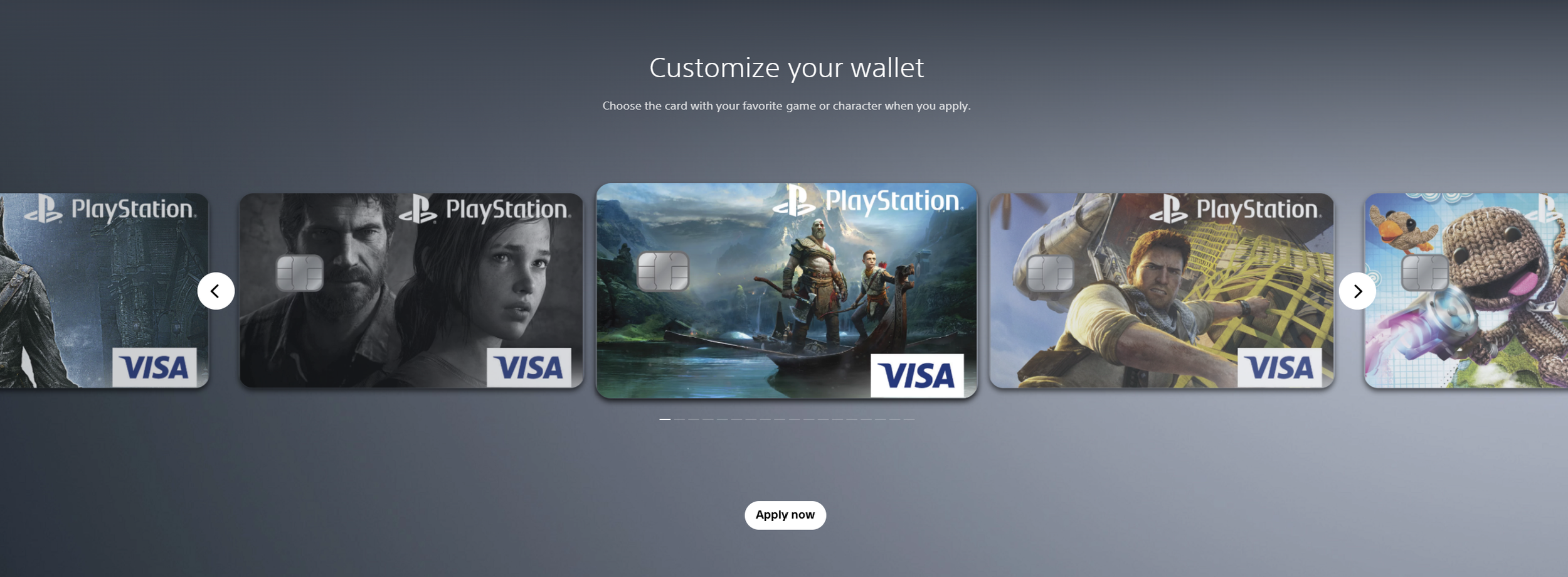
![Screenshot of a digital wallet customization page featuring PlayStation-themed VISA cards with game or character artwork.]()
Landing Page Strategy + Design Direction, Sony PlayStation
-
![Multiple electronic devices including a desktop monitor, laptop, tablet, and smartphone each displaying a website with a header in orange and white, and a background image of a busy downtown street scene with people walking and storefronts.]()
Digital Strategy + Website Redesign, Troyer Group
-
![A person touching a glass screen interface with a square icon, reflected in the glass yet not visible in the reflection.]()
Video Direction, Brilli Wellness
-
![Furniture catalog on a smartphone screen showing how to mix and match dining chairs, placed in a modern dining room with wood furniture, white walls, large windows, and decorative plants.]()
Email Strategy, Joss & Main
-
![A yellow decorative pillow with white embroidered leaf patterns and tassels on each corner, placed on a yellow background, with a packaged 75-watt LED light bulb labeled 'Wind Down' resting on top.]()
Product Photography Direction, Brilli Wellness
-
![Mid-century modern living room setup with a yellow armchair, a blue sofa partially visible on the left, and a small blue wooden side table on the right. Background wall is orange, and the floor is white. A green progress bar at the bottom reads '75% Purchased.']()
Digital Animation Art Direction, Wayfair
-
![Modern bathroom with a white freestanding bathtub, large windows, a wooden ladder with towels, a double vanity with vessel sinks, round mirrors, and minimalist decor.]()
Art Direction, 3d Imagery
-
![Box with a picture of a Victorian style bronze finish floor lamp in a room with a yellow armchair, a side table with a plant, and framed artwork on the wall.]()
Packaging Design Direction, Walmart
-
![Display at an exhibition for Brilli brand home lighting products, featuring a black wall with white text, a blue cabinet with a mirror and two lights, and a shelf filled with boxed light bulbs.]()
Experiential Design, Brill + Showfields NY
-
![Box of Brilli Bright Clean antimicrobial light bulbs for cleaning 5/6 inch recessed LED lights.]()
Product Rebranding, Brilli Bright Clean
-
![A woman with curly hair, wearing a white robe, looks at her reflection in a large mirror while eating ice cream at her bathroom vanity.]()
Lifestyle Photo Direction, Brilli Wellness